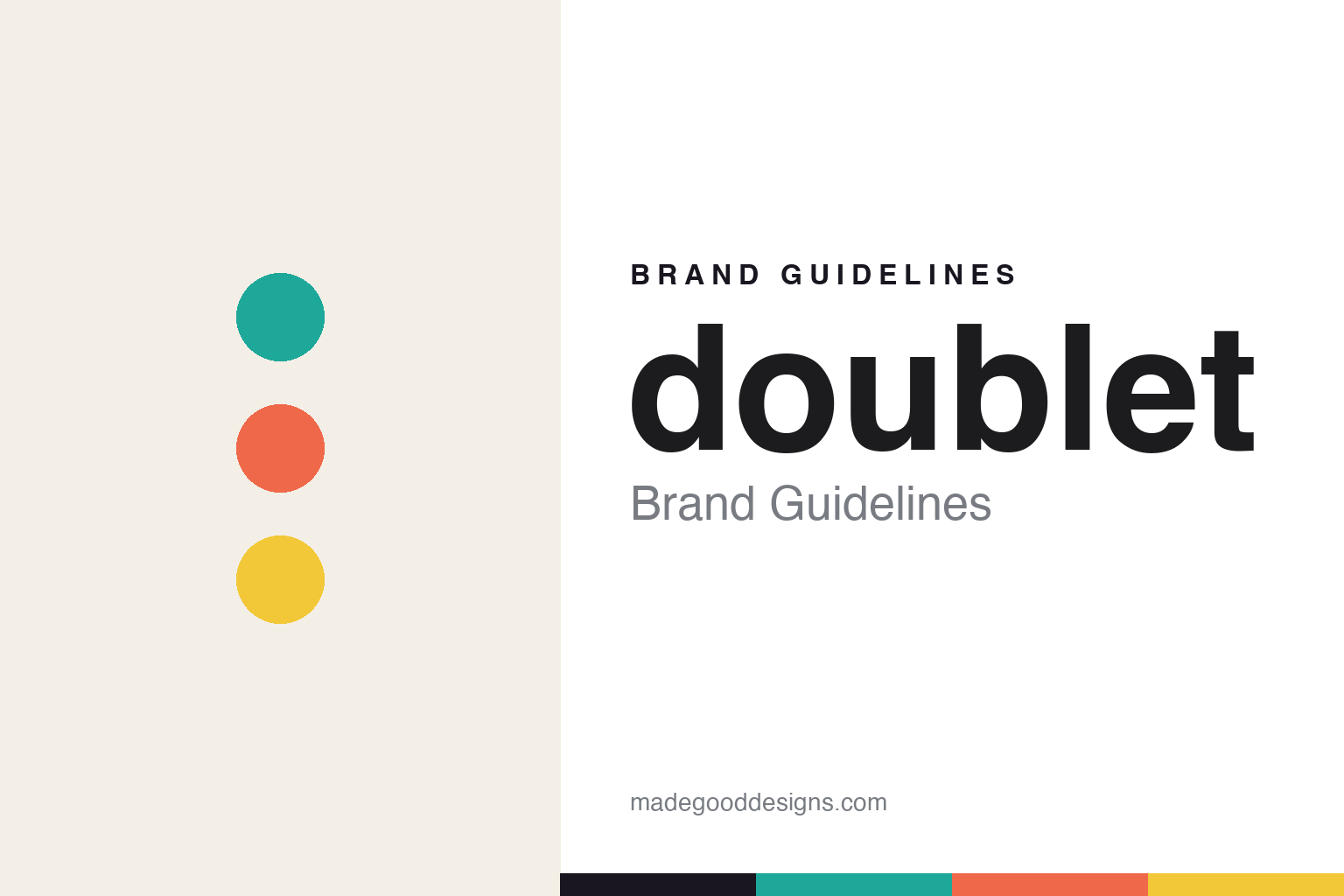
doublet Brand Guidelines
Surreal by design.
Aa
Two constants: a surreal, playful palette and a playful grotesque register. Abstract homage — not the doublet wordmark or logo.
Surreal by design
doublet turns humour into high fashion.
doublet is a lesson in humour as a design language. Founded in 2012 by Masayuki Ino (with a debut collection in Spring/Summer 2013) in Tokyo, the independent label makes playful, surreal, conceptual high fashion — “design that doesn’t harmonise with the everyday.”
Its brand identity is playful, surreal and witty — trompe-l’œil graphics, deconstruction, experimental embroidery and theatrical runway concepts, all cut with a sense of humour. Ino honed his footwear and accessories craft as head of that category at Miharayasuhiro before launching doublet.
(Honest notes: the name is styled lowercase, “doublet.” Ino won the LVMH Prize in 2018 — the first Japanese designer to do so — and also took the Tokyo Fashion Award in 2017. It’s playful, conceptual high fashion, not typical hype streetwear (and not the historical Renaissance garment of the same name). There’s no official brand hex, so the colours here are an unofficial interpretation.)
Colour
doublet lives in a surreal, playful palette. Click a swatch to copy the hex.
doublet’s identity is surreal, playful and unexpected — a turquoise, a coral, a lemon, an ink, and a cream. Rather than one restrained brand colour, doublet reaches for bright, unexpected colour — a turquoise, a coral, a lemon — that mirrors its trompe-l’œil surprises. It signals wit, surprise and conceptual play rather than restraint. The honest caveat: with no published brand hex, these tones are an original, unofficial interpretation, not first-party values.
The lesson is unexpected colour signals surreal play. doublet’s world is an optical illusion with a punchline. For designers, it is a reminder that bright, slightly clashing colour — turquoise, coral, lemon — reads as playful and surreal, right for a brand built on humour and trompe-l’œil. The takeaways: use unexpected, bright colour; keep a sense of surprise; and treat any single hex as unofficial — using ink for small text so the brights stay playful.
Typography
The register is a playful grotesque — witty and characterful.
doublet’s identity carries a playful, surreal, witty spirit — trompe-l’œil, humour and conceptual craft. A playful, characterful grotesque captures the mood: it is quirky and confident, the register of a visual joke and a clever concept. Set against surreal colour, the playful grotesque feels witty and characterful — exactly the personality doublet carries. It is quirky rather than austere, mirroring an optical trick. (doublet’s real wordmark and graphics are trademarks we describe but do not reproduce, and the exact brand typeface is not ours to use.) Because the marks are not ours to use, the honest description is “a playful grotesque spirit,” shown here in a stand-in. The type behaves like the brand: playful, surreal and witty.
Aa
A playful grotesque spirit — witty and characterful. (Specimen set in Darker Grotesque, a playful grotesque STAND-IN; NOT the doublet wordmark, which is a trademark.)
Wit as identity
doublet stands for surreal wit.
doublet is a lesson in making wit the identity. A surreal palette, trompe-l’œil craft and a genuine sense of humour make conceptual play the whole brand — witty, surprising, award-winning. The wit is the differentiator. The differentiator is a playful, surreal, conceptual identity.
For designers and brand-builders, doublet offers a clear takeaway: humour can be high craft. The lessons: let wit lead (jokes, illusions, surprises); back it with real technique (embroidery, trompe-l’œil); and keep it conceptual. It is also a reminder to stay accurate: the name is lowercase “doublet,” Ino won the LVMH Prize in 2018 (first Japanese winner), and the palette here is an unofficial interpretation. doublet made wit the brand — proof that humour can be the difference.
Explore & save
Keep doublet’s identity on hand — save it to a board in the Made Good inspiration library.
doublet identity set
Pin the surreal palette and the playful-grotesque register to your own board.


