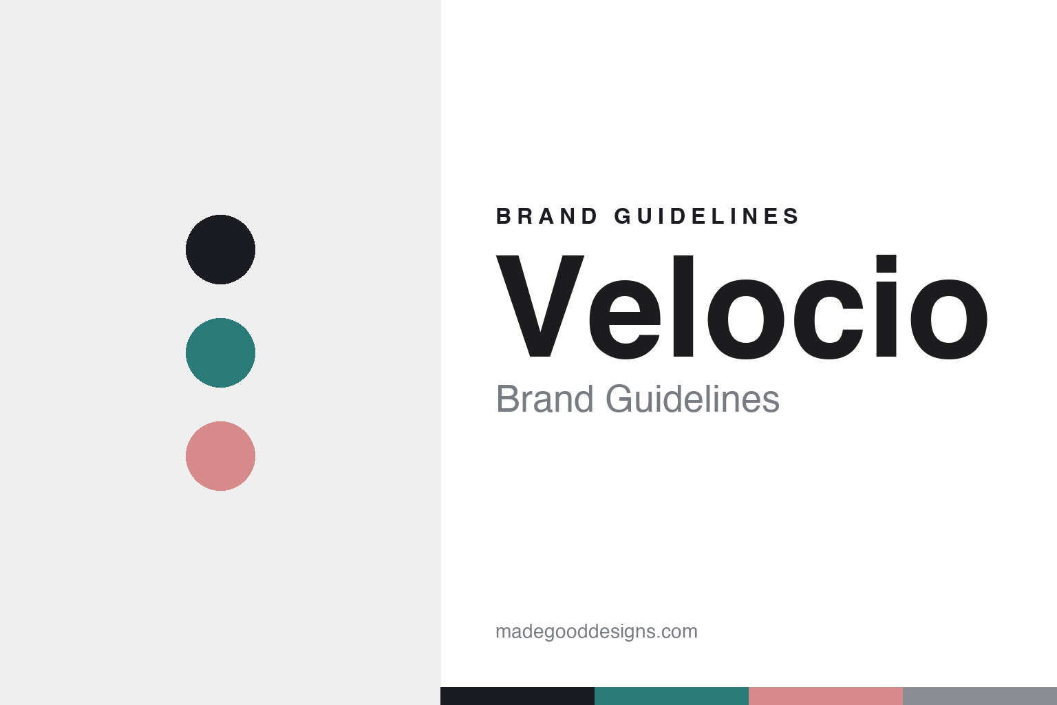
Velocio Brand Guidelines
A different way.
Aa
Two constants: a refined, technical palette and a clean geometric register. Abstract homage — not the Velocio wordmark or logo.
A different way
Velocio built premium cycling around equality.
Velocio is a lesson in a value as a brand. Founded in 2014 in the US (New England) — by, in its own words, “a cycling advocate and a designer” — the brand launched with a women’s collection first, and built a genuine gender-equality mission into its DNA: “we aren’t a women’s brand; we’re a let’s-look-at-this-differently brand.”
Its brand identity is premium, technical and considered — high-performance road and gravel kit anchored by its Signature Chamois and women-friendly FlyFree bib design, a substantive sustainability program, and the Unity Jersey — a social-cause fundraiser (since 2017) supporting mental-health partners like NAMI.
(Honest notes: the brand describes its founders as “a cycling advocate and a designer” rather than naming them, so we don’t hard-assert names; it’s US-based (New England). It’s independent-presenting and direct-to-consumer. There’s no official brand hex, so the tones here are an unofficial interpretation.)
Colour
Velocio lives in a refined, technical palette. Click a swatch to copy the hex.
Velocio’s identity is refined, technical and considered — an ink, a refined teal, a blush, a grey, and a snow. The palette pairs a refined teal with a considered blush on ink — the register of premium technical kit and an inclusive, thoughtful brand. It signals quality, equality and restraint rather than loud sport. The honest caveat: with no published brand hex, these tones are an original, unofficial interpretation, not first-party values.
The lesson is a refined, technical palette signals considered premium. Velocio’s world is a thoughtfully-engineered kit. For designers, it is a reminder that a refined teal with a considered blush reads as premium and inclusive — right for a brand built on equality and technical craft. The takeaways: use a refined, technical palette; keep it considered; and treat any single hex as unofficial — using ink for small text so the palette stays refined.
Typography
The register is a clean geometric — refined and modern.
Velocio’s identity carries a refined, modern, considered spirit — technical craft and an inclusive mission. A clean geometric sans captures the mood: it is precise and modern, the register of a premium, thoughtful brand. Set in a refined palette, the clean geometric feels refined and modern — exactly the personality Velocio carries. It is considered rather than loud, mirroring premium technical kit. (Velocio’s real wordmark is a trademark we describe but do not reproduce, and the exact brand typeface is not ours to use.) Because the mark is not ours to use, the honest description is “a clean geometric spirit,” shown here in a stand-in. The type behaves like the brand: refined, modern and considered.
Aa
A clean geometric spirit — refined and modern. (Specimen set in Outfit, a clean geometric STAND-IN; NOT the Velocio wordmark, which is a trademark.)
Equality as identity
Velocio stands for a different way.
Velocio is a lesson in making a value the identity. A refined palette, premium technical kit and a genuine gender-equality mission make “a different way” the whole brand — inclusive, considered, principled. The value is the differentiator. The differentiator is a refined, technical, equality-driven identity.
For designers and brand-builders, Velocio offers a clear takeaway: a genuine value can be a brand. The lessons: lead with a real principle (equality — women’s kit first, not an afterthought); back it with craft (Signature Chamois, FlyFree); and give back (the Unity Jersey). It is also a reminder to stay accurate: the founders aren’t named on-site, it’s US New England, and the palette here is an unofficial interpretation. Velocio made a value the brand — proof that a principle can be the difference.
Explore & save
Keep Velocio’s identity on hand — save it to a board in the Made Good inspiration library.
Velocio identity set
Pin the refined technical palette and the clean-geometric register to your own board.


