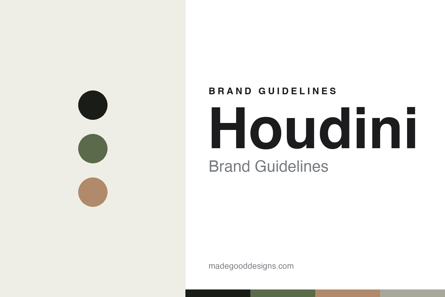
Houdini Brand Guidelines
Do more with less.
Aa
Two constants: a muted, natural palette and a minimal sans register. Abstract homage — not the Houdini wordmark or logo.
Do more with less
Houdini is a Swedish circular-design pioneer.
Houdini is a lesson in sustainability as the whole design brief. Founded in 1993 by Lotta Giornofelice — a climbing and ski guide — in Stockholm, Sweden, the independent, founder-owned brand set out to make outdoor apparel that does “more with less.”
Its brand identity is minimalist, Scandinavian and circular — a deliberately tight, multifunctional range designed for longevity. It pioneered mono-material (recyclable) design, compostable merino base layers, and a Repair/Rental/Resale system, went PFAS-free in 2018, and runs a distinctive Planetary Boundaries Assessment of its own business.
(Honest notes: Houdini is genuinely founder-owned — Eva Karlsson is its long-time CEO, not its founder or owner. It is not a B Corp and not a Fair Wear member (common mix-ups). It uses bluesign-approved fabrics rather than being a “System Partner,” and its “100% sustainable fabrics” is an inclusive claim, not “100% circular.” And there’s no official brand hex, so the tones here are an unofficial interpretation.)
Colour
Houdini lives in a muted, natural palette. Click a swatch to copy the hex.
Houdini’s identity is muted, natural and minimalist — an ink, a sage, a clay, a stone, and a bone. The palette leans on quiet, natural tones — a sage green, a clay — the register of a minimalist, nature-first brand. It signals restraint, sustainability and calm rather than loud performance. The honest caveat: with no published brand hex, these tones are an original, unofficial interpretation, not first-party values.
The lesson is muted, natural tones signal minimalist sustainability. Houdini’s world is a small, considered wardrobe. For designers, it is a reminder that sage and clay read as natural and restrained — right for a brand built on doing more with less. The takeaways: use quiet, natural tones; keep the range and palette tight; and treat any single hex as unofficial — using ink for small text so the palette stays calm.
Typography
The register is a minimal sans — clean and restrained.
Houdini’s identity carries a minimal, restrained, natural spirit — circular design and calm. A minimal sans captures the mood: it is clean and quiet, the register of a nature-first, minimalist brand. Set in a muted palette, the minimal sans feels clean and restrained — exactly the personality Houdini carries. It is quiet rather than loud, mirroring a tight, considered range. (Houdini’s real lowercase wordmark is a trademark we describe but do not reproduce, and the exact brand typeface is not ours to use.) Because the mark is not ours to use, the honest description is “a minimal sans spirit,” shown here in a stand-in. The type behaves like the brand: minimal, restrained and natural.
Aa
A minimal sans spirit — clean and restrained. (Specimen set in Hanken Grotesk, a minimal sans STAND-IN; NOT the Houdini wordmark, which is a trademark.)
Circularity as identity
Houdini stands for circular, minimalist design.
Houdini is a lesson in making circularity the identity. A muted palette, a tight multifunctional range and real circular programs make sustainability the whole brand — minimalist, natural, principled. The circularity is the differentiator. The differentiator is a minimalist, circular, sustainability-led identity.
For designers and brand-builders, Houdini offers a clear takeaway: sustainability can be the design brief. The lessons: shrink the range (do more with less); design for end-of-life (mono-material, compostable); and prove it (PFAS-free, Planetary Boundaries). It is also a reminder to stay accurate: it’s founder-owned (Karlsson is CEO), it’s not a B Corp, and the palette here is an unofficial interpretation. Houdini made circularity the brand — proof that sustainability can be the difference.
Explore & save
Keep Houdini’s identity on hand — save it to a board in the Made Good inspiration library.
Houdini identity set
Pin the muted natural palette and the minimal-sans register to your own board.


