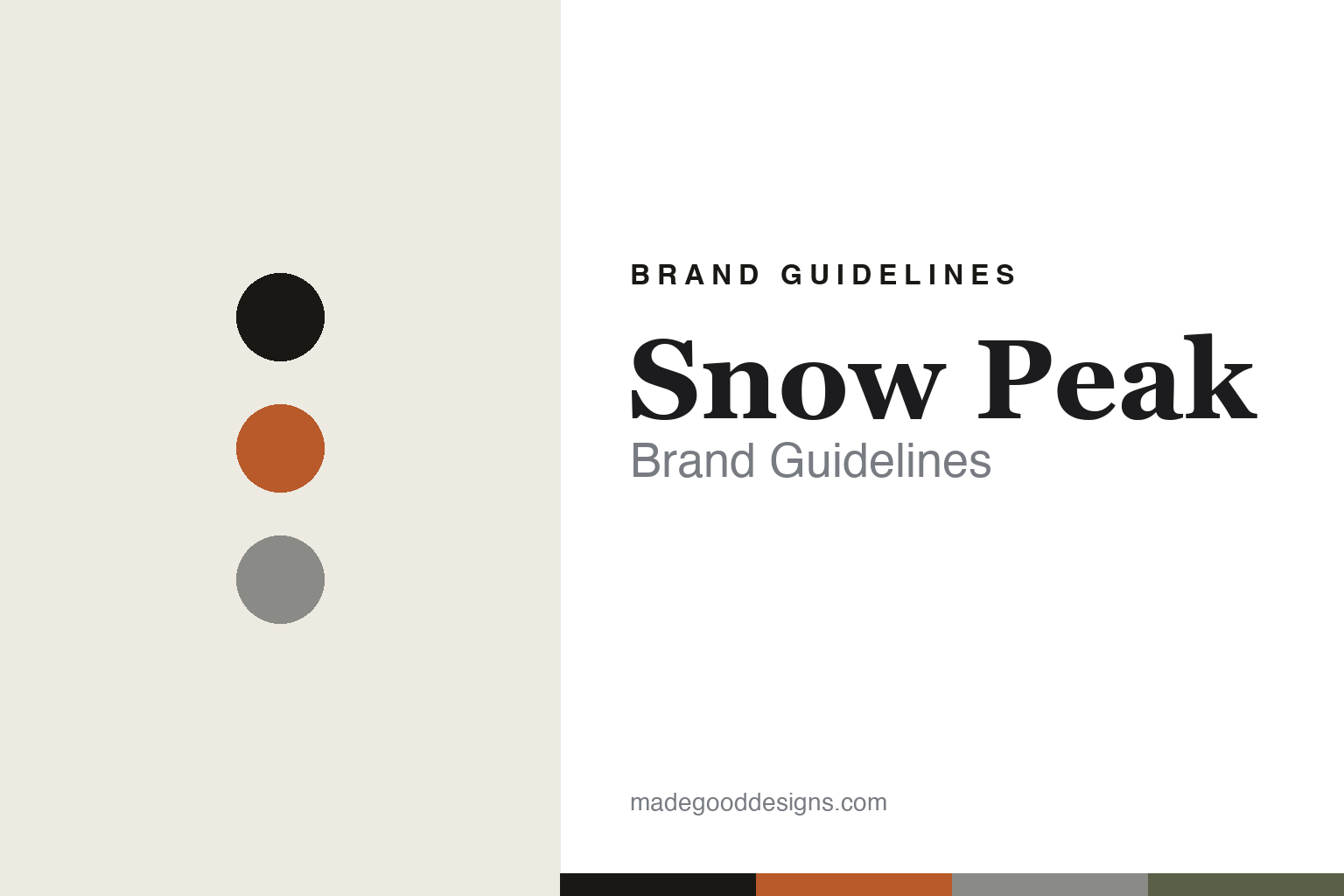
Snow Peak Brand Guidelines
Field play.
Aa
Two constants: an ember-and-charcoal palette and a craft serif register. Abstract homage — not the Snow Peak wordmark or logo.
Field play
Snow Peak brings Japanese craft to time outdoors.
Snow Peak is a lesson in craftsmanship as the brand. Founded in 1958 by Yukio Yamai as a metal-hardware forge in Sanjō, Niigata — Japan’s famous metalworking region — it took the “Snow Peak” name in 1963 (after Mount Tanigawa) and grew from mountaineering hardware into premium camping and outdoor lifestyle.
Its brand identity is premium, crafted and lifestyle-led — heirloom-quality gear built on the philosophy of noasobi (“field play”). Its signatures are precision titanium cookware and single-wall mugs, GigaPower stoves, the IGT modular camp kitchen and Takibi fire pits, plus an apparel line and experiences like the Takibi restaurant and Campfield campground.
(Honest notes: Snow Peak was listed on the Tokyo Stock Exchange but was taken private in 2024 via a founder-backed management buyout with Bain Capital — so it isn’t publicly traded now. It’s led by Tohru Yamai, the founder’s son. And there’s no official brand hex, so the tones here are an unofficial interpretation.)
Colour
Snow Peak lives in an ember-and-charcoal palette. Click a swatch to copy the hex.
Snow Peak’s identity is crafted, warm and premium — a charcoal, an ember, a titanium, a moss, and an ash. The palette pairs a warm ember with charcoal — the register of a campfire, titanium and Japanese craft. It signals warmth, craftsmanship and time outdoors rather than technical flash. The honest caveat: with no published brand hex, these tones are an original, unofficial interpretation, not first-party values.
The lesson is ember and charcoal signal craft and the campfire. Snow Peak’s world is a fire pit and a titanium mug. For designers, it is a reminder that a warm ember on charcoal reads as crafted and inviting — right for a brand built on field play. The takeaways: anchor with charcoal; add a warm ember; and treat any single hex as unofficial — using charcoal for small text so the ember stays warm.
Typography
The register is a craft serif — refined and considered.
Snow Peak’s identity carries a crafted, refined, considered spirit — Japanese metalwork and heirloom quality. A craft serif captures the mood: it is refined and considered, the register of a premium, precision-made brand. Set in an ember-and-charcoal palette, the craft serif feels refined and considered — exactly the personality Snow Peak carries. It is elegant rather than loud, mirroring precision craft. (Snow Peak’s real wordmark is a trademark we describe but do not reproduce, and the exact brand typeface is not ours to use.) Because the mark is not ours to use, the honest description is “a craft serif spirit,” shown here in a stand-in. The type behaves like the brand: crafted, refined and considered.
Aa
A craft serif spirit — refined and considered. (Specimen set in Shippori Mincho, a craft serif STAND-IN; NOT the Snow Peak wordmark, which is a trademark.)
Craft as identity
Snow Peak stands for Japanese craftsmanship.
Snow Peak is a lesson in making craft the identity. An ember-and-charcoal palette, precision titanium and a “field play” philosophy make Japanese craftsmanship the whole brand — heirloom, refined, lifestyle-led. The craft is the differentiator. The differentiator is a crafted, premium, Japanese identity.
For designers and brand-builders, Snow Peak offers a clear takeaway: craftsmanship can be a brand. The lessons: build from a real skill (Sanjō metalwork); design for a lifetime (heirloom quality); and give it a philosophy (noasobi). It is also a reminder to stay accurate: it’s privately held since the 2024 Bain buyout (not publicly traded), led by Tohru Yamai, and the palette here is an unofficial interpretation. Snow Peak made craft the brand — proof that skill can be the difference.
Explore & save
Keep Snow Peak’s identity on hand — save it to a board in the Made Good inspiration library.
Snow Peak identity set
Pin the ember-and-charcoal palette and the craft-serif register to your own board.


