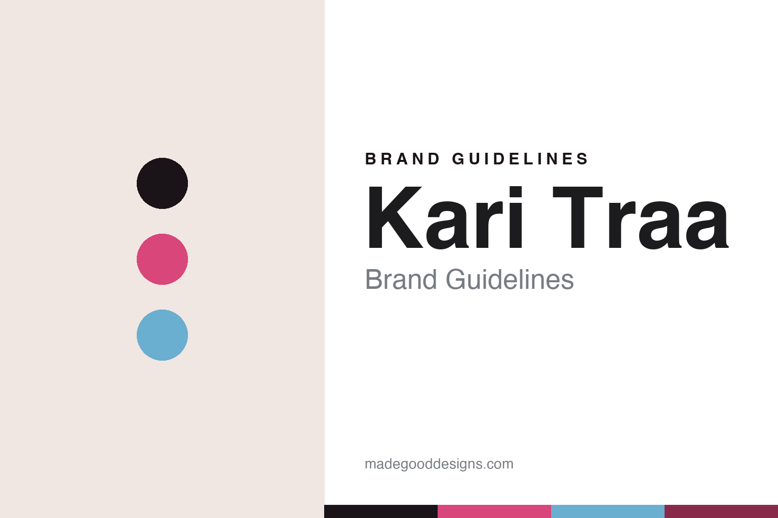
Kari Traa Brand Guidelines
For women, by women.
Aa
Two constants: a rose palette and a friendly geometric register. Abstract homage — not the Kari Traa wordmark or logo.
For women, by women
Kari Traa makes outdoor and base-layer kit for women, by women.
Kari Traa is a lesson in a clear audience as the identity. Founded in 2002 by Kari Traa — a Norwegian Olympic moguls skier (gold in 2002, silver 2006, bronze 1998) — and rooted in Voss, Norway, the brand makes outdoor, ski and training apparel for women.
Its brand identity is women-first, colourful and pattern-forward — “a women’s outdoor active brand, born in the Norwegian mountains,” under the tagline “For Women. By Women.” Merino base layers are its core, in distinctive feminine, colourful prints (its signature “Rose” pattern) — a deliberate contrast to the unisex-black norm of technical outerwear.
(Honest notes: Kari Traa the person is the founder and namesake, but no longer the owner-operator — the brand is owned by the Norwegian house Active Brands (backed by private equity), alongside Sweet Protection and Johaug. She won three Olympic medals — one of each colour — not three golds. And there’s no official brand hex, so the tones here are an unofficial interpretation.)
Colour
Kari Traa lives in a rose palette. Click a swatch to copy the hex.
Kari Traa’s identity is feminine, colourful and warm — an ink, a rose, a sky, a berry, and a cream. The palette leads with a bold rose and a sky blue — the register of colourful, pattern-forward women’s kit. It signals femininity, colour and individuality rather than the unisex black of most technical wear. The honest caveat: with no published brand hex, these tones are an original, unofficial interpretation, not first-party values.
The lesson is a bold rose signals a women-first brand. Kari Traa’s world is a colourful base layer on a mountain. For designers, it is a reminder that a bold rose with a sky blue reads as feminine and distinctive — right for a “for women, by women” brand. The takeaways: lead with colour; embrace pattern; and treat any single hex as unofficial — using ink for small text so the rose stays bold.
Typography
The register is a friendly geometric — warm and distinctive.
Kari Traa’s identity carries a warm, feminine, distinctive spirit — colour, pattern and a women-first mission. A friendly geometric sans captures the mood: it is warm and approachable, the register of a colourful, women-first brand. Set in a rose palette, the friendly geometric feels warm and distinctive — exactly the personality Kari Traa carries. It is approachable rather than austere, mirroring colourful kit. (Kari Traa’s real wordmark is a trademark we describe but do not reproduce, and the exact brand typeface is not ours to use.) Because the mark is not ours to use, the honest description is “a friendly geometric spirit,” shown here in a stand-in. The type behaves like the brand: warm, feminine and distinctive.
Aa
A friendly geometric spirit — warm and distinctive. (Specimen set in Poppins, a friendly geometric STAND-IN; NOT the Kari Traa wordmark, which is a trademark.)
Audience as identity
Kari Traa stands for women-first outdoor design.
Kari Traa is a lesson in making an audience the identity. A rose palette, colourful patterns and a women-first mission make “for women, by women” the whole brand — feminine, colourful, distinctive. The audience is the differentiator. The differentiator is a women-first, colourful, pattern-forward identity.
For designers and brand-builders, Kari Traa offers a clear takeaway: a clear audience can be a brand. The lessons: pick who you serve (women); design differently for them (colour, pattern, fit); and back it with a real founder story (an Olympic skier). It is also a reminder to stay accurate: it’s owned by Active Brands (not independent), Kari Traa won three medals not three golds, and the palette here is an unofficial interpretation. Kari Traa made its audience the brand — proof that a clear focus can be the difference.
Explore & save
Keep Kari Traa’s identity on hand — save it to a board in the Made Good inspiration library.
Kari Traa identity set
Pin the rose palette and the friendly-geometric register to your own board.


