Peak Performance Brand Guidelines
Born in Åre.
Aa
Two constants: an alpine-navy palette and a clean geometric register. Abstract homage — not the Peak Performance wordmark or logo.
Born in Åre
Peak Performance is premium Scandinavian ski, born in a ski resort.
Peak Performance is a lesson in resort-born credibility. Founded in 1986 by three skiers — Stefan Engström, Peter Blom and Christer Mårtensson — in Åre, Sweden, the brand grew from freeride ski roots into a premium Scandinavian ski, outdoor and lifestyle label (with a golf line too).
Its brand identity is premium, Scandinavian and ski-bred — functional, minimalist design rooted in Nordic nature. It title-sponsors the Freeride World Tour, and its flagship is the Helium down jacket (the 2025 Helium Loop is a disassemblable, circular-design piece).
(Honest notes: Peak Performance is no longer independent — after years under Denmark’s IC Group, it was acquired by Amer Sports in 2018, so it now sits alongside Arc’teryx and Salomon under the Amer umbrella (an Anta-led group). Its HQ moved from Åre to Stockholm in 1999. And there’s no official brand hex, so the tones here are an unofficial interpretation.)
Colour
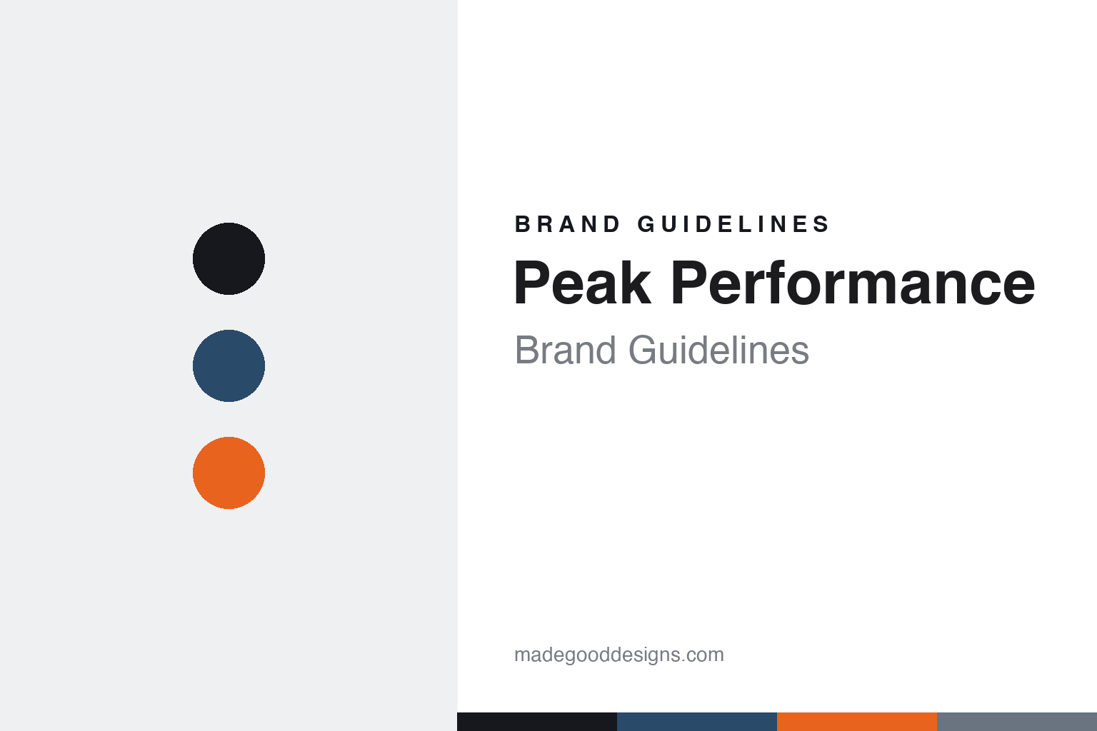
Peak Performance lives in an alpine-navy palette. Click a swatch to copy the hex.
Peak Performance’s identity is premium, Scandinavian and alpine — an ink, an alpine navy, a heritage orange, a steel, and a snow. The palette pairs a deep alpine navy with a heritage orange accent — the register of Nordic ski slopes and premium design. It signals the mountains, quality and Scandinavian restraint rather than loud sportswear. The honest caveat: with no published brand hex, these tones are an original, unofficial interpretation, not first-party values.
The lesson is alpine navy plus a warm accent signals premium Scandinavian ski. Peak Performance’s world is Åre in winter. For designers, it is a reminder that a deep navy with a warm accent reads as premium and alpine — right for a resort-born brand. The takeaways: anchor with ink; use an alpine navy; add a warm accent (an orange nod to its heritage); and treat any single hex as unofficial — using ink for small text so the palette stays premium.
Typography
The register is a clean geometric — premium and Scandinavian.
Peak Performance’s identity carries a premium, Scandinavian, ski spirit — Nordic nature and functional design. A clean geometric sans captures the mood: it is premium and modern, the register of a design-led Scandinavian brand. Set in an alpine-navy palette, the clean geometric feels premium and Scandinavian — exactly the personality Peak Performance carries. It is refined rather than loud, mirroring considered ski design. (Peak Performance’s real wordmark is a trademark we describe but do not reproduce, and the exact brand typeface is not ours to use.) Because the mark is not ours to use, the honest description is “a clean geometric spirit,” shown here in a stand-in. The type behaves like the brand: premium, Scandinavian and ski-bred.
Aa
A clean geometric spirit — premium and Scandinavian. (Specimen set in Manrope, a clean geometric STAND-IN; NOT the Peak Performance wordmark, which is a trademark.)
Resort heritage as identity
Peak Performance stands for premium Scandinavian ski.
Peak Performance is a lesson in making resort heritage the identity. An alpine-navy palette, a freeride origin and premium Scandinavian design make ski credibility the whole brand — premium, alpine, Nordic. The heritage is the differentiator. The differentiator is a premium, Scandinavian, ski identity.
For designers and brand-builders, Peak Performance offers a clear takeaway: a birthplace can be a brand. The lessons: own a real origin (Åre, freeride); design with restraint (Scandinavian minimalism); and prove it (Freeride World Tour, the Helium). It is also a reminder to stay accurate: it’s an Amer Sports brand (not independent), HQ is Stockholm (not Åre), and the palette here is an unofficial interpretation. Peak Performance made its birthplace the brand — proof that heritage can be the difference.
Explore & save
Keep Peak Performance’s identity on hand — save it to a board in the Made Good inspiration library.
Peak Performance identity set
Pin the alpine-navy palette and the clean-geometric register to your own board.