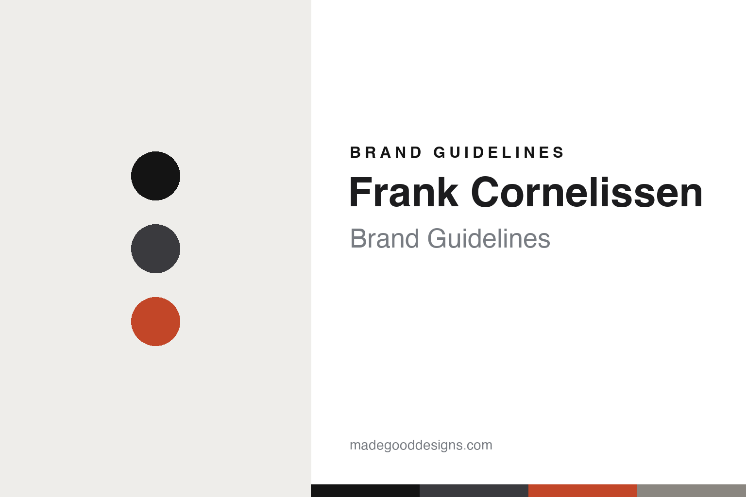
Frank Cornelissen Brand Guidelines
Etna austerity.
Aa
Two constants: a volcanic-black palette and an austere sans register. Abstract homage — not the Frank Cornelissen labels.
Etna austerity
Frank Cornelissen makes radical natural wine on Mount Etna.
Frank Cornelissen is a lesson in austerity as a signal of seriousness. Founded in 2001 by Frank Cornelissen — a Belgian former wine broker and alpinist — on the north slope of Mount Etna, Sicily (comune of Castiglione di Sicilia, cellar in Passopisciaro), it farms old, ungrafted, high-altitude vines with radical low intervention.
Its brand identity is austere, minimal and typographic — restrained labels that let the wine speak. Its cuvées are registered names: MunJebel® (from “Mongibello,” a Sicilian name for Etna), the top single-vineyard Magma®, and the entry Susucaru®, with premier crus labelled by two-letter contrada codes.
(Honest notes: the early “MunJebel N” edition-numbering was a legal workaround for table wine that couldn’t print a vintage — it ended around 2013 when vintage years returned; it wasn’t a permanent style. Contadino was discontinued after 2016. It’s an independent family business. And there’s no official brand hex, so the tones here are an unofficial interpretation.)
Colour
Frank Cornelissen lives in a volcanic-black palette. Click a swatch to copy the hex.
Cornelissen’s identity is austere, volcanic and restrained — a volcanic black, an ash, a magma, a stone, and a snow. The palette leans on black and ash with a single magma-lava accent — the register of Etna’s volcanic soils. It signals seriousness, place and restraint rather than decoration. The honest caveat: with no published brand hex, these tones are an original, unofficial interpretation, not first-party values.
The lesson is black and ash with a lava accent signals austere, volcanic seriousness. Cornelissen’s world is a black volcanic vineyard high on Etna. For designers, it is a reminder that a volcanic black with a single lava accent reads as austere and serious — right for a radical Etna estate. The takeaways: work in black and ash; add one lava accent; and treat any single hex as unofficial — using black for small text so the palette stays austere.
Typography
The register is an austere sans — restrained and serious.
Cornelissen’s identity carries an austere, restrained, serious spirit — minimalism and place. An austere sans captures the mood: it is spare and disciplined, the register of a wine that lets itself speak. Set in a volcanic-black palette, the austere sans feels restrained and serious — exactly the personality Cornelissen carries. It is disciplined rather than decorative, mirroring a minimalist label. (Cornelissen’s real labels are trademarks we describe but do not reproduce, and the exact typeface is not ours to use.) Because the labels are not ours to use, the honest description is “an austere sans spirit,” shown here in a stand-in. The type behaves like the brand: austere, restrained and serious.
Aa
An austere sans spirit — restrained and serious. (Specimen set in Chivo, an austere sans STAND-IN; NOT the Frank Cornelissen labels, which are trademarks.)
Restraint as identity
Frank Cornelissen stands for austere, place-first design.
Frank Cornelissen is a lesson in making restraint the identity. A volcanic-black palette, austere typography and place-driven names make minimalism the whole brand — serious, volcanic, restrained. The restraint is the differentiator. The differentiator is an austere, place-first, typographic identity.
For designers and brand-builders, Cornelissen offers a clear takeaway: less can signal more. The lessons: strip the label back (type, not decoration); root names in place (MunJebel from Etna, contrada codes); and let quiet packaging imply confidence (with modern authentication — an NFC chip in Magma from 2016, embossed cru bottles from 2022). It is also a reminder to stay accurate: it’s an independent family business, the MunJebel numbering was a legal device that ended around 2013, and the palette here is an unofficial interpretation. Cornelissen made restraint the brand — proof that less can be the difference.
Explore & save
Keep Frank Cornelissen’s identity on hand — save it to a board in the Made Good inspiration library.
Frank Cornelissen identity set
Pin the volcanic-black palette and the austere-sans register to your own board.


