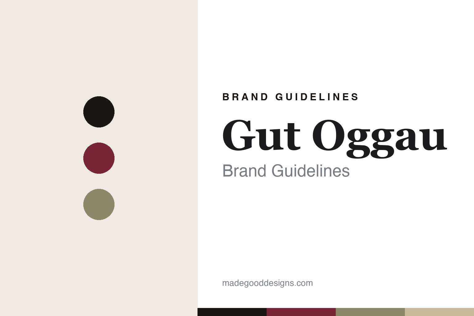
Gut Oggau Brand Guidelines
A family of wines.
Aa
Two constants: a burgundy palette and a classical serif register. Abstract homage — not the Gut Oggau labels or portraits.
A family of wines
Gut Oggau turns each wine into a member of one family.
Gut Oggau is a lesson in a label system as the whole brand. Founded in 2007 by Stephanie and Eduard Tscheppe, who revived an old estate in Oggau am Neusiedlersee, Burgenland, Austria, it farms biodynamically (Demeter-certified) and low-intervention.
Its brand identity is a hand-drawn family — every wine is personified as a fictional family member, each drawn as a black-ink line portrait with its own written personality. The range is a three-generation family tree: grandparents are the most serious, age-worthy wines; parents sit in the middle; children are the fresh, lighter bottlings — so the face tells you the wine’s character at a glance.
(Honest notes: the faces are fictitious — they encode each wine’s taste impression, not real ancestors. The original portrait identity was created by the agency Jung von Matt, which drew a face to match a personality brief for each wine. And there’s no official brand hex, so the tones here are an unofficial interpretation.)
Colour
Gut Oggau lives in a burgundy-and-ink palette. Click a swatch to copy the hex.
Gut Oggau’s identity is old-world, hand-drawn and warm — an ink, a burgundy, a sage, a portrait cream, and a bone. The palette pairs a deep burgundy with black ink on cream — the register of a monochrome portrait on old paper. It signals craft, character and biodynamic seriousness rather than modern gloss. The honest caveat: with no published brand hex, these tones are an original, unofficial interpretation, not first-party values.
The lesson is ink on cream with a wine burgundy signals a hand-drawn, old-world identity. Gut Oggau’s world is a gallery of ink portraits. For designers, it is a reminder that black ink on cream with a burgundy reads as characterful and crafted — right for a family of portrait labels. The takeaways: anchor with ink; work on a cream ground; add a wine burgundy; and treat any single hex as unofficial — using ink for small text so the palette stays classical.
Typography
The register is a classical serif — characterful and old-world.
Gut Oggau’s identity carries a classical, hand-drawn, characterful spirit — portraits and personalities. A classical serif captures the mood: it is old-world and expressive, the register of a portrait gallery. Set in a burgundy-and-ink palette, the classical serif feels characterful and old-world — exactly the personality Gut Oggau carries. It is human rather than clinical, mirroring hand-drawn faces. (Gut Oggau’s real portrait labels and typography are trademarks we describe but do not reproduce, and the exact brand typefaces are not ours to use.) Because the labels are not ours to use, the honest description is “a classical serif spirit,” shown here in a stand-in. The type behaves like the brand: classical, characterful and old-world.
Aa
A classical serif spirit — characterful and old-world. (Specimen set in Playfair Display, a classical serif STAND-IN; NOT Gut Oggau’s labels or lettering, which are trademarks.)
A family tree as identity
Gut Oggau stands for a label system you can read like a family.
Gut Oggau is a lesson in making a label system the identity. A burgundy-and-ink palette, hand-drawn portrait faces and a three-generation family tree make the label the whole brand — characterful, legible, unforgettable. The system is the differentiator. The differentiator is a portrait-family, hand-drawn, hierarchy-encoding identity.
For designers and brand-builders, Gut Oggau offers a clear takeaway: a system can be a story. The lessons: give each product a character (a face and a personality); encode the hierarchy visually (older face = more serious wine); and commit to one craft (hand-drawn ink). It is also a reminder to stay accurate: the faces are fictitious (not real ancestors), the originals are Jung von Matt’s work (later editions like Jaime Hayón’s are separate), and the palette here is an unofficial interpretation. Gut Oggau made a family tree the brand — proof that a system can be the difference.
Explore & save
Keep Gut Oggau’s identity on hand — save it to a board in the Made Good inspiration library.
Gut Oggau identity set
Pin the burgundy-and-ink palette and the classical-serif register to your own board.


