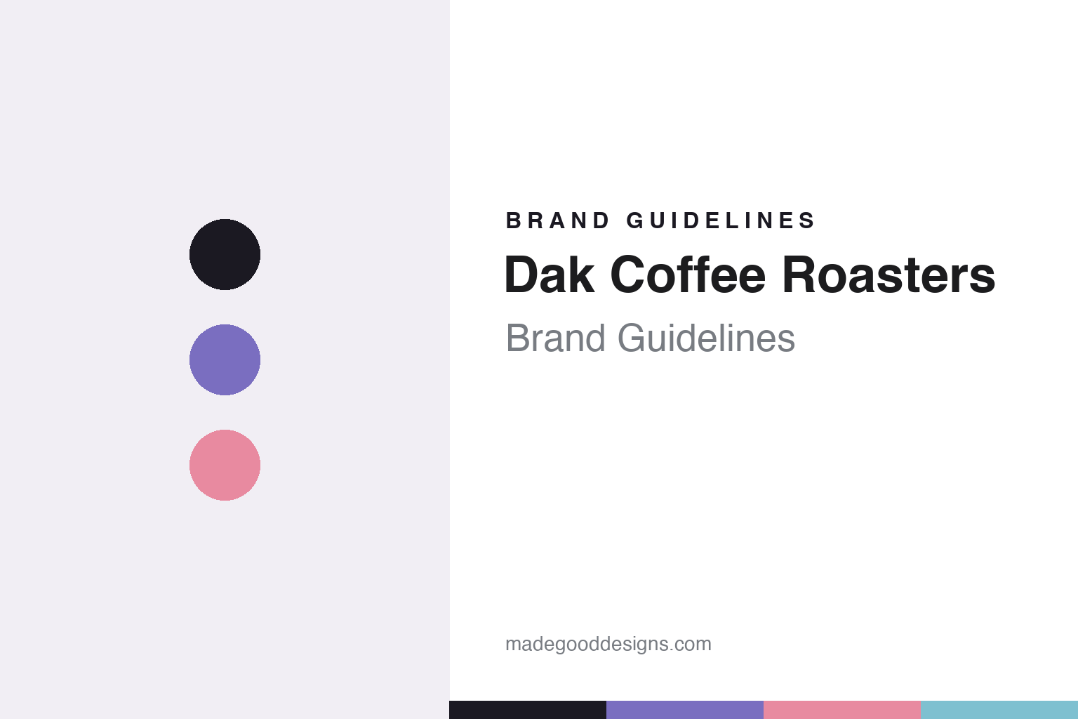
Dak Coffee Roasters Brand Guidelines
The illustrated face.
Aa
Two constants: a periwinkle-and-blush palette and a soft rounded register. Abstract homage — not the Dak packaging or illustrations.
The illustrated face
Dak’s identity is an illustrated, gender-neutral character.
Dak Coffee Roasters is a lesson in a character as a brand. Founded in 2019 by the Montreal-Canadian couple Louis-Philippe Boucher and Véronique Lagarde in Amsterdam, Dak is an online, export-driven roaster known as one of Europe’s most aesthetically-driven.
Its brand identity is an illustrated face. The logo and packaging hero is a distinctive, deliberately gender-neutral illustrated character — “man or woman? up to you” — drawn by the Montreal illustrator Valéry Lemay, whose soft, minimal style blurs art and design. What began as one founding illustration expanded into a series of limited-edition, per-release bag designs — bright, playful, pastel-and-saturated art objects that vary by coffee rather than sitting under one fixed label. Its Amsterdam showroom (interior by Barde vanVoltt) extends the warmth into space.
(Honest notes: the founders are Boucher and Lagarde — not the “Ghandour” name sometimes attached — and Dak was founded in 2019, not 2017. Valéry Lemay is the documented founding illustrator; who draws each current release isn’t always documented, so we don’t over-claim. And there’s no official brand hex, so the tones here are an unofficial interpretation.)
Colour
Dak lives in a periwinkle-and-blush palette. Click a swatch to copy the hex.
Dak’s identity is soft, playful and illustrated — an ink, a periwinkle, a blush, a sky, and a cream. The palette pairs a soft periwinkle with a blush and a sky — the register of gentle, pastel, character-led illustration. It signals warmth and play rather than austerity. The honest caveat: with no published brand hex, these tones are an original, unofficial interpretation, not first-party values.
The lesson is soft pastels signal an illustrated, friendly brand. Dak’s world is a collectible, character-led bag. For designers, it is a reminder that a periwinkle with a blush reads as gentle and playful — right for an illustration-forward roaster. The takeaways: build a soft, pastel set; let one character lead; vary the art per release; and treat any single hex as unofficial — using ink for small text so the illustration stays the hero.
Typography
The register is a soft rounded — gentle, playful, illustrated.
Dak’s identity carries a gentle, playful, illustrated spirit — a soft character and pastel art. A soft rounded face captures the mood: it is warm and friendly, the register of an illustration-led brand. Set in a periwinkle-and-blush palette, the soft rounded feels gentle and playful — exactly the personality Dak carries. It is warm rather than sharp, mirroring a soft illustrated bag. (Dak’s real packaging and Valéry Lemay’s illustrations are works we describe but do not reproduce, and the exact typeface is not ours to use.) Because they are not ours to use, the honest description is “a soft rounded spirit,” shown here in a stand-in. The type behaves like the brand: gentle, playful and illustrated.
Aa
A soft rounded spirit — gentle and illustrated. (Specimen set in Quicksand, a soft rounded STAND-IN; NOT the Dak packaging or illustrations.)
A character as identity
Dak stands for an illustrated face you recognise at a glance.
Dak Coffee Roasters is a lesson in making a character the identity. A periwinkle-and-blush palette, a soft rounded face and a gender-neutral illustrated character make the artwork the whole brand — gentle, playful, collectible. The character is the differentiator. The differentiator is an illustrated, per-release, art-object identity.
For designers and brand-builders, Dak offers a clear takeaway: a character can carry a brand. The lessons: commission a real illustrator (Valéry Lemay); make the character ownable and open (gender-neutral, “up to you”); and vary the art per release so bags become collectible. It is also a reminder to stay accurate: the founders are Boucher and Lagarde (founded 2019), the showroom interior is a separate studio’s work, and the palette here is an unofficial interpretation. Dak made a character the brand — proof that a face can be the difference.
Explore & save
Keep Dak Coffee Roasters’s identity on hand — save it to a board in the Made Good inspiration library.
Dak Coffee Roasters identity set
Pin the periwinkle-and-blush palette and the soft-rounded register to your own board.


