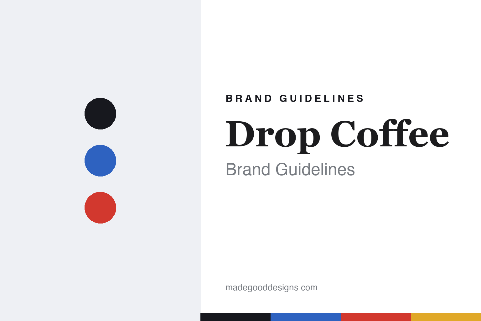
Drop Coffee Brand Guidelines
A box, not a bag.
Aa
Two constants: a cobalt-and-folk-red palette and a sign slab register. Abstract homage — not the Drop Coffee packaging.
A box, not a bag
Drop’s signature is a cardboard box, and a folk-art emblem.
Drop Coffee is a lesson in format as a statement. It opened as a café in 2009 in Södermalm, Stockholm, and began roasting around 2010 (production moved to Rosersberg in 2018), run by roaster Joanna Alm with husband and business partner Stephen Leighton (who joined in 2015) — a top-ranked, independent Nordic light roaster.
Its brand identity is a box, not a bag. Drop’s signature move is selling coffee in a rigid, printed cardboard box (with a valved inner bag) — praised back in 2013 precisely because no one else in Scandinavian supermarkets used a box; it stacks and reshelves neatly, made “for the consumer, not the industry.” The look is bright, clean Scandinavian minimalism — flat colour per coffee on white — with hand-lettering, and a 2024 rebrand by Simon Ålander introduced a new emblem: an abstract coffee plant in Swedish folk-art “kurbits” style with wings and a heart.
(Honest notes: it opened as a café in 2009 and began roasting around 2010; Stephen Leighton joined in 2015 (Joanna is the roaster). It’s not cartoon-heavy — the folk art lives in the logo. And there’s no official brand hex, so the tones here are an unofficial interpretation.)
Colour
Drop Coffee lives in a cobalt-and-folk-red palette. Click a swatch to copy the hex.
Drop’s identity is bright, clean and Swedish — an ink, a cobalt, a folk red, a gold, and a white. The palette pairs a bright cobalt with a folk red — the register of clean Scandinavian minimalism and Dalarna folk art. It signals clarity and craft rather than austerity or noise. The honest caveat: with no published brand hex, these tones are an original, unofficial interpretation, not first-party values.
The lesson is a bright cobalt with a folk red signals a clean, folk-rooted brand. Drop’s world is a colourful box on a white shelf and a folk-art emblem. For designers, it is a reminder that bright flat colour on white, with a folk accent, reads as clean and Swedish — right for a consumer-first roaster. The takeaways: let colour code each coffee; keep the ground white and clean; add a folk-art mark for warmth; and treat any single hex as unofficial — using ink for small text so the system stays crisp.
Typography
The register is a sign slab — hand-lettered, folk, characterful.
Drop’s identity carries a hand-lettered, folk, characterful spirit — old Swedish sign-painting and Dalarna craft. A sign slab captures the mood: it is sturdy and warm, the register of hand-painted factory and glassworks lettering. Set in a cobalt-and-folk-red palette, the sign slab feels hand-lettered and folk — exactly the personality Drop carries. It is characterful rather than clinical, mirroring a hand-lettered wordmark. (Drop’s real packaging and Simon Ålander’s emblem are works we describe but do not reproduce, and the exact lettering is not ours to use.) Because they are not ours to use, the honest description is “a sign slab spirit,” shown here in a stand-in. The type behaves like the brand: hand-lettered, folk and characterful.
Aa
A sign slab spirit — hand-lettered and folk. (Specimen set in Zilla Slab, a sign slab STAND-IN; NOT the Drop Coffee packaging.)
Format as identity
Drop stands for a box that changed how coffee sits on a shelf.
Drop Coffee is a lesson in making format the identity. A cobalt-and-folk-red palette, a sign slab and a cardboard box make the package itself the whole brand — clean, consumer-first, unmistakable. The box is the differentiator. The differentiator is a format-led, folk-rooted, Swedish identity.
For designers and brand-builders, Drop offers a clear takeaway: the format can be the design. The lessons: rethink the container (a box, not a bag, for the consumer); code each coffee by colour on a clean white ground; and root the mark in real craft (Swedish folk-art kurbits, by Simon Ålander). It is also a reminder to stay accurate: it opened as a café in 2009 (roasting around 2010), Joanna Alm is the roaster, and the palette here is an unofficial interpretation. Drop made the format the brand — proof that a box can be the difference.
Explore & save
Keep Drop Coffee’s identity on hand — save it to a board in the Made Good inspiration library.
Drop Coffee identity set
Pin the cobalt-and-folk-red palette and the sign-slab register to your own board.


