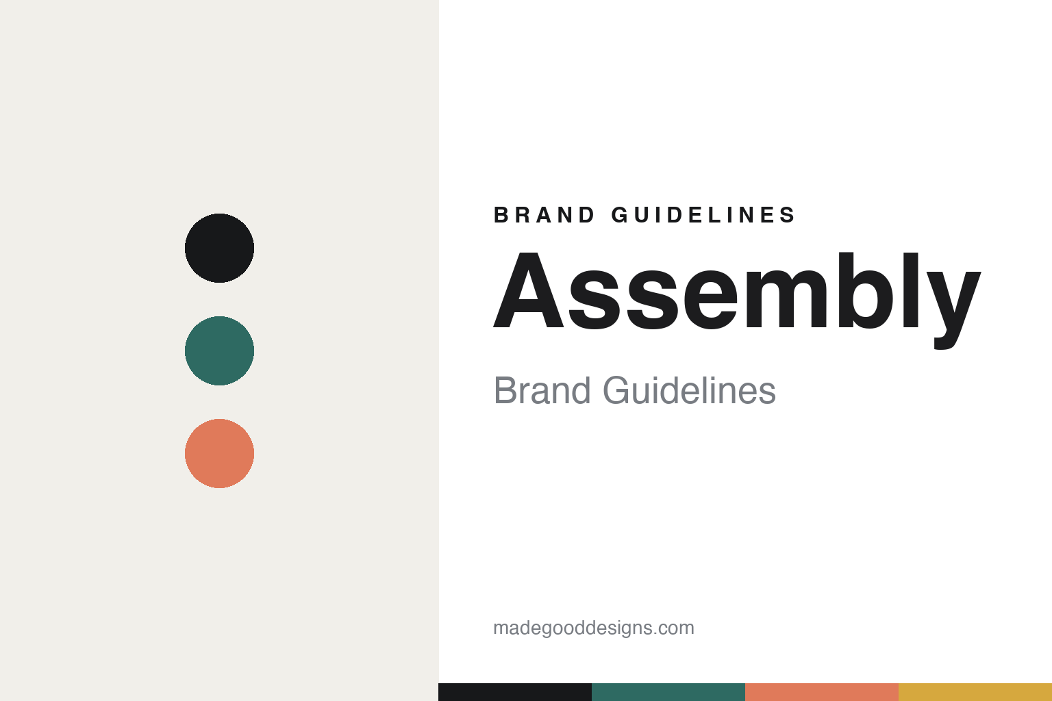
Assembly Brand Guidelines
The illustrated flavour.
Aa
Two constants: a teal-and-coral palette and a refined sans register. Abstract homage — not the Assembly packaging or illustrations.
The illustrated flavour
Assembly draws its flavour notes, and ships them in a box.
Assembly is a lesson in illustration doing the talking. Founded in 2015 in Brixton, London (in a converted 19th-century fire station) by Nick Mabey and Michael Cleland, it is a B-Corp roaster with both wholesale and direct-to-home channels.
Its brand identity is luxury-minimal, box-led — not the bright colour-blocking it’s sometimes assumed to have. The signature is a bespoke dyed, compostable box (with a recyclable inner bag), meant to feel “closer to luxury goods than another craft bag.” And instead of writing tasting notes, Assembly illustrates the flavour — testing found a visual medium engaged customers better and travelled across its multi-country markets. Colour and imagery vary per coffee through these illustrations. The front carries only name, origin and process; the wordmark sits vertically. The packaging and its flavour illustrations are by designer Max Spencer.
(Honest notes: Assembly is independently branded but not standalone — it sits under parent Full Steam Espresso, alongside sister roaster Volcano Coffee Works (it wasn’t “acquired” — it was spun up from within). Its look is a luxury box plus illustrated flavour notes, not flat colour-blocks. The designer is Max Spencer (an individual, not a studio). And there’s no official brand hex, so the tones here are an unofficial interpretation.)
Colour
Assembly lives in a teal-and-coral palette. Click a swatch to copy the hex.
Assembly’s identity is premium, restrained and warm — an ink, a teal, a coral, a mustard, and a chalk. The palette pairs a refined dyed-box teal with warm illustration accents — the register of a luxury object whose colour arrives through artwork. It signals craft and premium restraint rather than loud graphics. The honest caveat: with no published brand hex, these tones are an original, unofficial interpretation, not first-party values.
The lesson is a refined base plus warm illustration accents signals premium restraint. Assembly’s world is a dyed box with a drawn flavour scene. For designers, it is a reminder that a restrained ground with illustration-borne colour reads as luxury and considered — right for a box-led identity. The takeaways: design the object, not just the label (the dyed box); let illustration carry flavour and colour; keep the front minimal; and treat any single hex as unofficial — using ink for small text so the box reads premium.
Typography
The register is a refined sans — premium, quiet, considered.
Assembly’s identity carries a premium, quiet, considered spirit — a luxury box and drawn flavours. A refined sans captures the mood: it is clean and understated, the register of a considered, upmarket brand. Set in a teal-and-coral palette, the refined sans feels premium and quiet — exactly the personality Assembly carries. It is restrained rather than loud, mirroring a luxury box with a vertical wordmark. (Assembly’s real packaging and Max Spencer’s illustrations are works we describe but do not reproduce, and the exact typeface is not ours to use.) Because they are not ours to use, the honest description is “a refined sans spirit,” shown here in a stand-in. The type behaves like the brand: premium, quiet and considered.
Aa
A refined sans spirit — premium and quiet. (Specimen set in Manrope, a refined sans STAND-IN; NOT the Assembly packaging.)
Illustration as identity
Assembly stands for a box you keep and a flavour you can see.
Assembly is a lesson in making illustration the identity. A teal-and-coral palette, a refined sans and a luxury box make drawn flavour the whole brand — premium, considered, distinctive. The illustration is the differentiator. The differentiator is a luxury-box, illustrated-flavour identity.
For designers and brand-builders, Assembly offers a clear takeaway: a picture can beat a tasting note. The lessons: design the container as a luxury object (the dyed box); illustrate flavour so it crosses languages; and keep the front information minimal with a vertical wordmark. It is also a reminder to stay accurate: Assembly sits under Full Steam Espresso (with Volcano), the designer is Max Spencer, and the palette here is an unofficial interpretation. Assembly made illustration the brand — proof that a drawn flavour can be the difference.
Explore & save
Keep Assembly’s identity on hand — save it to a board in the Made Good inspiration library.
Assembly identity set
Pin the teal-and-coral palette and the refined-sans register to your own board.


