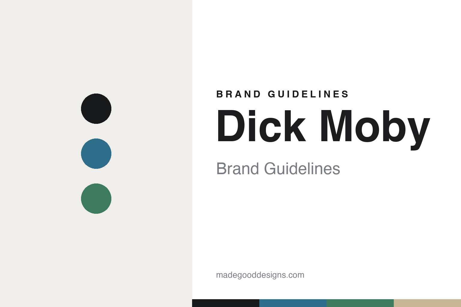
Dick Moby Brand Guidelines
Waste nothing.
Aa
Two constants: an ocean-and-kelp palette and a clean sans register. Abstract homage — not the Dick Moby identity.
Waste nothing
Dick Moby turned ocean plastic into its whole story.
Dick Moby is a lesson in a mission made material. Designed in Amsterdam (and handmade in Italy) by founders Tim Holland and Robbert Wefers Bettink — surfers who bonded over the ocean — it began with a 2012 surf trip and launched around 2014.
Its identity is a sustainability material story. Frames come in three materials: recycled acetate, a biodegradable acetate branded “M49®” (plant-based plasticizers; certified biodegradable to ISO 14855, composting in about 115 days), and recycled stainless steel (from supplier Sandvik). The name plays on Moby Dick — the whale, the ocean, and a mission against plastic pollution — carried by taglines like “Waste nothing. See everything.” The frames themselves are classic, timeless minimalist shapes.
(Honest notes: the founders are Tim Holland and Robbert Wefers Bettink — “Tim” is one person — with a 2012 origin trip and a ~2014 launch. The materials are recycled acetate, “M49” bio-acetate and recycled Sandvik steel. The identity is in-house — no external studio is documented — and there’s no official brand hex, so these tones are an unofficial interpretation.)
Colour
Dick Moby lives in an ocean-and-kelp palette. Click a swatch to copy the hex.
Dick Moby’s identity is clean, marine and purposeful — an ink, an ocean blue, a kelp green, a sand, and a chalk. The palette reads like the sea — ocean blue and kelp green over sand — the register of an ocean-mission, sustainable brand. It signals purpose and clarity rather than colour for its own sake. The honest caveat: with no published brand hex, these tones are an original, unofficial interpretation, not first-party values.
The lesson is ocean blue and kelp green signal a purposeful, marine brand. Dick Moby’s world is the sea it’s trying to protect. For designers, it is a reminder that a marine palette reads as clean and mission-driven — right for an anti-plastic eyewear brand. The takeaways: source the palette from the mission (the ocean); keep the shapes and type clean; let the materials carry the story; and treat any single hex as unofficial.
Typography
The register is a clean sans — clear, marine, purposeful.
Dick Moby’s identity carries a clear, marine, purposeful spirit — a mission and clean shapes. A clean sans captures the mood: it is simple and modern, the register of a purpose-driven brand. Set in an ocean-and-kelp palette, the clean sans feels clear and marine — exactly the personality Dick Moby carries. It is purposeful rather than decorative, mirroring timeless minimalist frames. (Dick Moby’s real wordmark is a work we describe but do not reproduce, and the exact typeface is not ours to use.) Because it is not ours to use, the honest description is “a clean sans spirit,” shown here in a stand-in. The type behaves like the brand: clear, marine and purposeful.
Aa
A clean sans spirit — clear and purposeful. (Specimen set in Sen, a clean sans STAND-IN; NOT the Dick Moby wordmark.)
Mission as identity
Dick Moby stands for eyewear against waste.
Dick Moby is a lesson in making a mission the identity. An ocean-and-kelp palette, a clean sans and recycled materials make anti-waste purpose the whole brand — clean, marine, meaningful. The mission is the differentiator. The differentiator is a recycled-and-bio, ocean identity.
For designers and brand-builders, Dick Moby offers a clear takeaway: make the mission the material. The lessons: build from recycled and biodegradable substances (M49 acetate, Sandvik steel); name the brand from the story (Moby Dick, the ocean); keep the shapes timeless; and say it plainly (“Waste nothing”). It is also a reminder to stay accurate: it’s an Amsterdam-designed, Italian-made brand from two surfers, and the palette here is an unofficial interpretation. Dick Moby made a mission the brand — proof that purpose can be the difference.
Explore & save
Keep Dick Moby’s identity on hand — save it to a board in the Made Good inspiration library.
Dick Moby identity set
Pin the ocean-and-kelp palette and the clean-sans register to your own board.


