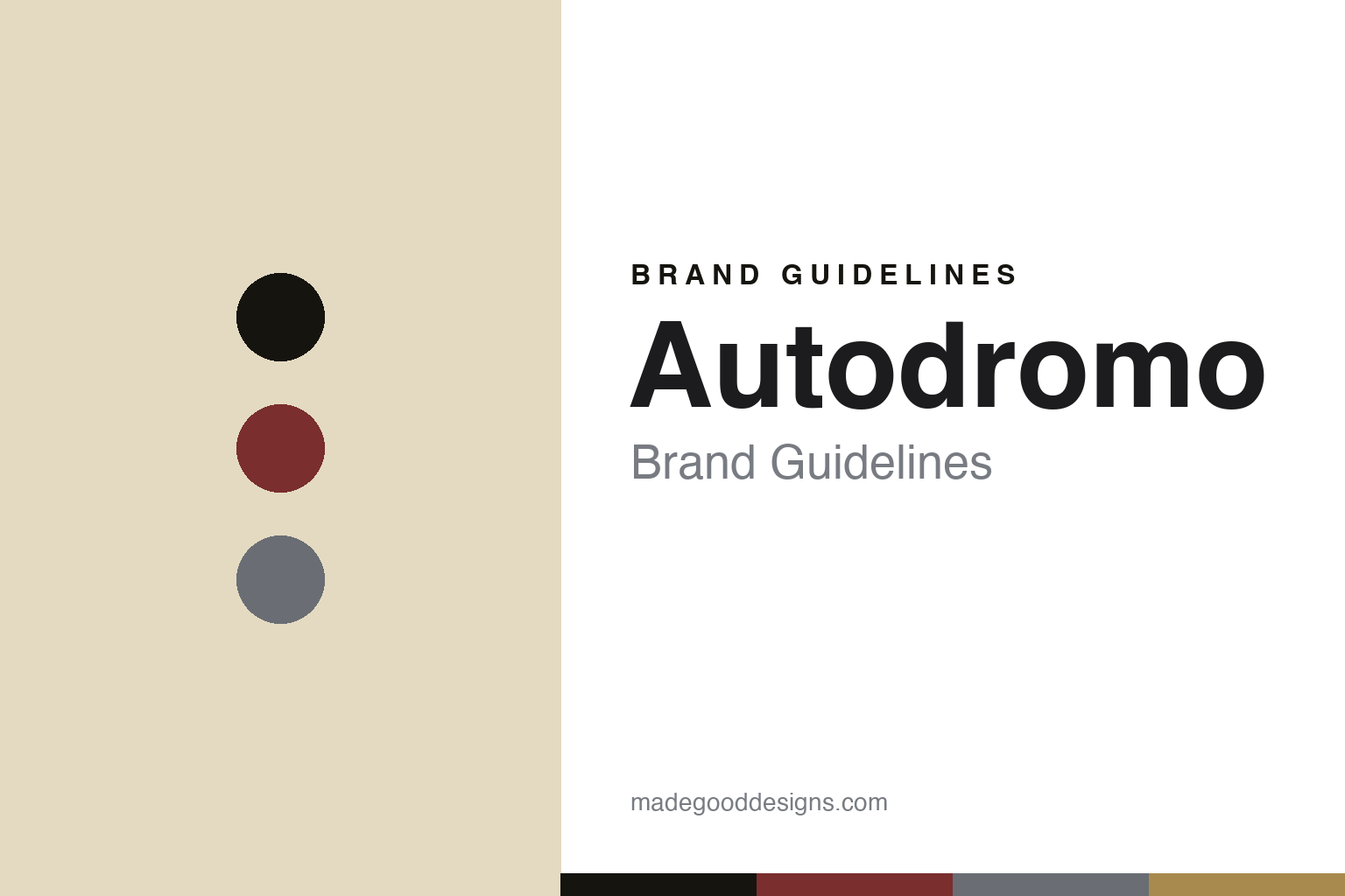
Autodromo Brand Guidelines
The gauge dial.
Aa
Two constants: an oxblood-and-brass palette and a gauge sans register. Abstract homage — not the Autodromo dials.
The gauge dial
Autodromo puts a dashboard on the wrist.
Autodromo is a lesson in a single, focused idea. Founded in 2011 by industrial designer Bradley Price — inspired by the tachometer typography on his Alfa Romeo GTV6 — it is an independent New York microbrand, designed almost entirely by one person.
Its identity is the vintage-automotive gauge dial: dashboard tachometers, speedometers and pit-lane timing, rendered with clean legibility over ornament. Each model is its own little design world — the Monoposto (1950s single-seater GP gauges), the Intereuropa (a multi-layer dial with a K1-glass chapter ring and 3D 1950s-gauge numerals), the Prototipo (a late-60s racing chronograph) and the Group B (mid-80s rally). Autodromo has even been the official Ford GT watch partner.
(Honest notes: the founder is Bradley Price (2011), an industrial designer — we don’t assert he attended RISD. The design is in-house by Price (no external studio), and there’s no official brand hex, so these tones are an unofficial interpretation.)
Colour
Autodromo lives in an oxblood-and-brass palette. Click a swatch to copy the hex.
Autodromo’s identity is vintage, automotive and warm — an ink, an oxblood, a steel, a brass, and a cream. The palette reads like an old instrument panel — oxblood and brass over gauge cream — the register of a dashboard gauge. It signals speed and heritage rather than gloss. The honest caveat: with no published brand hex, these tones are an original, unofficial interpretation, not first-party values.
The lesson is oxblood and brass over gauge cream signal a vintage instrument panel. Autodromo’s world is a dashboard, worn. For designers, it is a reminder that a palette sourced from a real object (the gauge) reads as authentic and focused — right for an automotive brand. The takeaways: source the palette from the idea (gauges); keep it warm and instrument-like; let each model be its own world; and treat any single hex as unofficial.
Typography
The register is a gauge sans — legible, technical, automotive.
Autodromo’s identity carries a legible, technical, automotive spirit — dashboard gauges and clean numerals. A gauge sans captures the mood: it is precise and utilitarian, the register of an instrument panel. Set in an oxblood-and-brass palette, the gauge sans feels legible and technical — exactly the personality Autodromo carries. It is automotive rather than decorative, mirroring tachometer typography. (Autodromo’s real dials are works we describe but do not reproduce, and the exact typeface is not ours to use.) Because it is not ours to use, the honest description is “a gauge sans spirit,” shown here in a stand-in. The type behaves like the brand: legible, technical and automotive.
Aa
A gauge sans spirit — legible and technical. (Specimen set in Saira, a technical sans STAND-IN; NOT the Autodromo dials.)
An idea as identity
Autodromo stands for the dashboard, on the wrist.
Autodromo is a lesson in making one idea the identity. An oxblood-and-brass palette, a gauge sans and dashboard dials make the automotive gauge the whole brand — vintage, focused, distinctive. The gauge is the differentiator. The differentiator is a single-idea, gauge-dial identity.
For designers and brand-builders, Autodromo offers a clear takeaway: commit to one idea and design everything from it. The lessons: pick a real object (the gauge); render it faithfully across the range; keep one designer’s voice; and let partnerships validate it (Ford GT). It is also a reminder to stay accurate: the founder is Bradley Price, the design is in-house, and the palette here is an unofficial interpretation. Autodromo made an idea the brand — proof that focus can be the difference.
Explore & save
Keep Autodromo’s identity on hand — save it to a board in the Made Good inspiration library.
Autodromo identity set
Pin the oxblood-and-brass palette and the gauge-sans register to your own board.


