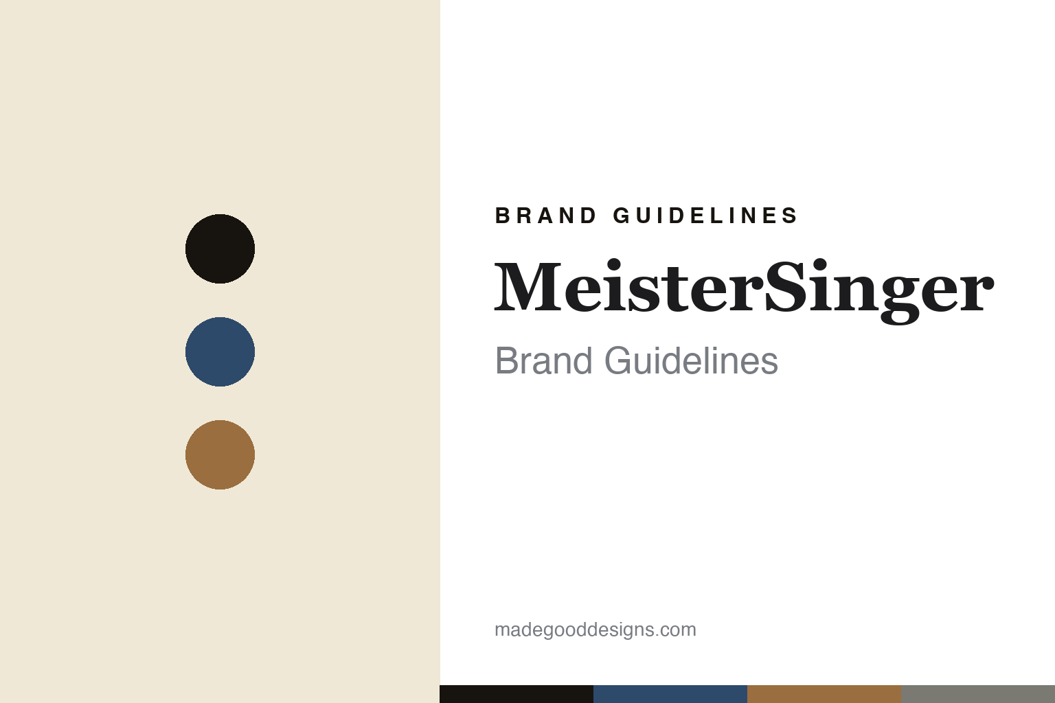
MeisterSinger Brand Guidelines
One hand.
Aa
Two constants: a blue-and-bronze palette and an instrument serif register. Abstract homage — not the MeisterSinger dials.
One hand
MeisterSinger tells the time with a single hand.
MeisterSinger is a lesson in a radical simplicity. Founded in 2001 in Münster by Manfred Brassler, it is an independent German brand whose entire concept is the single-hand dial: one central, needle-thin hand that reads the time to roughly five-minute precision.
The idea is philosophical — a “decelerated relationship with time,” inspired by sundials and medieval single-hand tower clocks. Even the name and mark reinforce it: “MeisterSinger” recalls the medieval master-singers who introduced a new melodic note, and the logo is a fermata — the musical symbol for a pause. Positioned as “German Design — Swiss Made,” the range runs from the ultra-thin Pangaea to the open-date Perigraph and the jump-hour Salthora, all in a vintage-scientific-instrument register.
(Honest notes: MeisterSinger is independent (founder-owned by Manfred Brassler, 2001). The concept is the single hand; the logo is a fermata. It’s “German Design — Swiss Made” (Swiss movements). Design is in-house (no external studio), and there’s no official brand hex, so these tones are an unofficial interpretation.)
Colour
MeisterSinger lives in a blue-and-bronze palette. Click a swatch to copy the hex.
MeisterSinger’s identity is calm, classic and instrument-like — an ink, a blue, a bronze, a grey, and an ivory. The palette pairs a classic blue with a warm bronze over ivory — the register of a vintage scientific instrument. It signals calm and craft rather than urgency. The honest caveat: with no published brand hex, these tones are an original, unofficial interpretation, not first-party values.
The lesson is a classic blue with warm bronze signals a vintage instrument. MeisterSinger’s world is a calm, single-hand dial. For designers, it is a reminder that classic, muted colour reads as considered and timeless — right for a “slow time” brand. The takeaways: keep the palette classic and calm; source it from instruments (ivory dials, bronze cases); let the single idea lead; and treat any single hex as unofficial.
Typography
The register is an instrument serif — calm, classic, considered.
MeisterSinger’s identity carries a calm, classic, considered spirit — a single hand and a fermata. An instrument serif captures the mood: it is elegant and period, the register of a scientific instrument. Set in a blue-and-bronze palette, the instrument serif feels calm and classic — exactly the personality MeisterSinger carries. It is considered rather than urgent, mirroring a single-hand dial. (MeisterSinger’s real dials and fermata mark are works we describe but do not reproduce, and the exact typeface is not ours to use.) Because it is not ours to use, the honest description is “an instrument serif spirit,” shown here in a stand-in. The type behaves like the brand: calm, classic and considered.
Aa
An instrument serif spirit — calm and classic. (Specimen set in EB Garamond, a classical serif STAND-IN; NOT the MeisterSinger dials.)
Simplicity as identity
MeisterSinger stands for slowing down, to one hand.
MeisterSinger is a lesson in making simplicity the identity. A blue-and-bronze palette, an instrument serif and a single hand make radical simplicity the whole brand — calm, classic, philosophical. The single hand is the differentiator. The differentiator is a one-hand, slow-time identity.
For designers and brand-builders, MeisterSinger offers a clear takeaway: subtract to a single, meaningful idea. The lessons: reduce to one hand; give the idea a philosophy (deceleration); reinforce it in the name and mark (the fermata); and hold a calm, instrument register. It is also a reminder to stay accurate: it’s independent, founder-owned since 2001, and the palette here is an unofficial interpretation. MeisterSinger made simplicity the brand — proof that one hand can be the difference.
Explore & save
Keep MeisterSinger’s identity on hand — save it to a board in the Made Good inspiration library.
MeisterSinger identity set
Pin the blue-and-bronze palette and the instrument-serif register to your own board.


