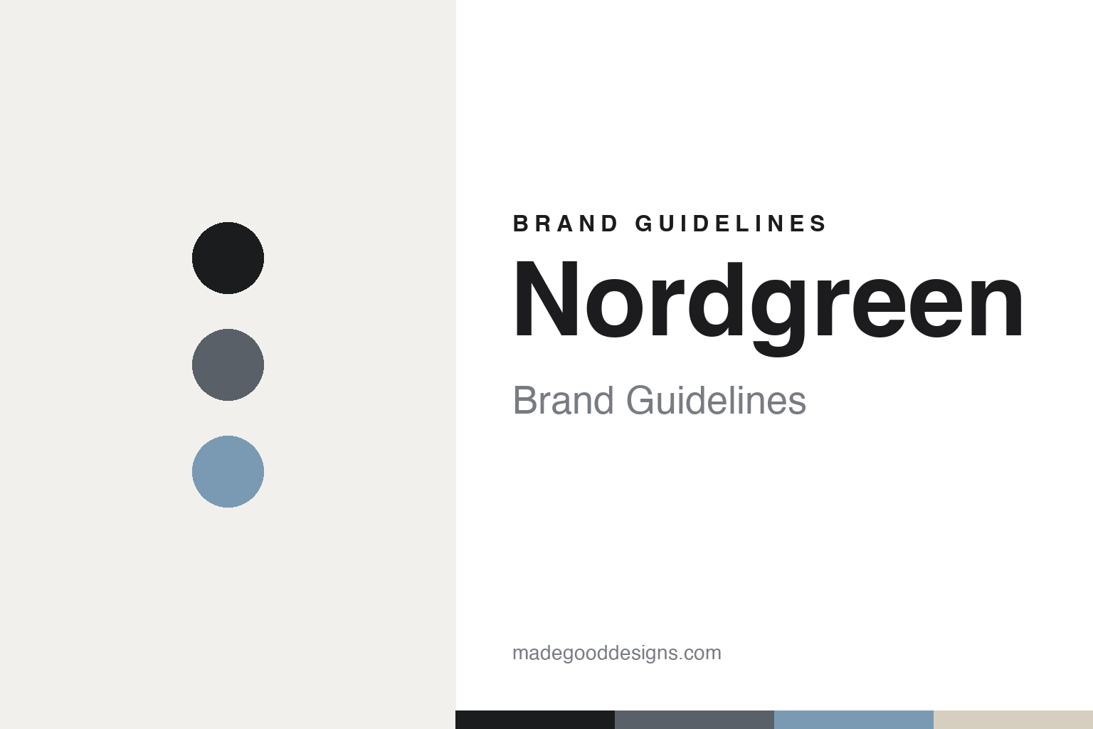
Nordgreen Brand Guidelines
Designed by Jakob Wagner.
Aa
Two constants: a slate-and-sky palette and a minimal sans register. Abstract homage — not the Nordgreen identity.
Designed by Jakob Wagner
Nordgreen put a famous industrial designer on the dial.
Nordgreen is a lesson in named-designer authorship. Founded in 2017 in Copenhagen by Vasilij Brandt and Pascar Sivam, it is a DTC Scandinavian watch brand whose whole design proposition rests on one name: every core model is designed by Jakob Wagner, the acclaimed Danish industrial designer known for Cappellini, HAY and Bang & Olufsen.
Its identity is strict Scandinavian minimalism: the bestselling Native, the ultra-slim Philosopher (with an asymmetric second hand), the Pioneer chronograph and the Infinity. Interchangeable quick-release straps let one watch shift registers, and a “Giving Back” program ties every purchase to a choice of NGOs. The brand’s strongest hook is simply who designed it.
(Honest notes: Nordgreen is not independent in 2026 — it went through a financial reconstruction in 2024 and was majority-acquired in 2025 (by N/A Ventures and department store Magasin du Nord). We include it here for its design-authorship story: Jakob Wagner (ex-Bang & Olufsen). There’s no official brand hex, so these tones are an unofficial interpretation.)
Colour
Nordgreen lives in a slate-and-sky palette. Click a swatch to copy the hex.
Nordgreen’s identity is minimal, muted and calm — an ink, a slate, a sky, a sand, and a chalk. The palette pairs a muted slate with a soft sky — the register of Scandinavian minimalism. It signals restraint and calm rather than colour. The honest caveat: with no published brand hex, these tones are an original, unofficial interpretation, not first-party values.
The lesson is a muted slate with soft sky signals Scandinavian minimalism. Nordgreen’s world is a clean dial and a famous designer’s hand. For designers, it is a reminder that muted, quiet colour reads as considered and premium — right for a Wagner-designed minimalist. The takeaways: keep the palette muted; let one designer’s discipline lead; make the watch flexible (interchangeable straps); and treat any single hex as unofficial.
Typography
The register is a minimal sans — quiet, considered, Scandinavian.
Nordgreen’s identity carries a quiet, considered, Scandinavian spirit — minimalism and a designer’s hand. A minimal sans captures the mood: it is clean and disciplined, the register of Danish design. Set in a slate-and-sky palette, the minimal sans feels quiet and considered — exactly the personality Nordgreen carries. It is disciplined rather than loud, mirroring Wagner’s reductive dials. (Nordgreen’s real dials and wordmark are works we describe but do not reproduce, and the exact typeface is not ours to use.) Because it is not ours to use, the honest description is “a minimal sans spirit,” shown here in a stand-in. The type behaves like the brand: quiet, considered and Scandinavian.
Aa
A minimal sans spirit — quiet and considered. (Specimen set in Albert Sans, a minimal sans STAND-IN; NOT the Nordgreen identity.)
Authorship as identity
Nordgreen stands for who designed it.
Nordgreen is a lesson in making authorship the identity. A slate-and-sky palette, a minimal sans and a famous designer’s hand make named-designer authorship the whole brand — minimal, calm, credible. The authorship is the differentiator. The differentiator is a Jakob-Wagner-designed, Scandi-minimal identity.
For designers and brand-builders, Nordgreen offers a clear takeaway: a named designer can carry a brand. The lessons: put design authorship front and centre (Jakob Wagner); keep the range minimal and coherent; add flexibility (interchangeable straps); and back it with values (Giving Back). It is also a reminder to stay accurate: Nordgreen is no longer independent (acquired in 2025), and the palette here is an unofficial interpretation. Nordgreen made authorship the brand — proof that a designer’s name can be the difference.
Explore & save
Keep Nordgreen’s identity on hand — save it to a board in the Made Good inspiration library.
Nordgreen identity set
Pin the slate-and-sky palette and the minimal-sans register to your own board.


