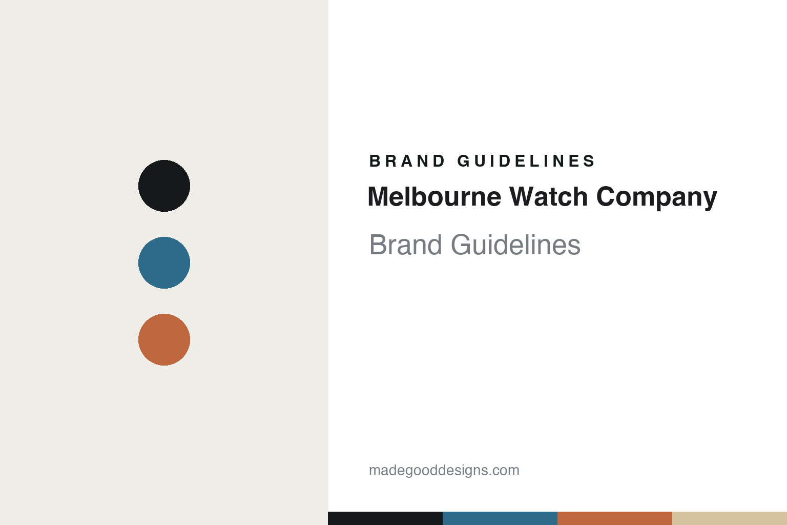
Melbourne Watch Company Brand Guidelines
Named for the city.
Aa
Two constants: a bay-blue-and-terracotta palette and a modern sans register. Abstract homage — not the Melbourne Watch Co dials.
Named for the city
Melbourne Watch Co names every model after a suburb.
Melbourne Watch Company is a lesson in a naming system as identity. Founded in 2013 by Sujain Krishnan — one of the longest-established Australian microbrands, launched via crowdfunding with the Flinders — it designs in Melbourne and imports its movements.
Its identity is a place-naming system: every model is named after a Melbourne suburb or region, each with its own design narrative — the Portsea evokes the nautical seaside Peninsula, the Carlton the “retro feel of the coffee shops established in the ’50s by Italian immigrants.” The construction backs it up: multi-layered ceramic dials, and details like the Sorrento’s engraved-aluminium-over-enamel dive bezel. It is a coherent, place-rooted design architecture.
(Honest notes: the founder is Sujain Krishnan (2013). The identity is the suburb-naming system, with per-model narratives, on layered ceramic dials. It is founder-designed (no external studio), and there’s no official brand hex, so these tones are an unofficial interpretation.)
Colour
Melbourne Watch Co lives in a bay-blue-and-terracotta palette. Click a swatch to copy the hex.
Melbourne Watch Co’s identity is coastal, warm and place-rooted — an ink, a bay blue, a terracotta, a sand, and a chalk. The palette pairs a coastal bay blue with a warm terracotta — the register of a place-named, city-rooted brand. It signals locale and warmth rather than abstraction. The honest caveat: with no published brand hex, these tones are an original, unofficial interpretation, not first-party values.
The lesson is a coastal bay blue with warm terracotta signals a place-rooted brand. Melbourne Watch Co’s world is a city and its bay. For designers, it is a reminder that colour drawn from a real place reads as rooted and warm — right for a suburb-naming brand. The takeaways: source the palette from the place (bay, coast, brick); tie each product to a real locale; keep the construction distinctive (ceramic dials); and treat any single hex as unofficial.
Typography
The register is a modern sans — clean, rooted, considered.
Melbourne Watch Co’s identity carries a clean, rooted, considered spirit — suburb names and ceramic dials. A modern sans captures the mood: it is contemporary and clear, the register of a place-rooted brand. Set in a bay-blue-and-terracotta palette, the modern sans feels clean and rooted — exactly the personality Melbourne Watch Co carries. It is considered rather than loud, mirroring a coherent naming system. (Melbourne Watch Co’s real dials and wordmark are works we describe but do not reproduce, and the exact typeface is not ours to use.) Because it is not ours to use, the honest description is “a modern sans spirit,” shown here in a stand-in. The type behaves like the brand: clean, rooted and considered.
Aa
A modern sans spirit — clean and rooted. (Specimen set in Sora, a modern sans STAND-IN; NOT the Melbourne Watch Co dials.)
A system as identity
Melbourne Watch Co stands for a city, one suburb per watch.
Melbourne Watch Co is a lesson in making a system the identity. A bay-blue-and-terracotta palette, a modern sans and suburb names make a place-rooted architecture the whole brand — coastal, warm, coherent. The system is the differentiator. The differentiator is a suburb-named, ceramic-dial identity.
For designers and brand-builders, Melbourne Watch Co offers a clear takeaway: build a naming system with real meaning. The lessons: tie each model to a real place (a Melbourne suburb); give each a documented narrative; back it with distinctive construction (layered ceramic dials); and keep the palette place-rooted. It is also a reminder to stay accurate: it’s founder-designed, 2013, and the palette here is an unofficial interpretation. Melbourne Watch Co made a system the brand — proof that a naming architecture can be the difference.
Explore & save
Keep Melbourne Watch Company’s identity on hand — save it to a board in the Made Good inspiration library.
Melbourne Watch Co identity set
Pin the bay-blue-and-terracotta palette and the modern-sans register to your own board.


