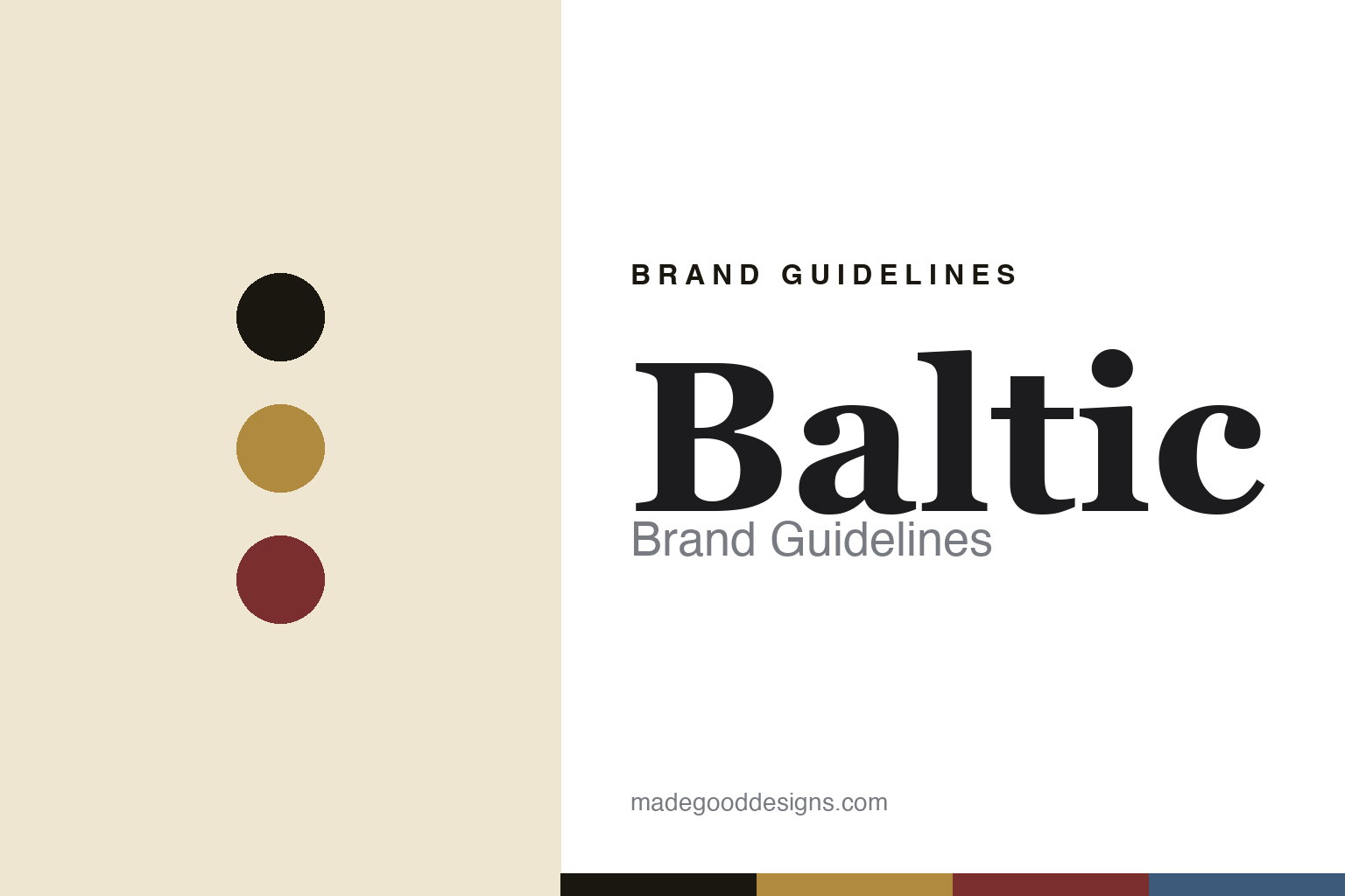
Baltic Brand Guidelines
The vintage revival.
Aa
Two constants: a gilt-and-oxblood palette and a vintage serif register. Abstract homage — not the Baltic dials.
The vintage revival
Baltic revives mid-century watch design for a new era.
Baltic is a lesson in vintage revival as identity. Founded in 2016 (and launched via Kickstarter in 2017) by Etienne Malec, it is an independent French microbrand — designed in Paris and assembled in Besançon, France’s historic watchmaking city.
Its identity is a faithful mid-20th-century revival. The line reads like a small vintage catalogue: the Bicompax 001, a two-register hand-wound chronograph nodding to 1930s–40s pieces; the time-only HMS 001; and the Aquascaphe skin-diver (later a GMT). The dials carry the era’s language — sector layouts, sword hands, lollipop “bubble” seconds and gilt markers — under domed crystals (acrylic on the early pieces, sapphire on the divers). The name honours Etienne’s father’s roots on the Baltic coast and the watch collection he left behind.
(Honest notes: Baltic is best dated 2016 (created) / 2017 (Kickstarter). The name comes from the father’s Baltic-Polish roots and his watch collection and journal — not a “parts hoard.” Design is in-house/founder-led (no external studio), the collaborations are with Peter Auto and Worn & Wound, and there’s no official brand hex, so these tones are an unofficial interpretation.)
Colour
Baltic lives in a gilt-and-oxblood palette. Click a swatch to copy the hex.
Baltic’s identity is warm, vintage and refined — an ink, a gilt, an oxblood, a steel blue, and a cream. The palette reads like an old gilt dial — warm gold and oxblood over cream — the register of mid-century revival. It signals heritage and warmth rather than modern gloss. The honest caveat: with no published brand hex, these tones are an original, unofficial interpretation, not first-party values.
The lesson is gilt and oxblood over cream signal mid-century vintage warmth. Baltic’s world is a 1950s dial, revived. For designers, it is a reminder that warm, aged colour reads as authentic and nostalgic — right for a vintage-revival brand. The takeaways: source the palette from the era (gilt dials, cream lume); keep it warm; let the dial details carry it; and treat any single hex as unofficial.
Typography
The register is a vintage serif — warm, refined, mid-century.
Baltic’s identity carries a warm, refined, mid-century spirit — old dials and domed crystals. A vintage serif captures the mood: it is characterful and period, the register of a 1950s catalogue. Set in a gilt-and-oxblood palette, the vintage serif feels warm and refined — exactly the personality Baltic carries. It is mid-century rather than modern, mirroring sector dials and gilt markers. (Baltic’s real dials and wordmark are works we describe but do not reproduce, and the exact typeface is not ours to use.) Because it is not ours to use, the honest description is “a vintage serif spirit,” shown here in a stand-in. The type behaves like the brand: warm, refined and mid-century.
Aa
A vintage serif spirit — warm and mid-century. (Specimen set in Fraunces, a vintage-flavoured serif STAND-IN; NOT the Baltic identity.)
Revival as identity
Baltic stands for the mid-century, faithfully revived.
Baltic is a lesson in making revival the identity. A gilt-and-oxblood palette, a vintage serif and sector dials make faithful mid-century revival the whole brand — warm, detailed, authentic. The revival is the differentiator. The differentiator is a vintage-faithful, domed-crystal identity.
For designers and brand-builders, Baltic offers a clear takeaway: revive an era with real fidelity. The lessons: study the period (1940s–50s dials); reproduce the details (sector layouts, gilt markers, domed crystals); keep the range small and coherent (HMS, Bicompax, Aquascaphe); and root it in a real story (the father’s collection). It is also a reminder to stay accurate: it dates to 2016/17, the design is founder-led, and the palette here is an unofficial interpretation. Baltic made revival the brand — proof that faithful vintage can be the difference.
Explore & save
Keep Baltic’s identity on hand — save it to a board in the Made Good inspiration library.
Baltic identity set
Pin the gilt-and-oxblood palette and the vintage-serif register to your own board.


