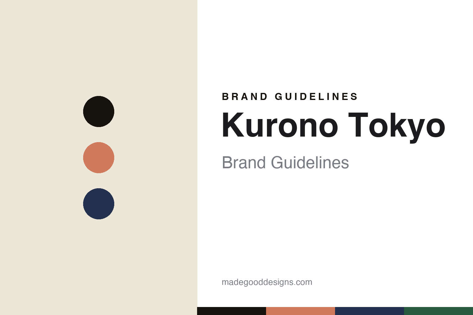
Kurono Tokyo Brand Guidelines
The master’s line.
Aa
Two constants: a salmon-and-midnight palette and a Deco sans register. Abstract homage — not the Kurono dials.
The master’s line
Kurono carries a master watchmaker’s design, made accessible.
Kurono Tokyo is a lesson in design DNA, made accessible. Its founder and designer is Hajime Asaoka — a celebrated, self-taught independent watchmaker and the first Japanese member of the AHCI, whose atelier tourbillons run into the tens of thousands. Launched in 2019 (after a 2018 domestic “Chrono Tokyo” line), Kurono is his accessible, design-forward line, made in Japan on outsourced movements.
Its identity is genuinely design-led — a master’s aesthetic point of view brought down-market, not a homage brand. The dials blend Art Deco and Japanese minimalism: sector layouts (as on the Toki), traditional urushi lacquer dials in deep greens and reds, sunburst finishes, box sapphire and compact, dressy cases. The differentiator is collectible per-drop colourways, sold in small lottery releases that sell out; the GMT 1 was even a GPHG finalist in 2023.
(Honest notes: “Kurono” is the Japanese rendering of chrono (クロノ) — not the word for “black.” Keep the accessible Kurono line distinct from Asaoka’s hand-made atelier watches; Kurono uses outsourced Miyota/Seiko movements. Design is Asaoka himself (no external studio), and there’s no official brand hex, so these tones are an unofficial interpretation.)
Colour
Kurono lives in a salmon-and-midnight palette. Click a swatch to copy the hex.
Kurono’s identity is refined, dressy and collectible — an ink, a salmon, a midnight blue, an urushi green, and a cream. The palette pairs a collectible salmon with a midnight blue — the register of Art-Deco-meets-Japanese dressy dials. It signals refinement and craft rather than loudness. The honest caveat: with no published brand hex, these tones are an original, unofficial interpretation, not first-party values.
The lesson is a collectible salmon with midnight blue signals refined, dressy design. Kurono’s world is a small, elegant dial in a coveted colour. For designers, it is a reminder that refined, considered colour reads as collectible and design-led — right for a master’s accessible line. The takeaways: pick collectible colourways; keep the case small and dressy; draw on Art Deco and lacquer; and treat any single hex as unofficial.
Typography
The register is a Deco sans — refined, dressy, considered.
Kurono’s identity carries a refined, dressy, considered spirit — Art Deco and Japanese minimalism. A Deco sans captures the mood: it is elegant and geometric, the register of a dressy, design-led watch. Set in a salmon-and-midnight palette, the Deco sans feels refined and considered — exactly the personality Kurono carries. It is dressy rather than loud, mirroring compact Art-Deco dials. (Kurono’s real dials and wordmark are works we describe but do not reproduce, and the exact typeface is not ours to use.) Because it is not ours to use, the honest description is “a Deco sans spirit,” shown here in a stand-in. The type behaves like the brand: refined, dressy and considered.
Aa
A Deco sans spirit — refined and dressy. (Specimen set in Josefin Sans, an Art-Deco-flavoured sans STAND-IN; NOT the Kurono identity.)
Design DNA as identity
Kurono stands for a master’s eye, made reachable.
Kurono is a lesson in making design DNA the identity. A salmon-and-midnight palette, a Deco sans and Art-Deco dials make a master’s aesthetic the whole brand — refined, dressy, collectible. The design DNA is the differentiator. The differentiator is an independent-watchmaker, accessible-design identity.
For designers and brand-builders, Kurono offers a clear takeaway: bring a rare point of view down-market. The lessons: carry a real designer’s aesthetic (Asaoka’s); centre the dial (sector layouts, urushi lacquer); make colour the collectible variable; and keep it small and dressy. It is also a reminder to stay accurate: “Kurono” means chrono (not black), the atelier and accessible lines are distinct, and the palette here is an unofficial interpretation. Kurono made design DNA the brand — proof that a master’s eye can be the difference.
Explore & save
Keep Kurono Tokyo’s identity on hand — save it to a board in the Made Good inspiration library.
Kurono identity set
Pin the salmon-and-midnight palette and the Deco-sans register to your own board.


