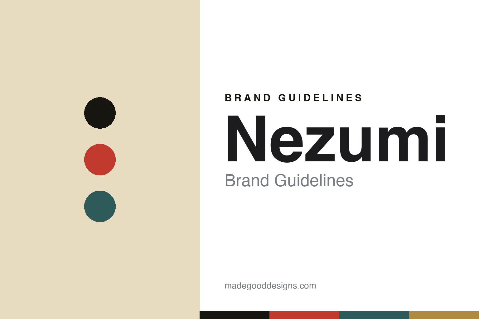
Nezumi Brand Guidelines
The racing line.
Aa
Two constants: a racing-red-and-petrol palette and a condensed sans register. Abstract homage — not the Nezumi dials.
The racing line
Nezumi channels 1960s racing chronographs from Stockholm.
Nezumi is a lesson in a theme, well kept. Founded in 2011 as a denim brand by David Campo (a Spanish-Swedish creative in Stockholm), it pivoted to watches in 2015 with the Voiture chronograph, designed in Sweden and assembled in Germany.
Its identity is vintage racing. Campo — an air-cooled Porsche enthusiast — draws on 1960s–70s racing chronographs, with a coherent, French-named model family: Voiture (“car,” a 24-hour rally chronograph), Loews (chronograph), Corbeau (“crow,” a field/pilot watch) and Baleine (“whale,” an automatic diver). The dials lean vintage — cream and “tropical” tones, panda chrono layouts, tachymeter and pulsometer scales — with a Scandinavian sensibility. The name is a story in itself: “Nezumi” is Japanese for rat/mouse, after Nezumi Kozō, an Edo-era “Japanese Robin Hood.”
(Honest notes: Nezumi was founded in 2011 (as denim) and pivoted to watches in 2015 — we cite both. The founder is David Campo; the watches are designed in Sweden and assembled in Germany. Design is in-house (no external studio), and there’s no official brand hex, so these tones are an unofficial interpretation.)
Colour
Nezumi lives in a racing-red-and-petrol palette. Click a swatch to copy the hex.
Nezumi’s identity is sporty, vintage and warm — an ink, a racing red, a petrol, a cream, and a gold. The palette pairs a racing red with petrol green over vintage cream — the register of a 1960s racing chronograph. It signals speed and nostalgia rather than restraint. The honest caveat: with no published brand hex, these tones are an original, unofficial interpretation, not first-party values.
The lesson is a racing red with petrol signals vintage motorsport. Nezumi’s world is a rally dial on a warm ground. For designers, it is a reminder that sporty, warm colour reads as vintage-automotive and characterful — right for a racing-themed brand. The takeaways: pick a real theme (1960s racing); keep the model names on-theme (French automotive); lean vintage in the dial tones; and treat any single hex as unofficial.
Typography
The register is a condensed sans — sporty, vintage, confident.
Nezumi’s identity carries a sporty, vintage, confident spirit — racing themes and rally dials. A condensed sans captures the mood: it is bold and signage-like, the register of motorsport. Set in a racing-red-and-petrol palette, the condensed sans feels sporty and confident — exactly the personality Nezumi carries. It is vintage rather than plain, mirroring rally chronograph scales. (Nezumi’s real dials and wordmark are works we describe but do not reproduce, and the exact typeface is not ours to use.) Because it is not ours to use, the honest description is “a condensed sans spirit,” shown here in a stand-in. The type behaves like the brand: sporty, vintage and confident.
Aa
A condensed sans spirit — sporty and confident. (Specimen set in Oswald, a condensed sans STAND-IN; NOT the Nezumi identity.)
A theme as identity
Nezumi stands for vintage racing, kept coherent.
Nezumi is a lesson in making a theme the identity. A racing-red-and-petrol palette, a condensed sans and a French-named model family make vintage racing the whole brand — sporty, warm, coherent. The theme is the differentiator. The differentiator is a racing-chronograph, automotive-named identity.
For designers and brand-builders, Nezumi offers a clear takeaway: pick a theme and keep it. The lessons: commit to an era (1960s racing); name the range on-theme (Voiture, Loews, Corbeau, Baleine); lean vintage in the dials; and give the brand a real story (Nezumi Kozō). It is also a reminder to stay accurate: it’s a 2011 brand that turned to watches in 2015, the founder is David Campo, and the palette here is an unofficial interpretation. Nezumi made a theme the brand — proof that coherence can be the difference.
Explore & save
Keep Nezumi’s identity on hand — save it to a board in the Made Good inspiration library.
Nezumi identity set
Pin the racing-red-and-petrol palette and the condensed-sans register to your own board.


