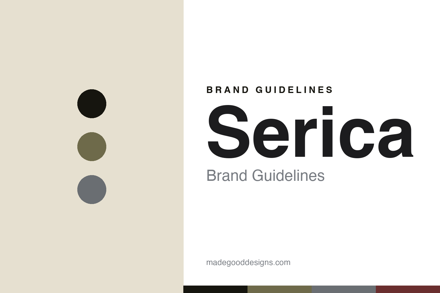
Serica Brand Guidelines
The logo-less dial.
Aa
Two constants: a khaki-and-grey palette and a restrained sans register. Abstract homage — not the Serica dials.
The logo-less dial
Serica leaves the logo off the dial entirely.
Serica is a lesson in restraint as identity. Founded in 2019 in Paris by Jérôme Burgert and Gabriel Vachette, it is a genuinely independent, founder-run microbrand — a French brand with Swiss-made watches.
Its identity is refined vintage-military “quiet luxury.” The most striking choice is what’s missing: no logo on the dial, only subtle brand naming, keeping the focus on form. The watches use textured “sandwich” dials, hand-wound movements and a distinctive bracelet, across a small, cohesive range — the 4512 field watch, the 5303 diver (its reference a tribute to 1953, the year of the modern rotating-bezel diver), and the 8315 GMT. It’s a level of visual coherence uncommon among young independents.
(Honest notes: Serica is genuinely independent — unlike the heritage brand Yema, which is group-owned. It’s a French brand with Swiss-made watches (not French-manufactured). The design is in-house by the two founders (no external studio), and there’s no official brand hex, so these tones are an unofficial interpretation.)
Colour
Serica lives in a khaki-and-grey palette. Click a swatch to copy the hex.
Serica’s identity is restrained, military and refined — an ink, a khaki, a grey, an oxblood, and a sand. The palette pairs a muted khaki with a cool grey — the register of vintage-military quiet luxury. It signals discipline and refinement rather than colour. The honest caveat: with no published brand hex, these tones are an original, unofficial interpretation, not first-party values.
The lesson is a muted khaki with a cool grey signals vintage-military quiet luxury. Serica’s world is a restrained field dial with no logo. For designers, it is a reminder that muted, disciplined colour reads as refined and considered — right for a quiet-luxury brand. The takeaways: keep the palette muted and military; strip the dial (no logo); use textured sandwich dials; and treat any single hex as unofficial.
Typography
The register is a restrained sans — refined, disciplined, quiet.
Serica’s identity carries a refined, disciplined, quiet spirit — a logo-less dial and military restraint. A restrained sans captures the mood: it is clean and understated, the register of quiet luxury. Set in a khaki-and-grey palette, the restrained sans feels refined and disciplined — exactly the personality Serica carries. It is quiet rather than loud, mirroring a dial that omits its own name. (Serica’s real dials and wordmark are works we describe but do not reproduce, and the exact typeface is not ours to use.) Because it is not ours to use, the honest description is “a restrained sans spirit,” shown here in a stand-in. The type behaves like the brand: refined, disciplined and quiet.
Aa
A restrained sans spirit — refined and quiet. (Specimen set in Instrument Sans, a restrained sans STAND-IN; NOT the Serica identity.)
Restraint as identity
Serica stands for a dial confident enough to omit its name.
Serica is a lesson in making restraint the identity. A khaki-and-grey palette, a restrained sans and a logo-less dial make quiet confidence the whole brand — refined, disciplined, coherent. The restraint is the differentiator. The differentiator is a vintage-military, logo-less identity.
For designers and brand-builders, Serica offers a clear takeaway: confidence can mean leaving things out. The lessons: strip the dial of its logo; keep the palette muted and military; use textured sandwich dials; and hold a small, coherent range. It is also a reminder to stay accurate: Serica is genuinely independent (unlike Yema), it’s French-brand/Swiss-made, and the palette here is an unofficial interpretation. Serica made restraint the brand — proof that leaving the name off can be the difference.
Explore & save
Keep Serica’s identity on hand — save it to a board in the Made Good inspiration library.
Serica identity set
Pin the khaki-and-grey palette and the restrained-sans register to your own board.


