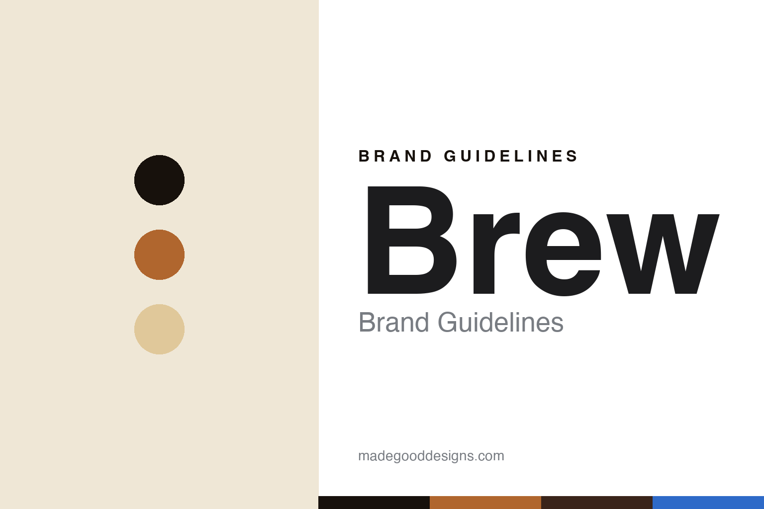
Brew Brand Guidelines
The espresso watch.
Aa
Two constants: a copper-and-crema palette and a retro display register. Abstract homage — not the Brew watches.
The espresso watch
Brew built a watch brand out of espresso machines.
Brew is a lesson in a single, delicious concept. Founded in 2015 by Jonathan Ferrer — an industrial designer and former Movado designer — it is an independent New York microbrand whose whole identity comes from espresso and coffee machines.
Its design language borrows from café hardware: brushed and polished surfaces, curves and contours drawn from espresso machines. The signature is the Metric chronograph — a TV-shaped, integrated-bracelet, “bug-eyed” retro chrono with a witty functional detail: a “shot-timer” rehaut, where the ring shifts from off-white to grey between the 25–35-second marks (the ideal espresso window). The colourways are coffee too — the Metric Bloom pairs copper with a “crema”-toned rippled dial that reads like espresso pouring — and the Metric earned a Red Dot Design Concept award in 2026.
(Honest notes: the founder is Jonathan Ferrer (ex-Movado), and Brew is NYC-designed. The identity largely orbits the Metric model family. Design is in-house by Ferrer (no external studio), and there’s no official brand hex, so these tones — copper, crema — are described by name and are an unofficial interpretation.)
Colour
Brew lives in a copper-and-crema palette. Click a swatch to copy the hex.
Brew’s identity is warm, retro and playful — an ink, a copper, a crema, an espresso, and an electric blue. The palette reads like a shot of espresso — copper and crema over dark espresso — the register of a coffee-machine concept. It signals warmth and wit rather than restraint. The honest caveat: with no published brand hex, these tones are an original, unofficial interpretation, not first-party values.
The lesson is copper and crema over espresso signal a coffee-machine concept. Brew’s world is a café rendered on the wrist. For designers, it is a reminder that a palette drawn from a single idea reads as cohesive and fun — right for a concept brand. The takeaways: commit to one concept (espresso); source the palette from it (copper, crema, espresso); add a witty functional detail (the shot-timer bezel); and treat any single hex as unofficial.
Typography
The register is a retro display — warm, playful, industrial.
Brew’s identity carries a warm, playful, industrial spirit — espresso machines and retro chronos. A retro display face captures the mood: it is characterful and mid-century-industrial, the register of a coffee-machine concept. Set in a copper-and-crema palette, the retro display feels warm and playful — exactly the personality Brew carries. It is industrial-retro rather than plain, mirroring a bug-eyed retro chrono. (Brew’s real watches and wordmark are works we describe but do not reproduce, and the exact typeface is not ours to use.) Because it is not ours to use, the honest description is “a retro display spirit,” shown here in a stand-in. The type behaves like the brand: warm, playful and industrial.
Aa
A retro display spirit — warm and playful. (Specimen set in Righteous, a retro display STAND-IN; NOT the Brew identity.)
A concept as identity
Brew stands for coffee, on the wrist.
Brew is a lesson in making a concept the identity. A copper-and-crema palette, a retro display and espresso-machine design make one delicious idea the whole brand — warm, playful, cohesive. The concept is the differentiator. The differentiator is an espresso-machine, shot-timer identity.
For designers and brand-builders, Brew offers a clear takeaway: build the whole brand on one idea. The lessons: pick a concept people love (espresso); express it in the hardware (café-machine surfaces); add a witty function (the shot-timer bezel); and source the colours from the idea (crema, copper). It is also a reminder to stay accurate: the founder is Jonathan Ferrer, the identity orbits the Metric, and the palette here is an unofficial interpretation. Brew made a concept the brand — proof that one great idea can be the difference.
Explore & save
Keep Brew’s identity on hand — save it to a board in the Made Good inspiration library.
Brew identity set
Pin the copper-and-crema palette and the retro-display register to your own board.


