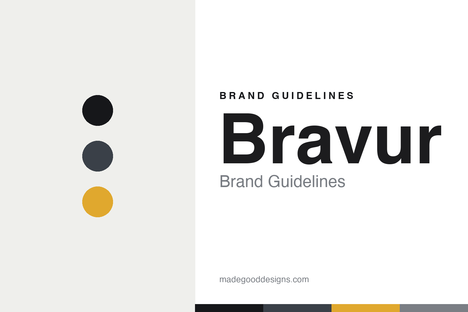
Bravur Brand Guidelines
The big loop.
Aa
Two constants: a slate-and-yellow palette and a Scandi grotesque register. Abstract homage — not the Bravur watches.
The big loop
Bravur fused Scandinavian minimalism with cycling.
Bravur is a lesson in a passion as identity. Founded in 2011 (first watch 2013) by Magnus Äppelryd and Johan Sahlin — both former competitive cyclists — it is an independent Swedish brand, with Stockholm origins and assembly now in Båstad.
Its identity is Scandinavian minimalism fused with cycling culture, expressed most sharply in the Grand Tour chronograph line. The most citable piece is La Grande Boucle — the French nickname for the Tour de France, “the big loop” — now on its fourth iteration, joined by La Corsa Rosa (the Giro) and La Vuelta. The dials are clean and modernist: applied stick markers, skeletonised rhodium hands, a finely graded outer track. It is design-led restraint with a cyclist’s heart.
(Honest notes: it’s a 2011 brand (first watch 2013), with Stockholm origins and Båstad assembly. The movements are Swiss — Ronda quartz and Sellita mechanicals (including the SW511 chronograph in La Grande Boucle IV) — so it’s “designed in Sweden, Swiss movements,” not a manufacture. Design is in-house, and there’s no official brand hex, so these tones are an unofficial interpretation.)
Colour
Bravur lives in a slate-and-yellow palette. Click a swatch to copy the hex.
Bravur’s identity is minimal, sporting and calm — an ink, a slate, a maillot yellow, a steel, and a chalk. The palette pairs a Scandinavian slate with a maillot yellow — the register of a cycling chronograph. It signals the road and restraint rather than flash. The honest caveat: with no published brand hex, these tones are an original, unofficial interpretation, not first-party values.
The lesson is a Scandinavian slate with a maillot yellow signals cycling minimalism. Bravur’s world is a clean chronograph with a jersey-yellow accent. For designers, it is a reminder that a restrained base with one sporting accent reads as calm and purposeful — right for a cycling brand. The takeaways: keep the base minimal (slate, steel); add one jersey accent (yellow); name from the sport (the Grand Tours); and — because a bright yellow fails as small text — keep type dark and let the yellow live in the dial and band; treat any single hex as unofficial.
Typography
The register is a Scandi grotesque — minimal, calm, precise.
Bravur’s identity carries a minimal, calm, precise spirit — Scandinavian restraint and a cyclist’s heart. A Scandi grotesque captures the mood: it is clean and exact, the register of Nordic design. Set in a slate-and-yellow palette, the Scandi grotesque feels minimal and calm — exactly the personality Bravur carries. It is precise rather than loud, mirroring a modernist chronograph. (Bravur’s real watches are works we describe but do not reproduce, and the exact typeface is not ours to use.) Because it is not ours to use, the honest description is “a Scandi grotesque spirit,” shown here in a stand-in. The type behaves like the brand: minimal, calm and precise.
Aa
A Scandi grotesque spirit — minimal and calm. (Specimen set in Readex Pro, a clean grotesque STAND-IN; NOT the Bravur watches.)
A passion as identity
Bravur stands for cycling, in a Swedish key.
Bravur is a lesson in making a passion the identity. A slate-and-yellow palette, a Scandi grotesque and a cycling chronograph make the founders’ sport the whole brand — minimal, sporting, coherent. The passion is the differentiator. The differentiator is a Grand-Tour, Scandinavian identity.
For designers and brand-builders, Bravur offers a clear takeaway: build the brand around a real passion. The lessons: name from the sport you love (the Grand Tours); keep the design Scandinavian and restrained; add one jersey accent; and be honest about the make (Swiss movements). It is also a reminder to stay accurate: it’s a 2011 brand with Stockholm origins and Båstad assembly, and the palette here is an unofficial interpretation. Bravur made a passion the brand — proof that a genuine love can be the difference.
Explore & save
Keep Bravur’s identity on hand — save it to a board in the Made Good inspiration library.
Bravur identity set
Pin the slate-and-yellow palette and the Scandi-grotesque register to your own board.


