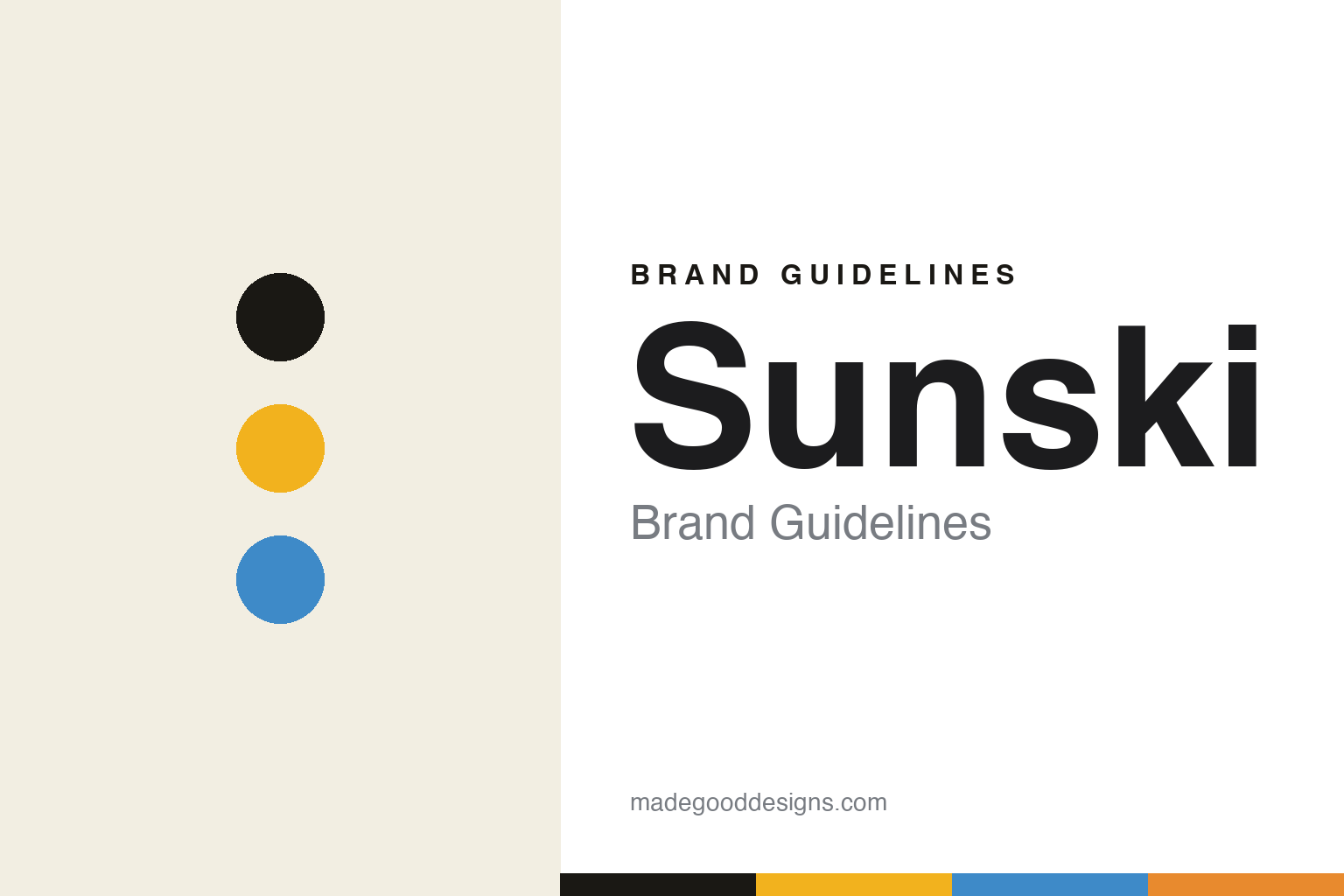
Sunski Brand Guidelines
Nature wants you.
Aa
Two constants: a yellow-and-sky palette and a rounded sans register. Abstract homage — not the Sunski identity.
Nature wants you
Sunski built a sunny identity on recycled resin.
Sunski is a lesson in optimism as identity. Founded in 2012 in San Francisco by Tom Stewart and Michael Charley (out of a Kickstarter sparked by a surf trip), it is an independent sunglasses brand built around getting outside.
Its identity is sustainability with a warm, sunny voice. A documented rebrand by studio TUX Creative House gave it a system: a warm, handwritten script wordmark, a bold condensed display for campaign lines like “Nature Wants You,” a restrained sans for the functional layer, and a palette of optimistic warm yellow against sky blue. The substance backs it — all frames use “SuperLight,” an in-house recycled resin from post-industrial scrap plastic, with a lifetime warranty.
(Honest notes: Sunski is a 1% for the Planet member and Climate Neutral certified — not a B-Corp, which we don’t claim. The material is a recycled polymer from post-industrial scrap. The studio is TUX Creative House. And there’s no official brand hex, so the yellow-and-sky tones here are an unofficial interpretation.)
Colour
Sunski lives in a yellow-and-sky palette. Click a swatch to copy the hex.
Sunski’s identity is warm, optimistic and outdoorsy — an ink, a yellow, a sky, a sun-orange, and a cream. The palette pairs a warm yellow with sky blue — the register of a sunny invitation to get outside. It signals optimism and the outdoors rather than restraint. The honest caveat: with no published brand hex, these tones are an original, unofficial interpretation, not first-party values.
The lesson is a warm yellow with sky blue signals optimistic, outdoorsy energy. Sunski’s world is a sunny day on the trail. For designers, it is a reminder that warm, bright colour reads as friendly and outdoorsy — right for a sustainability brand with a positive voice. The takeaways: pick an optimistic pairing (yellow and sky); back it with real substance (recycled resin); keep the voice warm; and — because a bright yellow fails as small text — keep type dark and let the yellow live in fields; treat any single hex as unofficial.
Typography
The register is a rounded sans — warm, friendly, optimistic.
Sunski’s identity carries a warm, friendly, optimistic spirit — a sunny palette and a positive voice. A rounded sans captures the mood: it is soft and welcoming, the register of an outdoorsy brand. Set in a yellow-and-sky palette, the rounded sans feels warm and friendly — exactly the personality Sunski carries. It is optimistic rather than austere, mirroring a handwritten script wordmark. (Sunski’s real script wordmark is a work we describe but do not reproduce, and the exact typefaces are not ours to use.) Because they are not ours to use, the honest description is “a rounded sans spirit,” shown here in a stand-in. The type behaves like the brand: warm, friendly and optimistic.
Aa
A rounded sans spirit — warm and friendly. (Specimen set in Nunito, a rounded sans STAND-IN; NOT the Sunski script wordmark.)
Optimism as identity
Sunski stands for a sunny push to get outside.
Sunski is a lesson in making optimism the identity. A yellow-and-sky palette, a rounded sans and a warm voice make sunny sustainability the whole brand — friendly, outdoorsy, positive. The optimism is the differentiator. The differentiator is a recycled-resin, get-outside identity.
For designers and brand-builders, Sunski offers a clear takeaway: make sustainability feel joyful. The lessons: pick a warm, optimistic palette; commission a studio to build the system (TUX Creative House); back the story with real material (recycled SuperLight resin) and a lifetime warranty; and keep the certifications honest (1% for the Planet, Climate Neutral — not B-Corp). It is also a reminder to stay accurate: it’s a 2012 San Francisco brand, and the palette here is an unofficial interpretation. Sunski made optimism the brand — proof that a sunny voice can be the difference.
Explore & save
Keep Sunski’s identity on hand — save it to a board in the Made Good inspiration library.
Sunski identity set
Pin the yellow-and-sky palette and the rounded-sans register to your own board.


