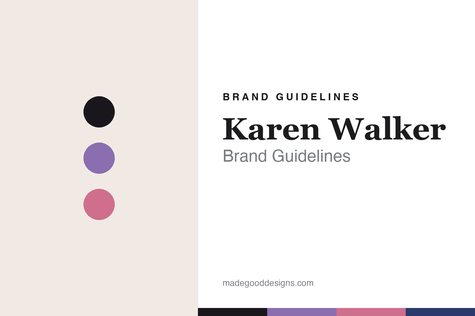
Karen Walker Brand Guidelines
A quiet arrow.
Aa
Two constants: a lilac-and-pink palette and a fashion serif register. Abstract homage — not the Karen Walker identity.
A quiet arrow
Karen Walker hides its mark in the frame.
Karen Walker is a lesson in the confidence of no logo. Founded in the late 1980s in Auckland by designer Karen Walker (with partner Mikhail Gherman), the independent New Zealand fashion label launched its eyewear line in 2005, with a dedicated optical collection in 2019.
Its eyewear identity is a piece of restraint: rather than name-branding the temples, Karen Walker uses a subtle arrow insignia — placed on the nosepads, hinges and temple tips — as a quiet “no-logo” signature (the arrow first appeared in her work in 2002). The frames themselves are the statement: oversized, retro-modern silhouettes with bold shapes and a playful, vintage-meets-contemporary spirit, in documented tones like lilac, pink, nude, gloss black and navy.
(Honest notes: the eyewear signature is the arrow — not the “Runaway Girl,” which is a separate jewellery motif we don’t put on the frames. The fashion label is still active (a 2020 restructure, not insolvency). We give the eyewear’s current licensee/producer as unknown rather than invent one, use the documented named colours, and — with no official brand hex — treat these tones as an unofficial interpretation.)
Colour
Karen Walker lives in a lilac-and-pink palette. Click a swatch to copy the hex.
Karen Walker’s identity is playful, fashion-forward and retro — an ink, a lilac, a pink, a nude, and a navy. The palette pairs a playful lilac with pink and navy — the register of retro-modern fashion eyewear. It signals wit and style rather than austerity. The honest caveat: with no published brand hex, these tones are an original, unofficial interpretation drawn from documented named colours, not first-party values.
The lesson is a playful lilac with pink and navy signals retro-modern fashion. Karen Walker’s world is a bold frame with a hidden mark. For designers, it is a reminder that playful, fashion colour reads as witty and current — right for a designer eyewear line. The takeaways: let the shapes and colour lead; hide the mark (the arrow); keep the palette playful; and treat any single hex as unofficial.
Typography
The register is a fashion serif — playful, elegant, retro-modern.
Karen Walker’s identity carries a playful, elegant, retro-modern spirit — bold shapes and a hidden arrow. A fashion serif captures the mood: it is chic and characterful, the register of designer eyewear. Set in a lilac-and-pink palette, the fashion serif feels playful and elegant — exactly the personality Karen Walker carries. It is retro-modern rather than plain, mirroring oversized statement frames. (Karen Walker’s real frames and arrow mark are works we describe but do not reproduce, and the exact typeface is not ours to use.) Because it is not ours to use, the honest description is “a fashion serif spirit,” shown here in a stand-in. The type behaves like the brand: playful, elegant and retro-modern.
Aa
A fashion serif spirit — playful and elegant. (Specimen set in Cormorant Garamond, a fashion serif STAND-IN; NOT the Karen Walker identity.)
Restraint as identity
Karen Walker stands for a mark you almost miss.
Karen Walker is a lesson in making restraint the identity. A lilac-and-pink palette, a fashion serif and a hidden arrow make quiet confidence the whole brand — playful, elegant, distinctive. The restraint is the differentiator. The differentiator is a no-logo, arrow-marked identity.
For designers and brand-builders, Karen Walker offers a clear takeaway: you don’t have to shout your name. The lessons: let the product be the statement (oversized retro-modern shapes); hide the mark where insiders find it (the arrow on nosepads and tips); and keep the colour playful. It is also a reminder to stay accurate: the eyewear signature is the arrow (not the jewellery’s Runaway Girl), the label is active, and the palette here is an unofficial interpretation. Karen Walker made restraint the brand — proof that a quiet mark can be the difference.
Explore & save
Keep Karen Walker’s identity on hand — save it to a board in the Made Good inspiration library.
Karen Walker identity set
Pin the lilac-and-pink palette and the fashion-serif register to your own board.


