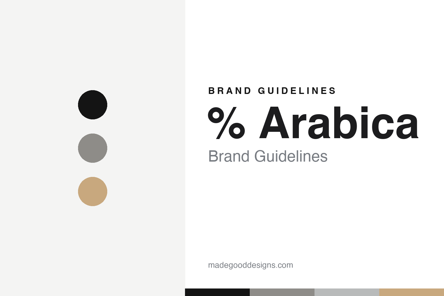
% Arabica Brand Guidelines
One percent sign.
Aa
Two constants: a white-and-concrete palette and a quiet sans register. Abstract homage — not the % Arabica identity.
One percent sign
% Arabica reduced a whole identity to a single glyph.
% Arabica is a lesson in reduction to one glyph. Founded by Kenneth Shoji — first café in Hong Kong (2013), then the Kyoto Higashiyama flagship (2014) that became its worldwide home — it has grown to hundreds of locations under the tagline “See the World Through Coffee.”
Its brand identity is the single “%” percent sign. The mark is the logo — a near-typographic monogram used at large scale on white, needing no wordmark or illustration. The palette is essentially monochrome white with black, plus the raw neutrals of concrete, wood and steel; the stores read as bright galleries where the “%” and the coffee are the only contrast. The absence of colour is the strategy, and it’s carried with total consistency across cup, bag, wall and signage. The stores — the identity’s real vehicle — are led by the Tokyo studio PUDDLE (architect Masaki Kato), in an explicit Dieter Rams lineage.
(Honest notes: % Arabica is founder-controlled but mostly franchised — of ~243 locations, only the three Kyoto stores are corporate-managed — so it isn’t an independent artisanal chain. Hong Kong came first (2013), Kyoto second (2014). The “%” meaning is unverified brand lore. PUDDLE designs the stores (with other firms on specific sites); no logo designer is documented. And there’s no official brand hex.)
Colour
% Arabica lives in a white-and-concrete palette. Click a swatch to copy the hex.
% Arabica’s identity is stark, gallery-white and reductive — a black, a concrete, a steel, a wood, and a white. The palette is near-monochrome white and black, with concrete, wood and steel neutrals — the register of a minimalist gallery where one glyph is the only graphic. It signals reduction and consistency rather than colour. The honest caveat: with no published brand hex, these tones are an original, unofficial interpretation, not first-party values.
The lesson is white plus raw neutrals signals reductive, gallery minimalism. % Arabica’s world is a white room with a black “%”. For designers, it is a reminder that white with concrete and wood reads as gallery-calm — the perfect backdrop for one mark. The takeaways: reduce to one glyph; let white and raw materials be the palette; hold it consistently across every touchpoint; and treat any single tone as unofficial — using black for small text so the mark stays the hero.
Typography
The register is a quiet sans — reductive, gallery-calm, consistent.
% Arabica’s identity carries a reductive, gallery-calm, consistent spirit — one glyph and a lot of white. A quiet sans captures the mood: it is neutral and disciplined, the register of a product-design sensibility (Dieter Rams by way of a café). Set in a white-and-concrete palette, the quiet sans feels reductive and calm — exactly the personality % Arabica carries. It is disciplined rather than expressive, mirroring a single-mark identity. (% Arabica’s real mark and stores are works we describe but do not reproduce, and the exact typefaces are not ours to use.) Because they are not ours to use, the honest description is “a quiet sans spirit,” shown here in a stand-in. The type behaves like the brand: reductive, calm and consistent.
%
A quiet sans spirit — reductive and gallery-calm. (Specimen set in Instrument Sans, a quiet sans STAND-IN; NOT the % Arabica mark.)
A glyph as identity
% Arabica stands for one symbol against an empty white ground.
% Arabica is a lesson in making one glyph the identity. A white-and-concrete palette, a quiet sans and the single “%” make reduction the whole brand — gallery-calm, consistent, globally recognisable. The glyph is the differentiator. The differentiator is a reductive, white, one-mark identity.
For designers and brand-builders, % Arabica offers a clear takeaway: one mark can travel the world. The lessons: reduce to a single glyph; make the absence of colour the strategy; and hold total consistency across every surface. It is also a reminder to stay accurate: it is founder-controlled but mostly franchised, Hong Kong came before Kyoto, the “%” meaning is unverified lore, and the tones here are an unofficial interpretation. % Arabica made one glyph the brand — proof that reduction can be the difference.
Explore & save
Keep % Arabica’s identity on hand — save it to a board in the Made Good inspiration library.
% Arabica identity set
Pin the white-and-concrete palette and the quiet-sans register to your own board.


