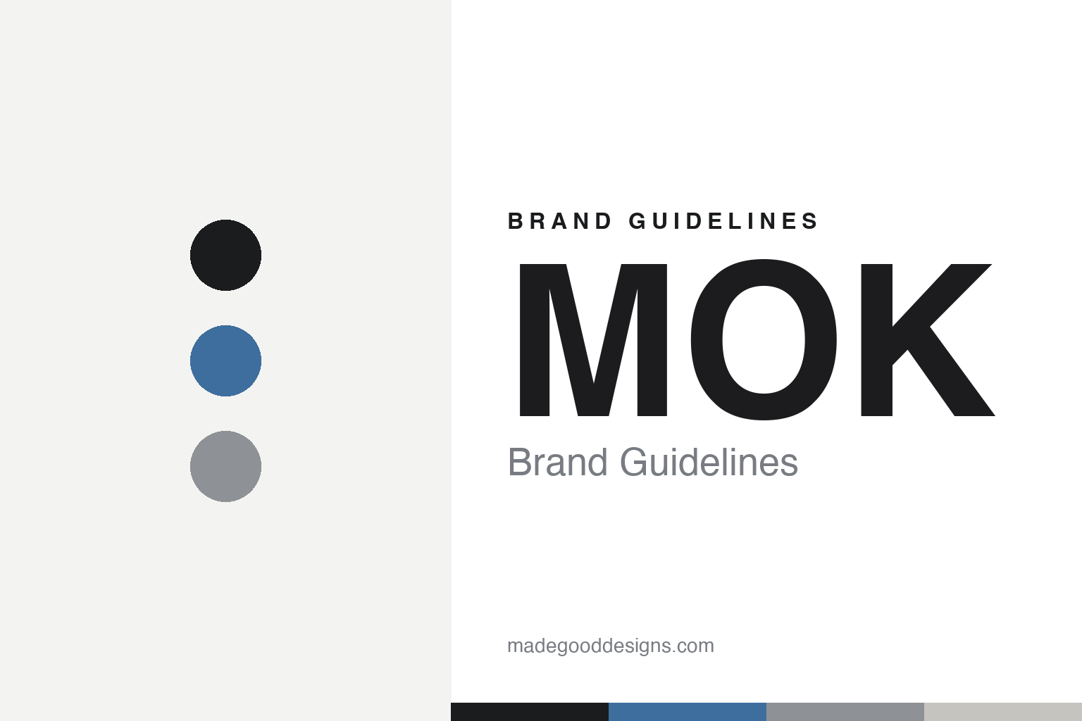
MOK Brand Guidelines
One monogram, three roasts.
Aa
Two constants: a soft-blue-and-ink palette and a clean sans register. Abstract homage — not the MOK monogram.
One monogram, three roasts
MOK’s mark splits into three shapes, one per roast.
MOK is a lesson in a mark that does a job. Founded in 2012 in Leuven by Jens Crabbé (bootstrapped, with no outside investment), it grew into a “godfather” of Belgian specialty coffee, with cafés in Leuven and Brussels and a hi-fi listening bar, MOK Studio, inside the PIAS record-label building.
Its identity is clean, minimalist and modern Belgian, and its cleverness is systematic. The 2016 identity, by Antwerp designer Matthias Deckx, centres on an abstract monogram that works standalone or as a repeating pattern — and, crucially, dissects into three primary shapes mapped to the three roast types: Espresso, Filter and Omni. That shape-per-roast system is the identity’s defining idea. The wordmark is a clear, contemporary sans, and a subtle palette distinguishes single-origin coffees from blends.
(Honest notes: Jens Crabbé is the sole founder (2012) — no co-founders. The designer is Matthias Deckx, an individual in Antwerp — not a “Belgian studio.” The three shapes map to Espresso / Filter / Omni roast — the core story. “MOK” is Dutch for “mug,” which we note rather than assert as a brand statement. And the exact typeface and palette aren’t published, so the tones here are an unofficial interpretation.)
Colour
MOK lives in a soft-blue-and-ink palette. Click a swatch to copy the hex.
MOK’s identity is clean, minimal and calm — an ink, a soft blue, a grey, a stone, and a white. The palette pairs a restrained blue with a near-white base — the register of a disciplined, systematic identity. It signals clarity and calm rather than colour. The honest caveat: with no published brand hex, these tones are an original, unofficial interpretation, not first-party values.
The lesson is a single soft accent on white signals calm, systematic design. MOK’s world is a white ground with one quiet accent and a modular mark. For designers, it is a reminder that a restrained base with a single accent reads as clean and considered — right for a shape-system identity. The takeaways: keep the ground near-white; use one soft accent; build a mark that can flex into a system (three roast shapes); and treat any single hex as unofficial, using ink for small text.
Typography
The register is a clean sans — minimal, precise, systematic.
MOK’s identity carries a minimal, precise, systematic spirit — a modular monogram and a lot of white. A clean sans captures the mood: it is quiet and exact, the register of considered Belgian design. Set in a soft-blue-and-ink palette, the clean sans feels minimal and precise — exactly the personality MOK carries. It is systematic rather than expressive, mirroring a monogram that splits into roast shapes. (MOK’s real monogram is a work we describe but do not reproduce, and the exact typeface is not ours to use.) Because it is not ours to use, the honest description is “a clean sans spirit,” shown here in a stand-in. The type behaves like the brand: minimal, precise and systematic.
Aa
A clean sans spirit — minimal and precise. (Specimen set in Albert Sans, a clean sans STAND-IN; NOT the MOK monogram.)
System as identity
MOK stands for a mark that encodes the roast.
MOK is a lesson in making a system the identity. A soft-blue-and-ink palette, a clean sans and a monogram that splits into three roast shapes make modular design the whole brand — minimal, precise, useful. The system is the differentiator. The differentiator is a shape-per-roast, clean-Belgian identity.
For designers and brand-builders, MOK offers a clear takeaway: build a mark that works. The lessons: design a monogram that can flex (standalone, pattern, three shapes); tie it to something real (Espresso / Filter / Omni roast); keep the palette and type quiet; and let the system carry meaning. It is also a reminder to stay accurate: the founder is Jens Crabbé (sole, 2012), the designer is Matthias Deckx (individual), and the palette here is an unofficial interpretation. MOK made a system the brand — proof that a working mark can be the difference.
Explore & save
Keep MOK’s identity on hand — save it to a board in the Made Good inspiration library.
MOK identity set
Pin the soft-blue-and-ink palette and the clean-sans register to your own board.


