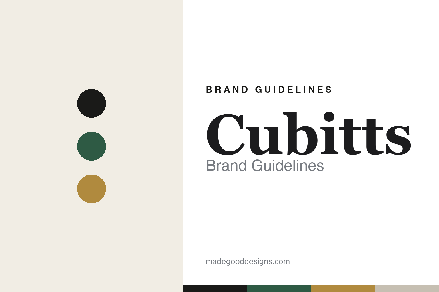
Cubitts Brand Guidelines
A rivet, and a repair.
Aa
Two constants: a heritage-green-and-brass palette and a heritage serif register. Abstract homage — not the Cubitts rivet mark.
A rivet, and a repair
Cubitts built an identity from King’s Cross iron and a fix-for-life ethos.
Cubitts is a lesson in place as identity. Founded in 2013 in London by Tom Broughton — from a kitchen table on Cubitt Street, King’s Cross — it makes spectacles in-house and now runs around twenty shops across the UK and New York. It is founder-led (though it has taken outside growth investment).
Its brand is rooted in King’s Cross history. Cubitts is named after the Cubitt brothers (Thomas, William and Lewis), the 19th-century master builders behind Bloomsbury, Belgravia and King’s Cross. Its logo is a “butterfly rivet” — drawn from the wrought-iron rivets on Lewis Cubitt’s Granary Building, its silhouette split vertically to read as a “K” and an “X” (King’s Cross) — and the same rivet motif is the custom pin that secures the acetate in every frame. Frames are named after King’s Cross streets, and the REDUX ethos offers repairs and lens changes for life, a free “frame rehab” at a year old, and frames made from workshop acetate waste (with recycled frames donated to the Kwale Eye Centre in Kenya).
(Honest notes: it was founded in 2013 (Wikipedia says 2012 — we flag rather than assert). The circular program is “REDUX,” not “Reincarnate.” The identity is in-house/founder-driven — we don’t name a single studio (The Human Half did positioning; Child Studio did some store interiors). And there’s no official brand hex, so these tones are an unofficial interpretation.)
Colour
Cubitts lives in a heritage-green-and-brass palette. Click a swatch to copy the hex.
Cubitts’ identity is refined, British and craft-forward — an ink, a heritage green, a brass, a stone, and a cream. The palette reads like a King’s Cross workshop — muted heritage tones with a brass glint — the register of British heritage-modern design. It signals craft and permanence rather than trend. The honest caveat: with no published brand hex, these tones are an original, unofficial interpretation, not first-party values.
The lesson is muted heritage tones with a brass accent signal craft and permanence. Cubitts’ world is a workshop that repairs for life. For designers, it is a reminder that restrained, place-rooted colour reads as considered and durable — right for a maker that fixes rather than replaces. The takeaways: source the palette from a real place (King’s Cross); keep it muted with one metallic glint; let the making show; and treat any single hex as unofficial, using ink for small text.
Typography
The register is a heritage serif — refined, British, craft-forward.
Cubitts’ identity carries a refined, British, craft-forward spirit — a rivet mark and a workshop. A heritage serif captures the mood: it is considered and characterful, the register of British heritage-modern design. Set in a heritage-green-and-brass palette, the serif feels refined and craft-forward — exactly the personality Cubitts carries. It is considered rather than trend-driven, mirroring frames named for King’s Cross streets. (Cubitts’ real rivet mark and frames are works we describe but do not reproduce, and the exact typeface is not ours to use.) Because it is not ours to use, the honest description is “a heritage serif spirit,” shown here in a stand-in. The type behaves like the brand: refined, British and craft-forward.
Aa
A heritage serif spirit — refined and craft-forward. (Specimen set in Spectral, a heritage serif STAND-IN; NOT the Cubitts identity.)
Place as identity
Cubitts stands for King’s Cross, in a rivet and a repair.
Cubitts is a lesson in making a place the identity. A heritage-green-and-brass palette, a heritage serif and a rivet mark make King’s Cross the whole brand — refined, rooted, durable. The place is the differentiator. The differentiator is a heritage-rooted, made-and-repaired identity.
For designers and brand-builders, Cubitts offers a clear takeaway: root the brand in something real. The lessons: name and mark from a real place (the Cubitts, the Granary rivet); make the mark do double duty (logo and frame pin); name the range from the neighbourhood; and put values into the product (REDUX repair, waste-acetate frames). It is also a reminder to stay accurate: it was founded in 2013, the program is REDUX, and the palette here is an unofficial interpretation. Cubitts made a place the brand — proof that rooted craft can be the difference.
Explore & save
Keep Cubitts’s identity on hand — save it to a board in the Made Good inspiration library.
Cubitts identity set
Pin the heritage-green-and-brass palette and the heritage-serif register to your own board.


