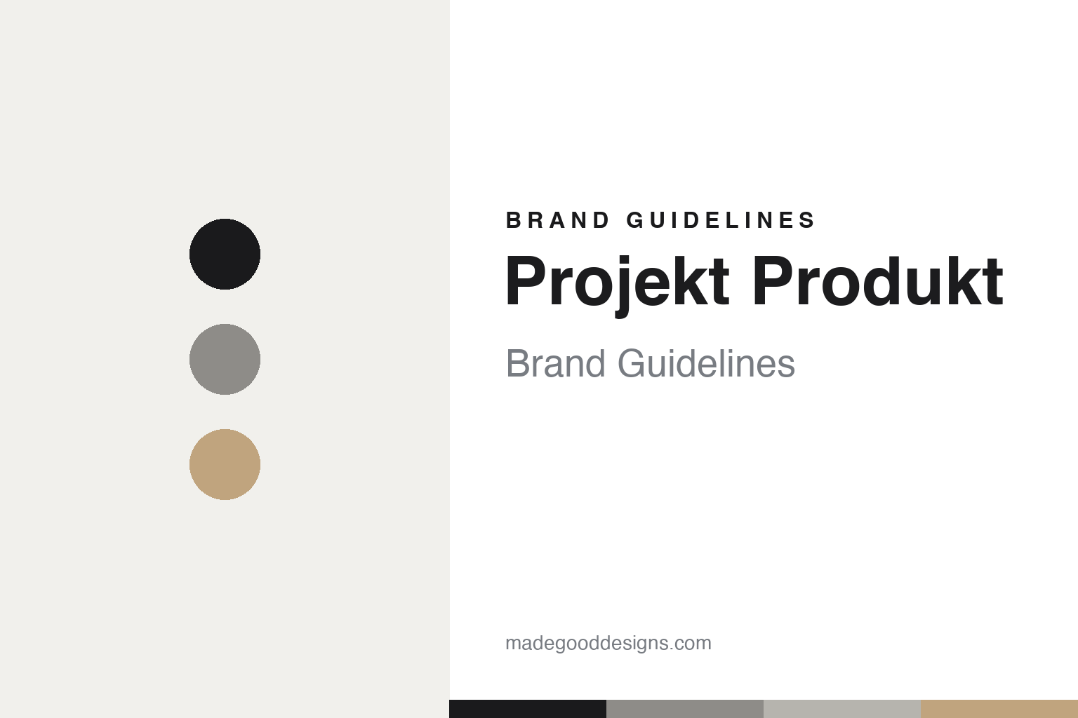
Projekt Produkt Brand Guidelines
The optician’s line.
Aa
Two constants: a stone-and-ink palette and a geometric sans register. Abstract homage — not the Projekt Produkt identity.
The optician’s line
Projekt Produkt built an identity around a proprietary typeface.
Projekt Produkt is a lesson in an identity documented like a spec sheet. Founded in 2014 in Seoul by Lee Hyun-ho, a trained optician, and run by his company LEEHO ITC, it is independent — not part of the Gentle Monster group — with a first flagship from 2017 and stockists across some twenty countries.
Its identity is a fully articulated in-house system. The wordmark is built from “circles and straight lines”; the symbol is two “P”s joined by a slash — the optician’s philosophy crossed with the designer’s sensibility; and there is a proprietary typeface, “PP Sans,” a variable geometric face built from the same straight lines and circles. The philosophy is “Modern, Minimal, Classy, Wearable,” and the gallery-like flagship (polished concrete, brick) was designed by Kunsik Choi.
(Honest notes: Projekt Produkt is independent (LEEHO ITC) — not affiliated with Gentle Monster, IICOMBINED or Tamburins. It was founded in 2014 by optician Lee Hyun-ho. “PP Sans” is a proprietary typeface — we don’t credit an external foundry — and Kunsik Choi designed the store, not the graphic identity. There’s no official brand hex, so these tones are an unofficial interpretation.)
Colour
Projekt Produkt lives in a stone-and-ink palette. Click a swatch to copy the hex.
Projekt Produkt’s identity is minimal, refined and gallery-like — an ink, a stone, a concrete, a warm wood, and a chalk. The palette pairs neutral stone and concrete with a warm wood — the register of a quiet, architectural optical brand. It signals refinement and calm rather than colour. The honest caveat: with no published brand hex, these tones are an original, unofficial interpretation, not first-party values.
The lesson is neutral stone with warm wood signals refined, gallery minimalism. Projekt Produkt’s world is a concrete room with one warm note. For designers, it is a reminder that a tonal, architectural palette reads as considered and premium — right for an optician’s exacting brand. The takeaways: keep the palette neutral and tonal; add one warm material note (wood); build the identity like a system (wordmark, monogram, typeface); and treat any single hex as unofficial.
Typography
The register is a geometric sans — minimal, exact, systematic.
Projekt Produkt’s identity carries a minimal, exact, systematic spirit — a proprietary typeface and a slash monogram. A geometric sans captures the mood: it is precise and quiet, the register of an architectural optical brand. Set in a stone-and-ink palette, the geometric sans feels minimal and exact — exactly the personality Projekt Produkt carries. It is systematic rather than expressive, mirroring a wordmark built from circles and lines. (Projekt Produkt’s real “PP Sans” typeface and monogram are works we describe but do not reproduce.) Because it is not ours to use, the honest description is “a geometric sans spirit,” shown here in a stand-in. The type behaves like the brand: minimal, exact and systematic.
Aa
A geometric sans spirit — minimal and exact. (Specimen set in Instrument Sans, a geometric sans STAND-IN; NOT the Projekt Produkt “PP Sans” typeface.)
System as identity
Projekt Produkt stands for an optician’s exact, built system.
Projekt Produkt is a lesson in making a built system the identity. A stone-and-ink palette, a geometric sans and a proprietary typeface make exact, architectural minimalism the whole brand — refined, systematic, coherent. The system is the differentiator. The differentiator is an optician-founded, fully-built identity.
For designers and brand-builders, Projekt Produkt offers a clear takeaway: build the identity like a product. The lessons: design a wordmark from a rule (circles and lines); give the brand a monogram with meaning (optician × designer); commission a proprietary typeface (PP Sans); and hold a calm, architectural palette. It is also a reminder to stay accurate: it’s independent (not Gentle Monster), optician-founded in 2014, and the palette here is an unofficial interpretation. Projekt Produkt made a built system the brand — proof that rigour can be the difference.
Explore & save
Keep Projekt Produkt’s identity on hand — save it to a board in the Made Good inspiration library.
Projekt Produkt identity set
Pin the stone-and-ink palette and the geometric-sans register to your own board.


