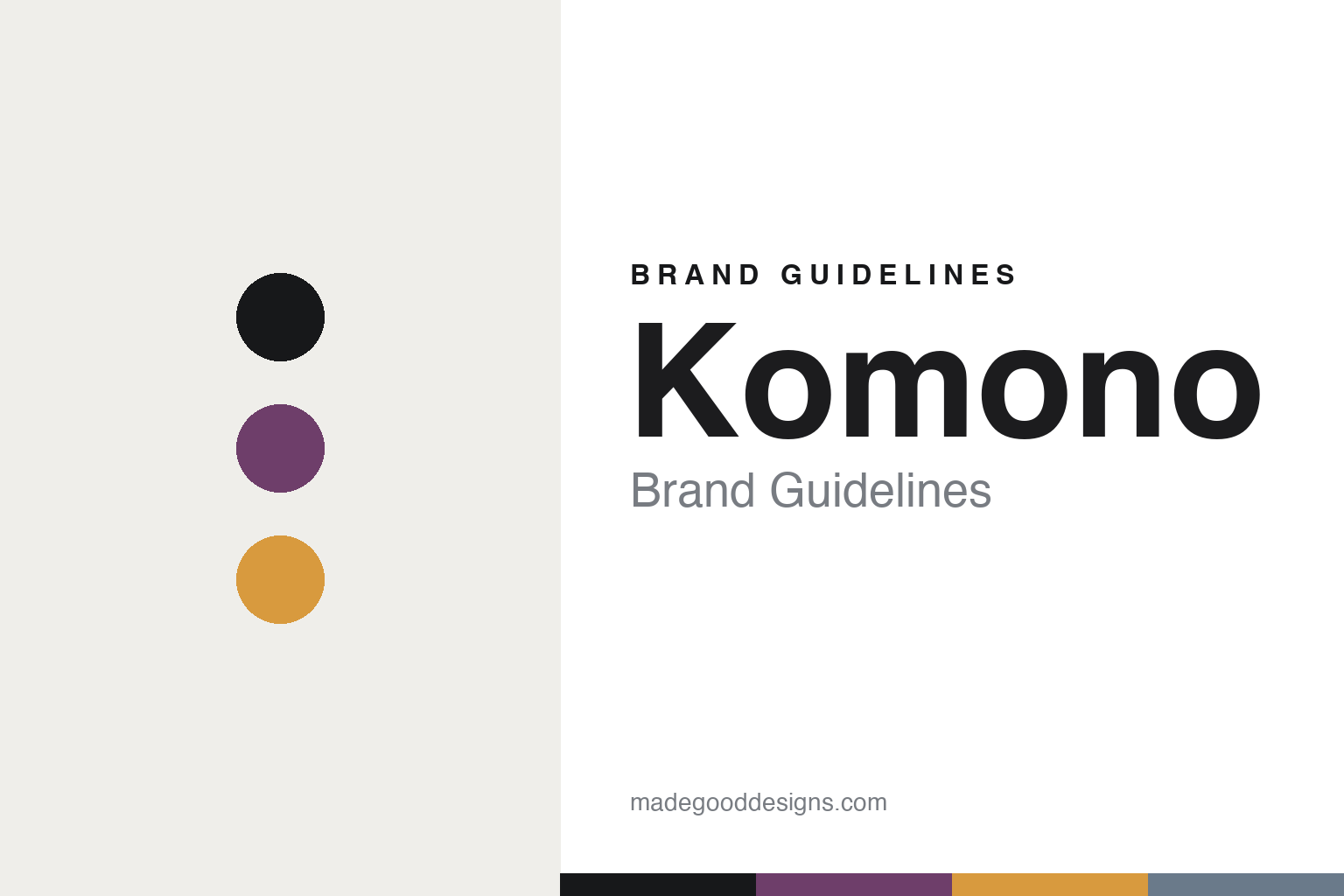
Komono Brand Guidelines
Antwerp, made accessible.
Aa
Two constants: a plum-and-amber palette and a modern sans register. Abstract homage — not the Komono identity.
Antwerp, made accessible
Komono brings avant-garde design to an accessible price.
Komono is a lesson in avant-garde, made accessible. Founded in 2009 in Antwerp by Anton Janssens and Raf Maes — former pro snowboarders with a decade in fashion distribution — it is an independent, founder-driven brand of watches, sunglasses and accessories, with no parent group and no outside investment.
Its identity is rooted in Antwerp’s fashion culture: an accessible, “affordable-luxury” take on avant-garde design, carried by a clean “KOMONO” wordmark and a “surprising colour palette.” The strongest thread for a design read is its named-designer collaborations — including Antwerp Six legend Walter Van Beirendonck, plus Maximilian Raynor and Tom Eerebout — which plug a mass-accessible brand into serious fashion authorship.
(Honest notes: Komono’s founders are Anton Janssens and Raf Maes (2009, Antwerp), and it’s independent with no outside investment. The name “Komono” is Japanese for “small article.” No house typeface or official palette hex is published, so we describe the wordmark from what’s observable and the tones here are a qualitative, unofficial interpretation.)
Colour
Komono lives in a plum-and-amber palette. Click a swatch to copy the hex.
Komono’s identity is confident, modern and surprising — an ink, a plum, an amber, a slate, and a chalk. The palette pairs an unexpected plum with a warm amber — the register of accessible avant-garde. It signals character and confidence rather than caution. The honest caveat: with no published brand hex, these tones are an original, unofficial interpretation, not first-party values.
The lesson is an unexpected plum with warm amber signals accessible avant-garde. Komono’s world is a surprising palette at an easy price. For designers, it is a reminder that a slightly unexpected colour pairing reads as characterful and modern — right for a brand that democratises design. The takeaways: pick a “surprising” hue (plum); warm it with an accent (amber); keep the wordmark clean; borrow authorship through collaborations; and treat any single hex as unofficial.
Typography
The register is a modern sans — clean, confident, accessible.
Komono’s identity carries a clean, confident, accessible spirit — a surprising palette and a clean wordmark. A modern sans captures the mood: it is contemporary and unfussy, the register of accessible design. Set in a plum-and-amber palette, the modern sans feels clean and confident — exactly the personality Komono carries. It is accessible rather than exclusive, mirroring avant-garde made affordable. (Komono’s real wordmark is a work we describe but do not reproduce, and no house typeface is published.) Because it is not ours to use, the honest description is “a modern sans spirit,” shown here in a stand-in. The type behaves like the brand: clean, confident and accessible.
Aa
A modern sans spirit — clean and confident. (Specimen set in Onest, a modern sans STAND-IN; NOT the Komono wordmark.)
Access as identity
Komono stands for avant-garde within reach.
Komono is a lesson in making access the identity. A plum-and-amber palette, a modern sans and designer collaborations make accessible avant-garde the whole brand — clean, confident, surprising. The access is the differentiator. The differentiator is an affordable-luxury, Antwerp identity.
For designers and brand-builders, Komono offers a clear takeaway: democratise design without dropping it. The lessons: root the brand in a real design city (Antwerp); keep the wordmark clean and the palette surprising; and borrow authorship through named collaborations (Walter Van Beirendonck). It is also a reminder to stay accurate: the founders are Janssens and Maes (2009), it’s independent, and the palette here is an unofficial interpretation. Komono made access the brand — proof that reachable design can be the difference.
Explore & save
Keep Komono’s identity on hand — save it to a board in the Made Good inspiration library.
Komono identity set
Pin the plum-and-amber palette and the modern-sans register to your own board.


