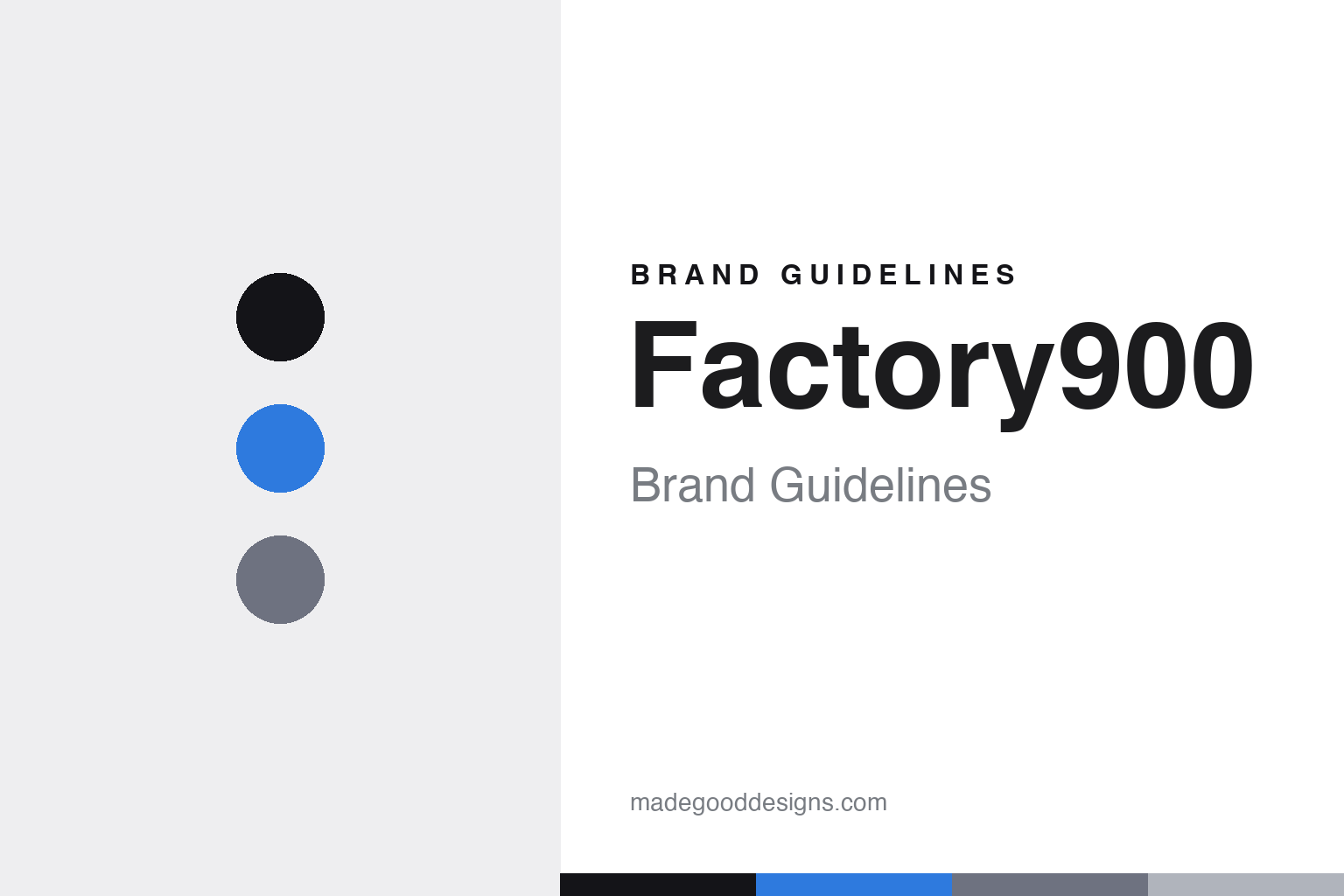
Factory900 Brand Guidelines
The future eyewear.
Aa
Two constants: an electric-blue-and-steel palette and a technical sans register. Abstract homage — not the Factory900 frames.
The future eyewear
Factory900 pushes acetate to sculptural extremes.
Factory900 is a lesson in form as identity. Launched in 2000 as the independent house brand of Aoyama Optical — a third-generation family factory in Sabae, Fukui — under the concept “THE FUTURE EYEWEAR,” it is designed by Yoshinori Aoyama (born 1972). The “900” is the factory’s official registration number.
Its identity is its form language: bold, sculptural, avant-garde acetate that pushes the material to structural extremes — oversized, layered 3-D shapes with deep beveling, made entirely in-house in Sabae. The frames are less accessories than wearable sculpture, and the design has the awards to match: two Silmo d’Or wins (Paris), an iF Design Award, and a run of Japanese “Eyewear of the Year” honours.
(Honest notes: Factory900 is the independent house brand of Aoyama Optical — not part of Japan Eyewear Holdings (that’s Kaneko and 999.9). The designer is Yoshinori Aoyama, and “900” is the factory’s registration number. The identity is form-driven — no official palette or external logo studio is documented — so the tones here are a qualitative, unofficial interpretation.)
Colour
Factory900 lives in an electric-blue-and-steel palette. Click a swatch to copy the hex.
Factory900’s identity is bold, futuristic and structural — an ink, an electric blue, a steel, a silver, and a chalk. The palette pairs an electric blue with cool steel — the register of “future eyewear.” It signals engineering and sculpture rather than nostalgia. The honest caveat: with no published brand hex, these tones are an original, unofficial interpretation, not first-party values.
The lesson is an electric blue on cool steel signals futuristic, structural design. Factory900’s world is a sculpted form under cool light. For designers, it is a reminder that a cool, technical palette reads as forward and engineered — right for radically sculptural frames. The takeaways: let the form lead; keep the palette cool and technical; add one electric accent; and treat any single hex as unofficial.
Typography
The register is a technical sans — bold, engineered, futuristic.
Factory900’s identity carries a bold, engineered, futuristic spirit — sculptural form and cool precision. A technical sans captures the mood: it is angular and modern, the register of “future eyewear.” Set in an electric-blue-and-steel palette, the technical sans feels bold and engineered — exactly the personality Factory900 carries. It is futuristic rather than nostalgic, mirroring radically sculpted frames. (Factory900’s real frames are works we describe but do not reproduce, and the exact typeface is not ours to use.) Because it is not ours to use, the honest description is “a technical sans spirit,” shown here in a stand-in. The type behaves like the brand: bold, engineered and futuristic.
Aa
A technical sans spirit — bold and engineered. (Specimen set in Chakra Petch, a technical sans STAND-IN; NOT the Factory900 identity.)
Form as identity
Factory900 stands for acetate pushed to sculpture.
Factory900 is a lesson in making form the identity. An electric-blue-and-steel palette, a technical sans and sculptural acetate make radical form the whole brand — bold, futuristic, unmistakable. The form is the differentiator. The differentiator is a sculptural, future-eyewear identity.
For designers and brand-builders, Factory900 offers a clear takeaway: let the object be the logo. The lessons: commit to a radical form language (deep-beveled, layered 3-D); make it in-house at real depth (Sabae craft); and let awards validate it (Silmo d’Or, iF). It is also a reminder to stay accurate: it’s the independent house brand of Aoyama Optical (not JEH), designed by Yoshinori Aoyama, and the palette here is an unofficial interpretation. Factory900 made form the brand — proof that a shape can be the difference.
Explore & save
Keep Factory900’s identity on hand — save it to a board in the Made Good inspiration library.
Factory900 identity set
Pin the electric-blue-and-steel palette and the technical-sans register to your own board.


