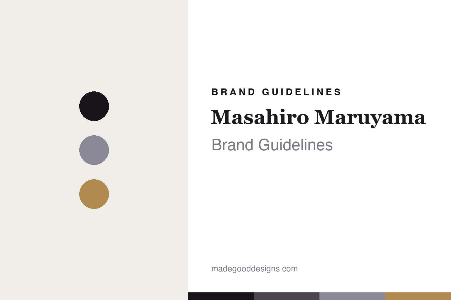
Masahiro Maruyama Brand Guidelines
Beauty in the incomplete.
Aa
Two constants: an ink-and-amber palette and an artful serif register. Abstract homage — not the MM frames.
Beauty in the incomplete
Masahiro Maruyama built a brand on deliberate imperfection.
Masahiro Maruyama is a lesson in a single, uncompromising idea. Founded in 2011 by the designer Masahiro Maruyama — whose name is the brand — after he began carving frames he couldn’t find elsewhere, it is an independent, designer-led house whose frames are made in Sabae, Fukui, Japan’s eyewear town.
Its identity is a coherent design philosophy: “unfinished art.” The frames find beauty in the incomplete — deliberate, subtle asymmetry, broken lines, single-drop temples, and details that look “broken and pieced back together.” Crucially, that idea is a system: four named collections, each a distinct construction method — Erase, Broken, Straight and Dessin — executed by Sabae artisans. The brand is the designer’s vision, unmediated.
(Honest notes: unlike Kaneko Optical and 999.9 — both subsidiaries of the listed Japan Eyewear Holdings — Masahiro Maruyama is genuinely independent and designer-led. The designer himself is the author; no external graphic or branding studio is documented. The identity is conceptual and product-led — thin on documented logo or palette — so the tones here are a qualitative, unofficial interpretation.)
Colour
Masahiro Maruyama lives in an ink-and-amber palette. Click a swatch to copy the hex.
Masahiro Maruyama’s identity is artful, restrained and sculptural — an ink, a charcoal, a slate, an amber, and a chalk. The palette is a near-monochrome warmed by one amber — the register of a gallery object, not a fashion label. It signals art and craft rather than colour. The honest caveat: with no published brand hex, these tones are an original, unofficial interpretation, not first-party values.
The lesson is a near-monochrome warmed by one accent signals sculptural, artful restraint. Masahiro Maruyama’s world is a broken line on a quiet ground. For designers, it is a reminder that a spare, tonal palette with a single warm accent reads as considered and artful — right for frames treated as sculpture. The takeaways: keep the palette near-monochrome; add one warm accent; let the object’s form carry the drama; and treat any single hex as unofficial.
Typography
The register is an artful serif — sculptural, considered, incomplete.
Masahiro Maruyama’s identity carries an artful, considered, sculptural spirit — a broken line and a quiet ground. An artful serif captures the mood: it is expressive and refined, the register of a gallery object. Set in an ink-and-amber palette, the artful serif feels sculptural and considered — exactly the personality Masahiro Maruyama carries. It is artful rather than commercial, mirroring frames built on deliberate imperfection. (Masahiro Maruyama’s real frames are works we describe but do not reproduce, and the exact typeface is not ours to use.) Because it is not ours to use, the honest description is “an artful serif spirit,” shown here in a stand-in. The type behaves like the brand: sculptural, considered and incomplete.
Aa
An artful serif spirit — sculptural and considered. (Specimen set in Instrument Serif, an artful serif STAND-IN; NOT the MM identity.)
Imperfection as identity
Masahiro Maruyama stands for the beauty of the incomplete.
Masahiro Maruyama is a lesson in making an idea the identity. An ink-and-amber palette, an artful serif and broken-line frames make “unfinished art” the whole brand — sculptural, considered, singular. The idea is the differentiator. The differentiator is a conceptual, imperfection-first identity.
For designers and brand-builders, Masahiro Maruyama offers a clear takeaway: commit to one idea completely. The lessons: find a single philosophy (beauty in the incomplete); turn it into a system (Erase / Broken / Straight / Dessin); and let the product carry it without dilution. It is also a reminder to stay accurate: it’s independent (unlike the Japan Eyewear Holdings brands), designer-led, and the palette here is an unofficial interpretation. Masahiro Maruyama made imperfection the brand — proof that one idea can be the difference.
Explore & save
Keep Masahiro Maruyama’s identity on hand — save it to a board in the Made Good inspiration library.
Masahiro Maruyama identity set
Pin the ink-and-amber palette and the artful-serif register to your own board.


