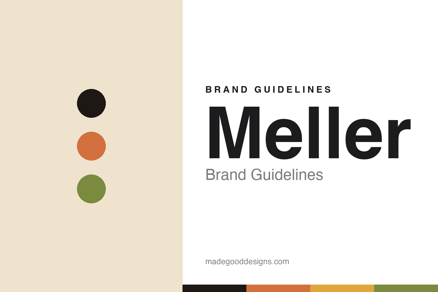
Meller Brand Guidelines
The chameleon.
Aa
Two constants: a terracotta-and-olive palette and a warm sans register. Abstract homage — not the Meller identity.
The chameleon
Meller took its colour cue from a colour-shifting animal.
Meller is a lesson in a metaphor made palette. Founded in 2014 in Barcelona by four friends — Sergi Benet, Borja Nadal, Marco Grandi and Chris Erthel — it is an independent, bootstrapped accessories brand spanning eyewear, watches and jewellery.
Its identity has a genuine conceptual spine: the brand is named after Meller’s chameleon (Chamaeleo melleri, a large African species) — the colour-shifting animal as the metaphor for a warm, ever-changing palette. That idea runs through everything: a vibrant, earthy, multi-tone colourway system (named tones like Tigris, Camel, Olive, Kakao), patterned frames, and an African-style model-naming convention — Kubu, Nayah, Dashi, Oba, Lebo. A “Bio-Based” sustainability sub-line and recycled packaging round it out.
(Honest notes: Meller has four founders (2014, Barcelona) and is independent and bootstrapped. The chameleon/Africa origin is documented in press rather than restated on the current About page, so we present it as reported. There’s no external design agency and no official brand hex, so these warm tones are a qualitative, unofficial interpretation.)
Colour
Meller lives in a terracotta-and-olive palette. Click a swatch to copy the hex.
Meller’s identity is warm, earthy and multi-tone — an ink, a terracotta, an olive, an ochre, and a sand. The palette is a vibrant, sun-warmed spread — the register of a colour-shifting, Africa-inspired brand. It signals warmth and versatility rather than restraint. The honest caveat: with no published brand hex, these tones are an original, unofficial interpretation, not first-party values.
The lesson is a warm, multi-tone palette signals a colour-shifting, sun-warmed brand. Meller’s world is a chameleon’s spectrum. For designers, it is a reminder that earthy, versatile colour reads as warm and adaptable — right for a brand built on a colour-shifting metaphor. The takeaways: build the palette from the concept (the chameleon); name your colourways and models with a theme (African tones and cities); keep it warm and earthy; and treat any single hex as unofficial.
Typography
The register is a warm sans — friendly, earthy, versatile.
Meller’s identity carries a friendly, earthy, versatile spirit — a warm palette and a colour-shifting idea. A warm sans captures the mood: it is approachable and rounded, the register of an accessible, sun-warmed brand. Set in a terracotta-and-olive palette, the warm sans feels friendly and earthy — exactly the personality Meller carries. It is versatile rather than austere, mirroring an ever-changing colour range. (Meller’s real wordmark is a work we describe but do not reproduce, and the exact typeface is not ours to use.) Because it is not ours to use, the honest description is “a warm sans spirit,” shown here in a stand-in. The type behaves like the brand: friendly, earthy and versatile.
Aa
A warm sans spirit — friendly and earthy. (Specimen set in Baloo 2, a warm sans STAND-IN; NOT the Meller wordmark.)
Metaphor as identity
Meller stands for a colour-shifting animal made brand.
Meller is a lesson in making a metaphor the identity. A terracotta-and-olive palette, a warm sans and a chameleon namesake make colour-shifting warmth the whole brand — earthy, versatile, sunny. The metaphor is the differentiator. The differentiator is a chameleon-named, colour-forward identity.
For designers and brand-builders, Meller offers a clear takeaway: let a metaphor organise the palette. The lessons: name the brand from a real idea (the chameleon); build the colour system around it; theme the model names (African cities); and add substance (a bio sub-line). It is also a reminder to stay accurate: there are four founders, the chameleon origin is press-documented, and the palette here is an unofficial interpretation. Meller made a metaphor the brand — proof that a good idea can be the difference.
Explore & save
Keep Meller’s identity on hand — save it to a board in the Made Good inspiration library.
Meller identity set
Pin the terracotta-and-olive palette and the warm-sans register to your own board.


