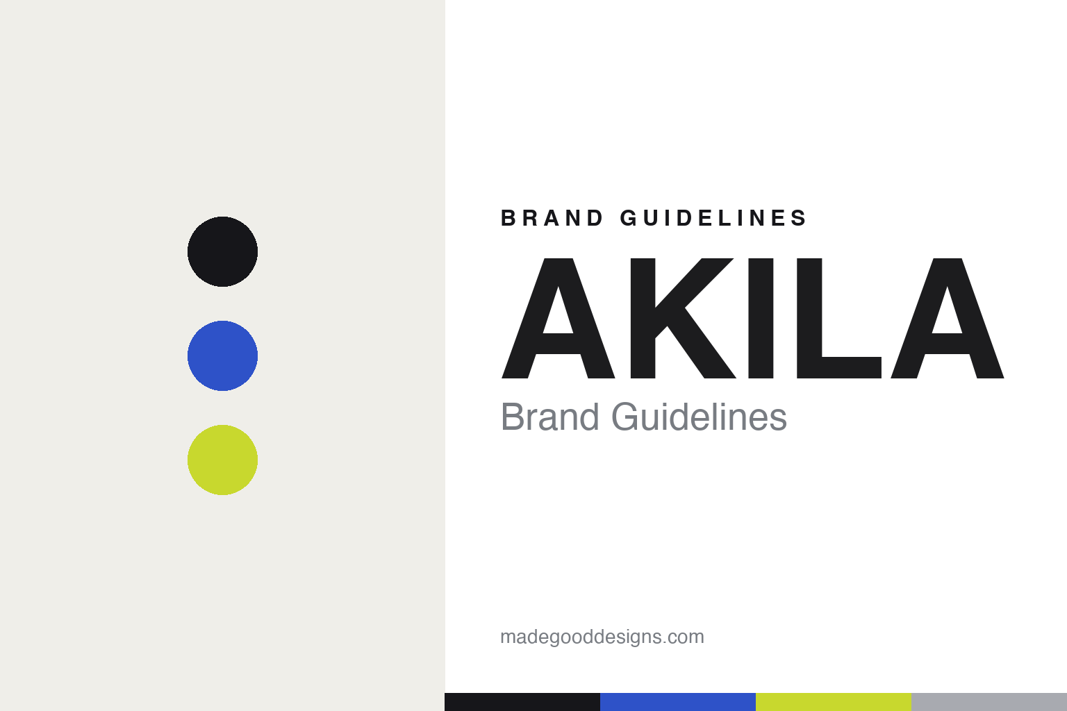
AKILA Brand Guidelines
Letters first.
Aa
Two constants: a cobalt-and-acid palette and a display sans register. Abstract homage — not the AKILA wordmark.
Letters first
AKILA made typography, not the frame, the front of the brand.
AKILA is a lesson in a lettering-led identity. Founded around 2016–2018 and led by creative director Chris Mart — with a background in streetwear and, the brand says, “typography and lettering design” — it is an independent Los Angeles eyewear label with flagships on Sunset (in a restored 1932 Art Deco building) and Ludlow Street, New York.
Its identity is typography-led: a distinctive “AKILA” wordmark anchors a bold, city-inspired, 90s/Y2K streetwear art direction, covered widely by design and streetwear press. The frames are handmade in limited runs, and the sustainability spec is concrete — plant-based cellulose acetate, Tritan Renew lenses (50% recycled), plastic-free biodegradable packaging, and 1% for the Planet membership.
(Honest notes: the founding year is contested (2016 vs 2018) — we hedge it. Chris Mart is the named principal; “a creative collective” is the brand’s own framing. AKILA sells a model literally named “Logos” — that’s a product name, not the brand’s logo. The identity is in-house (no external branding studio), and there’s no official brand hex, so these tones are an unofficial interpretation.)
Colour
AKILA lives in a cobalt-and-acid palette. Click a swatch to copy the hex.
AKILA’s identity is bold, urban and graphic — an ink, a cobalt, an acid, a silver, and a cream. The palette pairs a cobalt with an acid-green pop — the register of Y2K streetwear graphics. It signals energy and edge rather than restraint. The honest caveat: with no published brand hex, these tones are an original, unofficial interpretation, not first-party values.
The lesson is a cobalt with an acid pop signals bold, Y2K graphic energy. AKILA’s world is a wordmark shouting off a lookbook. For designers, it is a reminder that strong colour under strong type reads as urban and current — right for a lettering-led brand. The takeaways: lead with type; pick a bold accent and one loud pop; keep the base ink; and — because bright hues fail as small text — keep type dark and let colour fill the fields; treat any single hex as unofficial.
Typography
The register is a display sans — bold, graphic, lettering-led.
AKILA’s identity carries a bold, graphic, lettering-led spirit — a wordmark and a lookbook. A display sans captures the mood: it is loud and confident, the register of Y2K streetwear. Set in a cobalt-and-acid palette, the display sans feels bold and graphic — exactly the personality AKILA carries. It is lettering-led rather than quiet, mirroring a type-forward identity. (AKILA’s real wordmark is a work we describe but do not reproduce, and the exact letterforms are not ours to use.) Because they are not ours to use, the honest description is “a display sans spirit,” shown here in a stand-in. The type behaves like the brand: bold, graphic and lettering-led.
Aa
A display sans spirit — bold and graphic. (Specimen set in Unbounded, a display sans STAND-IN; NOT the AKILA wordmark.)
Type as identity
AKILA stands for letters doing the heavy lifting.
AKILA is a lesson in making type the identity. A cobalt-and-acid palette, a display sans and a strong wordmark make lettering the whole brand — bold, urban, current. The type is the differentiator. The differentiator is a typography-led, Y2K-streetwear identity.
For designers and brand-builders, AKILA offers a clear takeaway: let the wordmark carry the brand. The lessons: lead with lettering; build a bold, city-referencing art direction; and back it with concrete substance (recycled lenses, biodegradable packaging). It is also a reminder to stay accurate: the year is best hedged, Chris Mart is the named principal, and the palette here is an unofficial interpretation. AKILA made type the brand — proof that letters can be the difference.
Explore & save
Keep AKILA’s identity on hand — save it to a board in the Made Good inspiration library.
AKILA identity set
Pin the cobalt-and-acid palette and the display-sans register to your own board.


