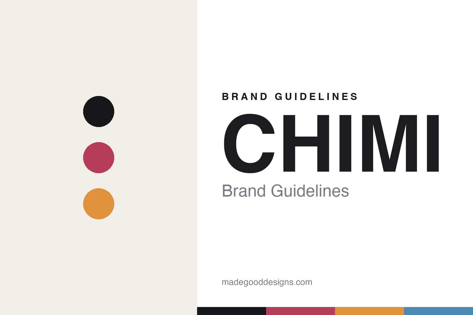
CHIMI Brand Guidelines
Numbered, and named.
Aa
Two constants: a berry-and-noir palette and a Nordic grotesque register. Abstract homage — not the CHIMI identity.
Numbered, and named
CHIMI codes its shapes by number and its colours by name.
CHIMI is a lesson in a clean system, warmly coloured. Founded in 2016 in Stockholm by childhood friends Daniel Djurdjevic and Charlie Lindström, it is a DTC “Swedish fashion house” that grew from colour-forward sunglasses into ready-to-wear, with flagships from Stockholm to New York. It is founder-controlled, with a minority investor (Eequity).
Its identity is affordable-luxury Scandinavian minimalism, designed since inception by Stockholm studio Nineties Studio — the naming, the minimalist wordmark, the premium “unbox slowly” packaging (a puffer eyewear case), and the retail. Its cleverness is a coding system: the numbers (#001, #002, #003…) denote the frame shape, while the colours are given names — Berry, Coco, Ginger, Kiwi, Noir. So a quiet, high-contrast wordmark carries the brand while the acetate ranges supply the colour.
(Honest notes: the founders are a duo (not a trio, not “Ax”). CHIMI is founder-controlled with a minority Eequity stake — not acquired. Crucially, the numbers are shape/model codes, and the colours are named — a common mix-up. The identity is by Nineties Studio (the NYC store is a separate CAMPUS project). And there’s no official brand hex, so these tones are an unofficial interpretation.)
Colour
CHIMI lives in a berry-and-noir palette. Click a swatch to copy the hex.
CHIMI’s identity is clean, colour-forward and confident — a noir, a berry, an amber, a sky, and a cream. The palette pairs a minimal noir base with named, fruit-bright acetate tones — the register of Scandi minimalism where the colour comes from the frames. It signals accessible luxury rather than austerity. The honest caveat: with no published brand hex, these tones are an original, unofficial interpretation, not first-party values.
The lesson is a minimal base plus named brights signals colour-forward minimalism. CHIMI’s world is a quiet wordmark and loud acetate. For designers, it is a reminder that a restrained identity can carry vivid, named colour without losing discipline — right for a DTC fashion house. The takeaways: keep the wordmark minimal; let named colours do the talking; code shape by number and colour by name; and treat any single hex as unofficial.
Typography
The register is a Nordic grotesque — clean, minimal, confident.
CHIMI’s identity carries a clean, minimal, confident spirit — a quiet wordmark and vivid frames. A Nordic grotesque captures the mood: it is orderly and understated, the register of Scandinavian minimalism. Set in a berry-and-noir palette, the Nordic grotesque feels clean and confident — exactly the personality CHIMI carries. It is minimal rather than loud, letting the colour come from the acetate. (CHIMI’s real wordmark is a work we describe but do not reproduce, and the exact typeface is not ours to use.) Because it is not ours to use, the honest description is “a Nordic grotesque spirit,” shown here in a stand-in. The type behaves like the brand: clean, minimal and confident.
Aa
A Nordic grotesque spirit — clean and confident. (Specimen set in Familjen Grotesk, a Nordic grotesque STAND-IN; NOT the CHIMI wordmark.)
System as identity
CHIMI stands for numbered shapes and named colours.
CHIMI is a lesson in making a system the identity. A berry-and-noir palette, a Nordic grotesque and a number-and-name code make clean colour the whole brand — minimal, confident, accessible. The system is the differentiator. The differentiator is a numbered-shape, named-colour, Scandi-DTC identity.
For designers and brand-builders, CHIMI offers a clear takeaway: a clean system can carry loud colour. The lessons: keep the wordmark minimal (it works in streetwear or luxury contexts); code shape by number; name your colours; and let a design studio (Nineties Studio) hold it together. It is also a reminder to stay accurate: it’s founder-controlled with a minority investor, the numbers are shapes, and the palette here is an unofficial interpretation. CHIMI made a system the brand — proof that clean coding can be the difference.
Explore & save
Keep CHIMI’s identity on hand — save it to a board in the Made Good inspiration library.
CHIMI identity set
Pin the berry-and-noir palette and the Nordic-grotesque register to your own board.


