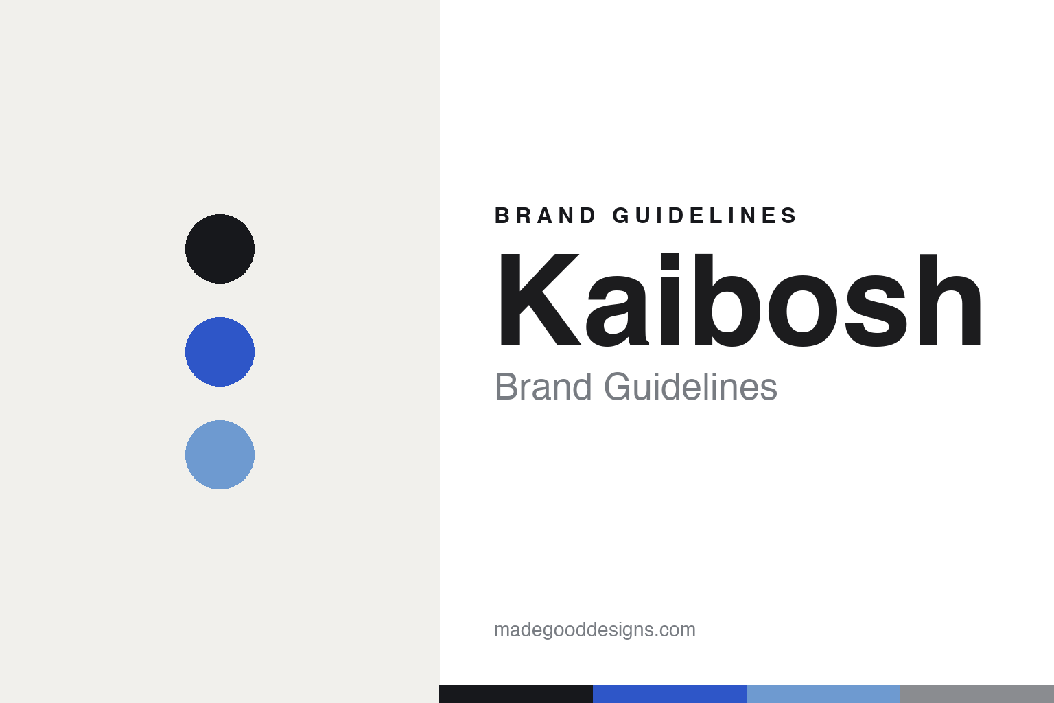
Kaibosh Brand Guidelines
An eye chart, in a brand.
Aa
Two constants: a bold-blue palette and a technical sans register. Abstract homage — not the Kaibosh identity.
An eye chart, in a brand
Kaibosh turned the optician’s eye chart into an identity.
Kaibosh is a lesson in borrowing from the optician. Founded in 2013 in Bergen, Norway by Helge Flo and Michelle Rowley, it designs its frames in-house with a “Scandinavian DNA,” with stores in Norway, Denmark and Poland.
Its identity is a well-published 2017 rebrand by the Stockholm studio Snask (with credited designer Jens Nilsson). The brief kept the existing Kaibosh logotype and refreshed everything else: a custom typeface named “Sentrum,” two eyelashes used as a distinguishing symbol, an eye icon, and — the clever move — bags and signage that reference eye-test charts, with lines of type in decreasing sizes. Snask handled ads, bags, packaging, signage and the Copenhagen flagship interior, all anchored by a signature bold blue.
(Honest notes: Kaibosh was founded in Bergen in 2013 — not Oslo, and not 2005. Its identity is by Snask, a Stockholm (Swedish) studio — so it’s a Norwegian brand with a Swedish design studio. The custom typeface is “Sentrum.” The name’s meaning isn’t documented, so we don’t assert one. And there’s no official brand hex, so the bold blue here is an unofficial interpretation.)
Colour
Kaibosh lives in a bold-blue palette. Click a swatch to copy the hex.
Kaibosh’s identity is bold, clean and clever — an ink, a bold blue, a sky, a grey, and a cream. The palette leads with a single confident blue — the register of a witty, optician-inspired identity. It signals clarity and confidence rather than nostalgia. The honest caveat: with no published brand hex, these tones are an original, unofficial interpretation, not first-party values.
The lesson is one bold blue signals clean, confident wit. Kaibosh’s world is an eye chart rendered as branding. For designers, it is a reminder that a single strong accent on a clean base reads as confident and modern — right for an identity that plays on the eye test. The takeaways: own one bold colour; borrow a real idea (the eye chart); build a distinguishing symbol (two eyelashes); and treat any single hex as unofficial, using ink for small text.
Typography
The register is a technical sans — clean, modern, systematic.
Kaibosh’s identity carries a clean, modern, systematic spirit — an eye chart and a bold blue. A technical sans captures the mood: it is exact and contemporary, the register of a witty, systematic identity. Set in a bold-blue palette, the technical sans feels clean and systematic — exactly the personality Kaibosh carries. It is precise rather than nostalgic, mirroring eye-test-chart typography. (Kaibosh’s real identity and its “Sentrum” typeface are works we describe but do not reproduce.) Because it is not ours to use, the honest description is “a technical sans spirit,” shown here in a stand-in. The type behaves like the brand: clean, modern and systematic.
Aa
A technical sans spirit — clean and systematic. (Specimen set in Space Grotesk, a technical sans STAND-IN; NOT the Kaibosh “Sentrum” typeface.)
Wit as identity
Kaibosh stands for the eye chart, turned into a brand.
Kaibosh is a lesson in making wit the identity. A bold-blue palette, a technical sans and eye-chart typography make a clever idea the whole brand — clean, confident, memorable. The wit is the differentiator. The differentiator is an optician-inspired, eye-chart identity.
For designers and brand-builders, Kaibosh offers a clear takeaway: borrow the category’s own language. The lessons: take a real artifact (the eye chart) and make it branding; own one bold colour; build a distinguishing symbol (two eyelashes); and commission a studio that can hold it (Snask, with a custom “Sentrum” typeface). It is also a reminder to stay accurate: it’s Bergen-founded (2013), the studio is Swedish, and the palette here is an unofficial interpretation. Kaibosh made wit the brand — proof that a clever borrow can be the difference.
Explore & save
Keep Kaibosh’s identity on hand — save it to a board in the Made Good inspiration library.
Kaibosh identity set
Pin the bold-blue palette and the technical-sans register to your own board.


