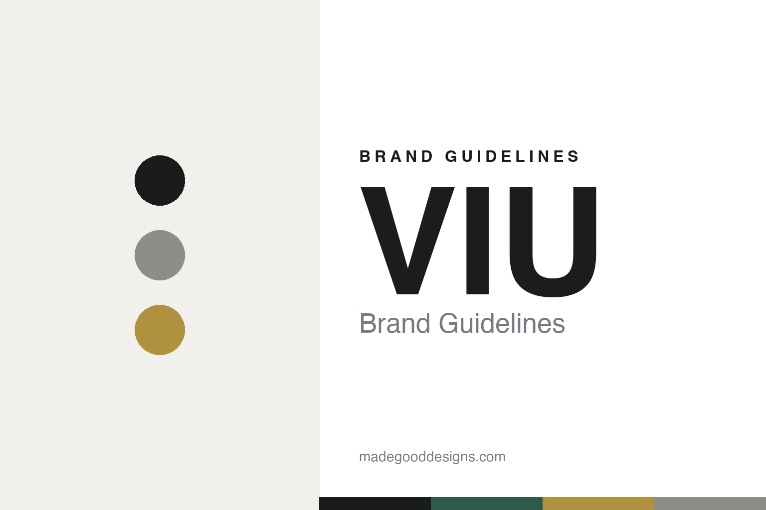
VIU Brand Guidelines
Concrete, and brass.
Aa
Two constants: a marble-green-and-brass palette and a clean sans register. Abstract homage — not the VIU identity.
Concrete, and brass
VIU designs its frames and its gallery-like stores in-house.
VIU is a lesson in Swiss minimalism, made total. Founded in 2013 in Zurich by a group of five owners — including CEO Kilian Wagner and creatives Fabrice Aeberhard and Christian Kaegi — it designs frames in Zurich, made in Italy and Japan, across 50-plus European stores. It is founder-led and venture-backed (Sparrow Ventures, a Migros subsidiary).
Its identity is gallery-like Swiss minimalism. The brand identity and the retail concept were created by Aeberhard and Kaegi through their own Zurich studio Aekae — a named studio that is effectively in-house. Frames use Italian cotton acetate, Japanese titanium and 3D printing; the stores are the signature — whitewashed concrete floors and ceilings, signature eyewear walls, brass pendant lamps and green marble backdrops, from Vienna to Berlin to Hamburg. Sustainability runs through “VIU RE” and recycled paperboard packaging.
(Honest notes: VIU is founder-led but venture-backed (Sparrow/Migros) — not fully independent — and it is not a certified B-Corp, so we describe it as sustainability-forward. The core creatives are Aeberhard and Kaegi (with Wagner and Käser); we drop an unverified “Werner Wehrli.” The acetate is Italian cotton acetate — we don’t assert a specific supplier. And there’s no official brand hex, so these tones are an unofficial interpretation.)
Colour
VIU lives in a marble-green-and-brass palette. Click a swatch to copy the hex.
VIU’s identity is calm, refined and gallery-like — an ink, a concrete, a brass, a marble green, and a chalk. The palette pairs concrete neutrals with brass and marble green — the register of a minimalist Swiss gallery. It signals refinement and calm rather than colour. The honest caveat: with no published brand hex, these tones are an original, unofficial interpretation, not first-party values.
The lesson is concrete neutrals plus brass and marble green signal gallery-calm refinement. VIU’s world is a concrete room with a brass glow. For designers, it is a reminder that raw neutrals warmed by metal and stone read as refined and quiet — right for a Swiss-minimal identity. The takeaways: build from raw materials (concrete, brass, marble); keep the palette calm; let the retail carry the brand; and treat any single hex as unofficial, using ink for small text.
Typography
The register is a clean sans — minimal, refined, Swiss.
VIU’s identity carries a minimal, refined, Swiss spirit — concrete, brass and calm. A clean sans captures the mood: it is quiet and exact, the register of Swiss minimalism. Set in a marble-green-and-brass palette, the clean sans feels minimal and refined — exactly the personality VIU carries. It is disciplined rather than expressive, mirroring gallery-like stores. (VIU’s real identity and Aekae’s stores are works we describe but do not reproduce, and the exact typeface isn’t documented — we don’t claim Helvetica.) Because it is not ours to use, the honest description is “a clean sans spirit,” shown here in a stand-in. The type behaves like the brand: minimal, refined and Swiss.
Aa
A clean sans spirit — minimal and refined. (Specimen set in Albert Sans, a clean sans STAND-IN; NOT the VIU identity.)
Total design as identity
VIU stands for one studio designing frames and space alike.
VIU is a lesson in making total design the identity. A marble-green-and-brass palette, a clean sans and gallery-like stores make Swiss minimalism the whole brand — calm, refined, coherent. The totality is the differentiator. The differentiator is a frames-and-space, one-studio identity.
For designers and brand-builders, VIU offers a clear takeaway: design the whole world, not just the logo. The lessons: keep creative direction close (the founders’ own studio, Aekae); build from raw materials (concrete, brass, marble); design the frames and the rooms as one; and carry sustainability through (VIU RE). It is also a reminder to stay accurate: VIU is venture-backed and not a B-Corp, the creatives are Aeberhard and Kaegi, and the palette here is an unofficial interpretation. VIU made total design the brand — proof that a coherent world can be the difference.
Explore & save
Keep VIU’s identity on hand — save it to a board in the Made Good inspiration library.
VIU identity set
Pin the marble-green-and-brass palette and the clean-sans register to your own board.


