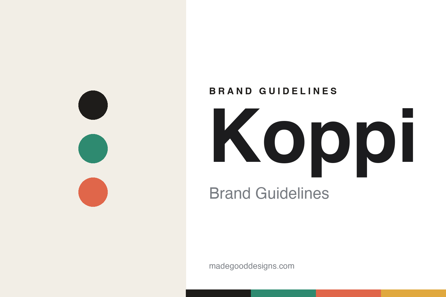
Koppi Brand Guidelines
Every bag a painting.
Aa
Two constants: a painted-teal-and-coral palette and a Nordic grotesque register. Abstract homage — not the Koppi labels or paintings.
Every bag a painting
Koppi’s labels are painted by its staff, and none repeat.
Koppi is a lesson in variability as the brand. Founded in 2007 in Helsingborg, Sweden by Anne Lunell and Charles Nystrand (Swedish barista champions and World Barista Championship finalists), it dropped its café in 2016 to focus on Nordic light roasting.
Its brand identity is a rotating gallery of painted labels. Moving on from early industrial matt-black bags, Koppi gave each coffee its own unique, multi-coloured label — no two alike. The colour isn’t random: Anne selects it to subtly represent the coffee’s flavour and to encode its country of origin (customers were choosing by colour and origin). The artwork comes from collaborative “painting nights” — the staff paint together, and those abstract paintings become the labels; “the labels are made by everyone working at Koppi.” A custom box-bottom bag, with all sizes the same width, keeps it all consistent.
(Honest notes: Anne and Charles are national champions and WBC finalists (4th, 2006), not world champions. Koppi was founded in 2007 (2016 is the café-to-roastery shift). The paintings are staff-made in-house — we don’t credit an outside illustrator (the designer Christoffer Erneholm worked with Anne, modestly). And there’s no official brand hex, so the tones here are an unofficial interpretation.)
Colour
Koppi lives in a painted-teal-and-coral palette. Click a swatch to copy the hex.
Koppi’s identity is painterly, expressive and varied — an ink, a painted teal, a coral, an ochre, and a cream. The palette is a painterly, ever-changing spectrum where colour maps to flavour and origin — the register of staff-painted labels on a clean Scandinavian frame. It signals expression and craft rather than a fixed brand hue. The honest caveat: with no published brand hex, these tones are an original, unofficial interpretation, not first-party values.
The lesson is a painterly palette can be the brand. Koppi’s world is a shelf where every bag is a different painting. For designers, it is a reminder that colour, used as a flavour-and-origin code, reads as expressive yet systematic — right for a range that changes constantly. The takeaways: let colour carry meaning (flavour, origin); embrace variability (no two labels alike); discipline it with a fixed structure (same-width bag, clean frame); and treat any single hex as unofficial.
Typography
The register is a Nordic grotesque — clean, structured, expressive.
Koppi’s identity carries a clean, structured, expressive spirit — a Scandinavian frame around painted colour. A Nordic grotesque captures the mood: it is orderly and quiet, letting the paintings do the talking. Set in a painted-teal-and-coral palette, the Nordic grotesque feels clean yet expressive — exactly the personality Koppi carries. It is structured rather than loud, mirroring a disciplined bag that frames wild colour. (Koppi’s real labels and staff paintings are works we describe but do not reproduce, and the exact typeface is not ours to use.) Because they are not ours to use, the honest description is “a Nordic grotesque spirit,” shown here in a stand-in. The type behaves like the brand: clean, structured and expressive.
Aa
A Nordic grotesque spirit — clean and structured. (Specimen set in Familjen Grotesk, a Nordic grotesque STAND-IN; NOT the Koppi labels.)
Variability as identity
Koppi stands for a label that’s different every time.
Koppi is a lesson in making variability the identity. A painted-teal-and-coral palette, a Nordic grotesque and staff-painted labels make change itself the whole brand — expressive, painterly, coherent. The variability is the differentiator. The differentiator is a painted, flavour-coded, ever-changing identity.
For designers and brand-builders, Koppi offers a clear takeaway: difference can be the system. The lessons: let colour code flavour and origin; make every label unique (paint them in-house, together); and hold it with a rigid structure (same-width bag). It is also a reminder to stay accurate: they’re national champions and WBC finalists, founded 2007, and the palette here is an unofficial interpretation. Koppi made variability the brand — proof that “no two alike” can be the difference.
Explore & save
Keep Koppi’s identity on hand — save it to a board in the Made Good inspiration library.
Koppi identity set
Pin the painted-teal-and-coral palette and the Nordic-grotesque register to your own board.


