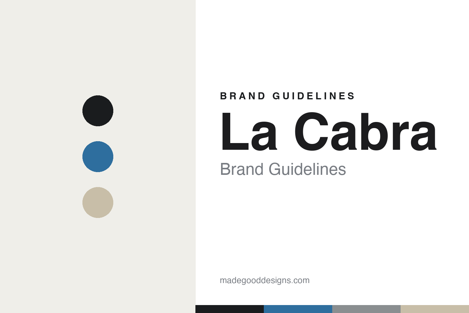
La Cabra Brand Guidelines
Nordic gallery minimalism.
Aa
Two constants: a cerulean-and-sand palette and a clean grotesque register. Abstract homage — not the La Cabra packaging.
Nordic gallery minimalism
La Cabra’s restraint is anchored by its cerulean ceramics.
La Cabra is a lesson in restraint anchored by craft objects. Founded in Aarhus, Denmark (café around 2012, its own roasting from 2013, with roasting later centred in Copenhagen), by Esben Piper, it is an independent, founder-led roaster known for ultra-light Nordic coffee — “Brighter is Better” — and a New York expansion (East Village 2021, Brooklyn 2024). The name means “the goat” in Spanish.
Its brand identity is Scandinavian gallery minimalism. It has evolved from an early figurative goat emblem to a refined, largely typographic wordmark — the literal goat has receded. Its strongest, most tactile signature is spatial and material: an in-house design lead (Mikkel Selmer) and the KH Würtz ceramics — the cerulean blue-black bar tiles and handleless cups that are the brand’s most recognisable cue.
(Honest notes: the current identity is minimalist and typographic, not a goat-illustration logo (that’s the name origin and an early emblem). The design leadership is in-house (Mikkel Selmer), with KH Würtz on ceramics — no external identity studio is documented, so we don’t name one. And there’s no official brand hex, so the tones here are an unofficial interpretation.)
Colour
La Cabra lives in a cerulean-and-sand palette. Click a swatch to copy the hex.
La Cabra’s identity is calm, neutral and considered — an ink, a cerulean, a stone, a sand, and a white. The palette pairs the cerulean of its KH Würtz ceramics with warm sand and neutrals — the register of a quiet Nordic gallery. It signals craft and calm rather than colour or noise. The honest caveat: with no published brand hex, these tones are an original, unofficial interpretation, not first-party values.
The lesson is a cerulean against neutrals signals considered Nordic craft. La Cabra’s world is a pale room with cerulean cups. For designers, it is a reminder that a single ceramic-blue against creams reads as calm and crafted — right for a gallery-like roaster. The takeaways: keep the ground neutral; let one material colour (the cerulean) be the accent; lead with clean type; and treat any single hex as unofficial — using ink for small text so the calm holds.
Typography
The register is a clean grotesque — calm, considered, contemporary.
La Cabra’s identity carries a calm, considered, contemporary spirit — a 21st-century Nordic restraint. A clean grotesque captures the mood: it is quiet and modern, the register of a typographic, gallery-like brand. Set in a cerulean-and-sand palette, the clean grotesque feels calm and considered — exactly the personality La Cabra carries. It is restrained rather than ornate, mirroring a minimalist wordmark. (La Cabra’s real wordmark and packaging are works we describe but do not reproduce, and the exact typeface is not ours to use.) Because they are not ours to use, the honest description is “a clean grotesque spirit,” shown here in a stand-in. The type behaves like the brand: calm, considered and contemporary.
Aa
A clean grotesque spirit — calm and contemporary. (Specimen set in Schibsted Grotesk, a clean grotesque STAND-IN; NOT the La Cabra wordmark.)
Material as identity
La Cabra stands for minimalism made tactile by ceramics.
La Cabra is a lesson in making material the identity. A cerulean-and-sand palette, a clean grotesque and signature ceramics make craft the whole brand — calm, tactile, unmistakable. The ceramics are the differentiator. The differentiator is a Nordic-minimal, material, gallery identity.
For designers and brand-builders, La Cabra offers a clear takeaway: a material can carry a minimal brand. The lessons: keep the graphics quiet and typographic; let a signature object (the cerulean KH Würtz cups) do the memorable work; and let the space and the wordmark share one restraint. It is also a reminder to stay accurate: the current mark is typographic (not a goat logo), the design is in-house with KH Würtz ceramics, and the palette here is an unofficial interpretation. La Cabra made material the brand — proof that craft objects can be the difference.
Explore & save
Keep La Cabra’s identity on hand — save it to a board in the Made Good inspiration library.
La Cabra identity set
Pin the cerulean-and-sand palette and the clean-grotesque register to your own board.


