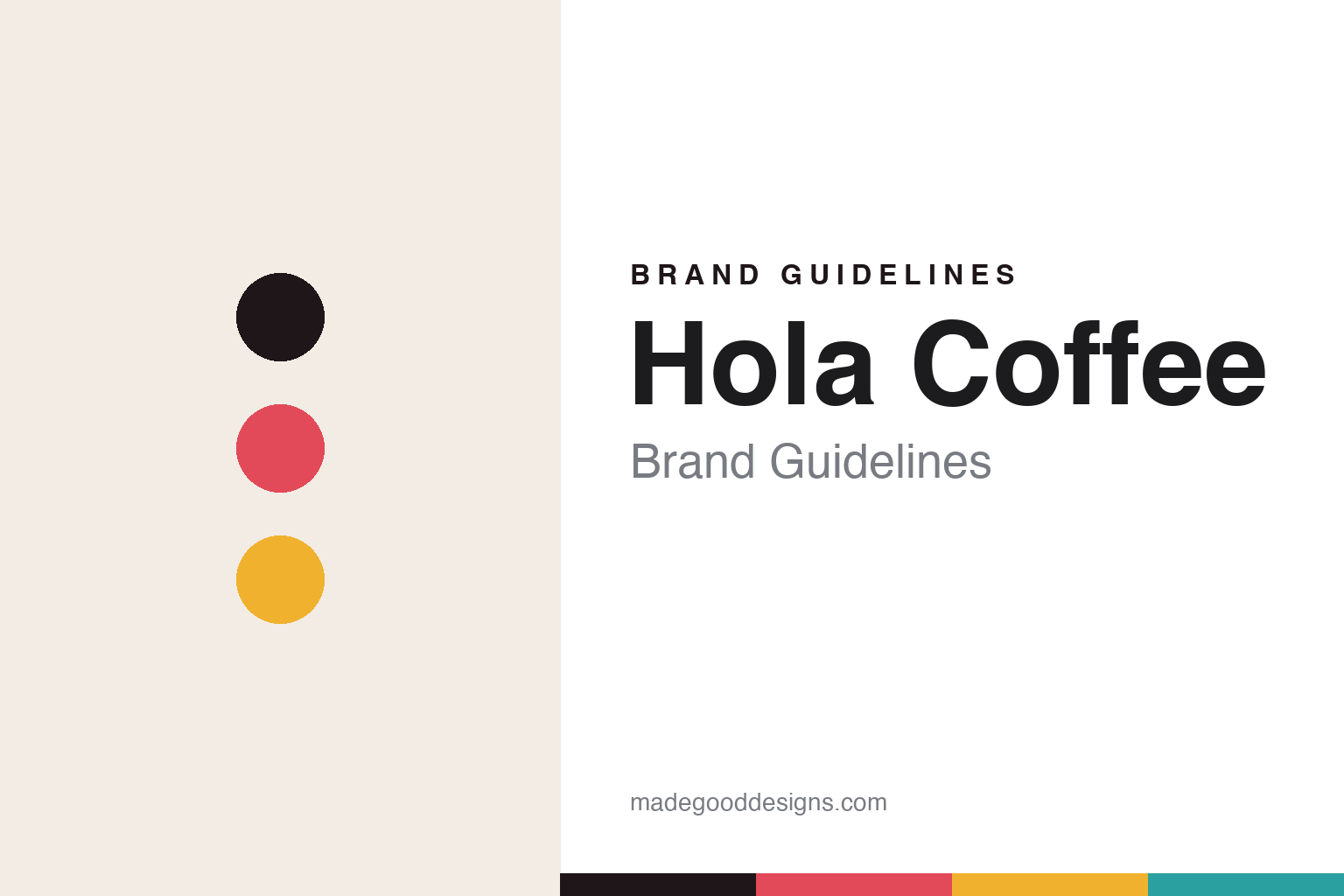
Hola Coffee Brand Guidelines
A playful fiesta.
Aa
Two constants: a coral-and-yellow palette and a friendly rounded register. Abstract homage — not the Hola packaging or illustrations.
A playful fiesta
Hola greets you in colour, the opposite of austere coffee.
Hola Coffee is a lesson in warmth as a brand. Founded in 2017 in Lavapiés, Madrid by Pablo Caballero and Nolo Botana, it is an independent café group and roastery — its Lagasca café placed #12 on the World’s 100 Best Coffee Shops in 2025.
Its brand identity is playful, colourful and illustration-led — the friendly opposite of austere third-wave minimalism. The original identity, packaging and illustrations were created by Miriam Persand (Miriam Muñoz) — colourful, fun work spanning cups, neon signage and bags. A celebrated collaboration coffee, “Hey Hola Coffee” with Hey Studio, took it further: each pouch is a unique, hand-applied composition of bright geometric shapes, so every pack differs. (The everyday core wordmark leans warm yellow-brown.)
(Honest notes: the core identity is Miriam Persand’s — Hey Studio did the collaboration product, not the main brand. It was founded in 2017 (some sources say 2016). The core wordmark is warm rather than uniformly rainbow. And there’s no official brand hex, so the tones here are an unofficial interpretation.)
Colour
Hola lives in a coral-and-yellow palette. Click a swatch to copy the hex.
Hola’s identity is bright, warm and friendly — an ink, a coral, a yellow, a teal, and a cream. The palette pairs a warm coral with a sunny yellow and a teal — the register of playful, illustration-led, welcoming design. It signals warmth and fun rather than austerity. The honest caveat: with no published brand hex, these tones are an original, unofficial interpretation, not first-party values.
The lesson is warm coral and yellow signal a friendly, playful brand. Hola’s world is a colourful “hello” on the shelf. For designers, it is a reminder that a coral with a yellow and a teal reads as welcoming and fun — right for an illustration-led roaster. The takeaways: lead with warm, friendly colour; let illustration carry the identity; and treat any single hex as unofficial — using ink for small text so the colour stays cheerful.
Typography
The register is a friendly rounded — warm, playful, welcoming.
Hola’s identity carries a warm, playful, welcoming spirit — a colourful “hello.” A friendly rounded face captures the mood: it is soft and cheerful, the register of an illustration-led, approachable brand. Set in a coral-and-yellow palette, the friendly rounded feels warm and playful — exactly the personality Hola carries. It is welcoming rather than austere, mirroring a colourful illustrated bag. (Hola’s real packaging and its designers’ work are described but not reproduced, and the exact typeface is not ours to use.) Because they are not ours to use, the honest description is “a friendly rounded spirit,” shown here in a stand-in. The type behaves like the brand: warm, playful and welcoming.
Aa
A friendly rounded spirit — warm and playful. (Specimen set in Baloo 2, a friendly rounded STAND-IN; NOT the Hola packaging.)
Warmth as identity
Hola stands for a coffee brand that says a colourful hello.
Hola Coffee is a lesson in making warmth the identity. A coral-and-yellow palette, a friendly rounded face and illustration-led design make warmth the whole brand — colourful, playful, welcoming. The warmth is the differentiator. The differentiator is a playful, illustration-led, friendly identity.
For designers and brand-builders, Hola offers a clear takeaway: friendliness can stand out. The lessons: reject the austere default with warm colour; commission a real illustrator (Miriam Persand); and let a collaboration push the idea (Hey Studio’s hand-applied geometric pouches). It is also a reminder to stay accurate: the core identity is Persand’s (Hey did the collab), it was founded in 2017, and the palette here is an unofficial interpretation. Hola made warmth the brand — proof that a colourful hello can be the difference.
Explore & save
Keep Hola Coffee’s identity on hand — save it to a board in the Made Good inspiration library.
Hola Coffee identity set
Pin the coral-and-yellow palette and the friendly-rounded register to your own board.


