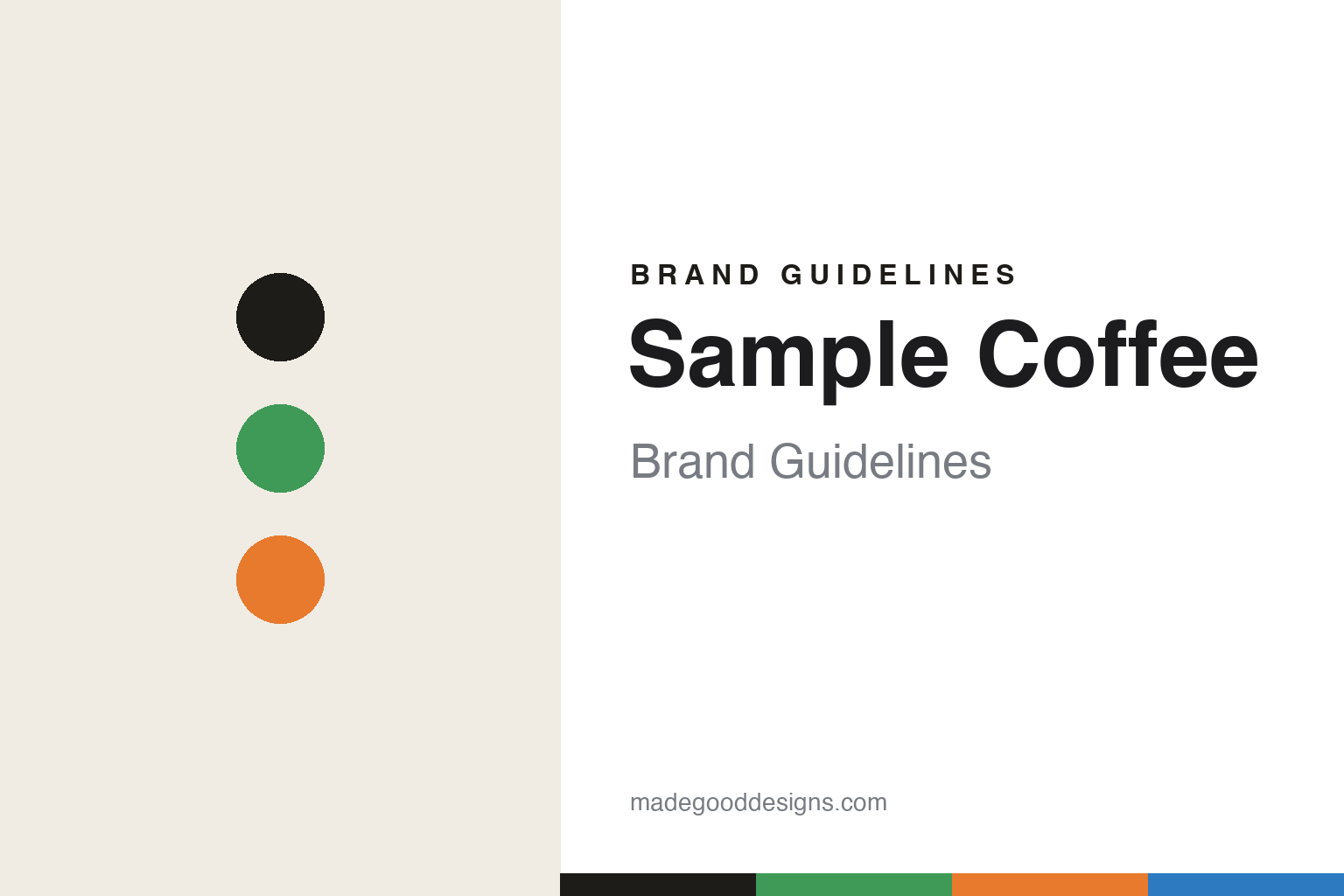
Sample Coffee Brand Guidelines
Hand-lettered & colour-coded.
Aa
Two constants: a sticker-green-and-orange palette and a brush lettering register. Abstract homage — not the Sample packaging.
Hand-lettered & colour-coded
Sample carries its identity in brush lettering and stickers.
Sample Coffee is a lesson in a human hand on a minimal bag. Founded in 2011 in Surry Hills, Sydney by Reuben Mardan (ex-Single O and Mecca), with its own roastery from 2014 in St Peters, it is an independent, owner-run roaster — “small by design, independent by nature,” and a certified B Corp — known for one of Australia’s most diverse single-origin ranges.
Its brand identity has two eras and a signature system. An early hand-drawn coffee-plant “stamp” logo (from ~2012–13) gave way, in a ~2019 rebrand, to a system with custom brush hand-lettering of each bean’s country of origin by the Melbourne letterer Carla Hackett. Its most distinctive, functional device is a colour-coded sticker system — coloured stickers applied in-house to a minimal base bag, so a small team can mix and match the constantly rotating origins each week without reprinting. Zen, minimal base; hand-lettering and colour dots carry the identity.
(Honest notes: this is Sample of Sydney, Australia — not a Portuguese roaster. It was founded in 2011 (roastery 2014). The country brush-lettering is Carla Hackett’s; the early stamp’s authorship is contested (Reuben with Matti Puckridge), so we attribute cautiously. And there’s no official brand hex, so the tones here are an unofficial interpretation.)
Colour
Sample lives in a sticker-green-and-orange palette. Click a swatch to copy the hex.
Sample’s identity is minimal, warm and hand-made — an ink, a sticker green, a sticker orange, a sticker blue, and a cream. The palette pairs a zen, minimal base with bright coloured sticker dots — the register of hand-lettering and a functional colour-coding system. It signals craft and flexibility rather than a fixed loud look. The honest caveat: with no published brand hex, these tones are an original, unofficial interpretation, not first-party values.
The lesson is a minimal base plus colour dots signals a flexible, hand-made brand. Sample’s world is a light bag with a brush-lettered origin and a coloured sticker. For designers, it is a reminder that bright dots on a calm base read as playful yet systematic — right for a rotating single-origin range. The takeaways: keep the base minimal; add colour as a functional code (stickers); let hand-lettering carry warmth; and treat any single hex as unofficial — using ink for small text so the system stays legible.
Typography
The register is brush lettering — hand-made, warm, human.
Sample’s identity carries a hand-made, warm, human spirit — brush lettering and stickers. A brush-lettering face captures the mood: it is casual and personal, the register of a hand-lettered origin name. Set in a sticker-green-and-orange palette, the brush lettering feels hand-made and warm — exactly the personality Sample carries. It is human rather than clinical, mirroring hand-applied labels. (Sample’s real packaging and Carla Hackett’s lettering are works we describe but do not reproduce, and the exact lettering is not ours to use.) Because they are not ours to use, the honest description is “a brush lettering spirit,” shown here in a stand-in. The type behaves like the brand: hand-made, warm and human.
Aa
A brush lettering spirit — hand-made and warm. (Specimen set in Caveat, a brush lettering STAND-IN; NOT the Sample packaging.)
A system as identity
Sample stands for hand-lettering plus a colour-coded system.
Sample Coffee is a lesson in making a flexible system the identity. A sticker-green-and-orange palette, brush lettering and a colour-coded sticker scheme make hand-made flexibility the whole brand — warm, functional, unmistakable. The system is the differentiator. The differentiator is a hand-lettered, colour-coded, minimal identity.
For designers and brand-builders, Sample offers a clear takeaway: a functional system can be the design. The lessons: keep a minimal base so it never dates; add hand-lettering for warmth (Carla Hackett); and let colour-coded stickers handle a rotating range without reprinting. It is also a reminder to stay accurate: it’s Sample of Sydney (not Portugal), founded 2011 (roastery 2014), and the palette here is an unofficial interpretation. Sample made a flexible system the brand — proof that a working system can be the difference.
Explore & save
Keep Sample Coffee’s identity on hand — save it to a board in the Made Good inspiration library.
Sample Coffee identity set
Pin the sticker-green-and-orange palette and the brush-lettering register to your own board.