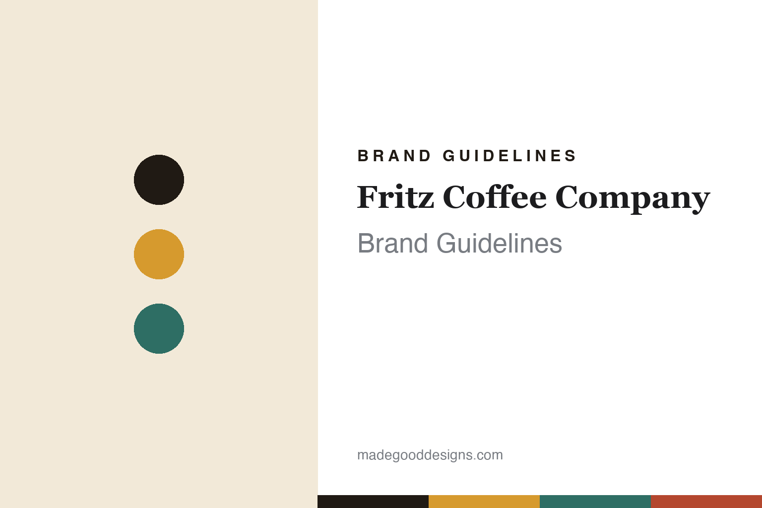
Fritz Coffee Company Brand Guidelines
A seal, and a Korean vintage.
Aa
Two constants: a mustard-and-teal palette and a retro serif register. Abstract homage — not the Fritz seal or lettering.
A seal, and a Korean vintage
Fritz built a nostalgic identity around a seal.
Fritz Coffee Company is a lesson in nostalgia as strategy. Founded in 2014 in Seoul by a collective of six — a barista-championship team of friends (including national champion Park Geun-ha) plus a baker — it is an independent roaster and a full bakery, where the bread is a co-equal part of the brand.
Its identity is a deliberate Korean vintage, “modern-yet-old” nostalgia. The signature is its mascot — a seal (물개), usually shown holding a coffee cup. The identity is by Cho In-hyuk, who became the company’s in-house design director; the lettering is hand-drawn, pairing a Hangul serif-style “프릳츠” — set in a deliberately archaic Hangul spelling of “Fritz” — with Latin “coffee company,” all inside a square frame decorated with traditional Korean patterns. The seal itself has a charming origin: the building had been an “Owl Galbi” restaurant, so an owl was considered first — the seal was chosen simply because it was cuter.
(Honest notes: the mascot is a seal, usually with a coffee cup — not a sea lion or otter, and not “a seal with a flower.” The designer is Cho In-hyuk (in-house) — not studio fnt, a common mix-up. The name “Fritz” is just transliterated English with no special meaning and no German connection. And there’s no official brand hex, so the mustard-and-cream tones here are an unofficial interpretation.)
Colour
Fritz lives in a mustard-and-teal palette. Click a swatch to copy the hex.
Fritz’s identity is warm, retro and nostalgic — an ink, a mustard, a teal, a brick, and a cream. The palette reads like old Korean signage — warm mustard and cream with a vintage teal and brick — the register of a “modern-yet-old” aesthetic. It signals nostalgia and craft rather than clinical minimalism. The honest caveat: with no published brand hex, these tones are an original, unofficial interpretation, not first-party values.
The lesson is warm mustard and vintage tones signal nostalgic craft. Fritz’s world is an old-signage frame with a friendly seal. For designers, it is a reminder that muted, retro colour reads as warm and characterful — right for a brand built on nostalgia. The takeaways: choose a palette with a period feel (old signage); anchor it with a warm neutral (cream); let a mascot carry the charm; and treat any single hex as unofficial, keeping type dark so the retro palette stays legible.
Typography
The register is a retro serif — warm, characterful, nostalgic.
Fritz’s identity carries a warm, characterful, nostalgic spirit — hand-drawn lettering and a period frame. A retro serif captures the mood: it is old-fashioned and friendly, the register of vintage signage. Set in a mustard-and-teal palette, the retro serif feels warm and characterful — exactly the personality Fritz carries. It is nostalgic rather than clinical, mirroring hand-drawn lettering in a patterned frame. (Fritz’s real seal, lettering and frame are works we describe but do not reproduce, and the exact letterforms are not ours to use.) Because they are not ours to use, the honest description is “a retro serif spirit,” shown here in a stand-in. The type behaves like the brand: warm, characterful and nostalgic.
Aa
A retro serif spirit — warm and nostalgic. (Specimen set in Fraunces, a vintage-flavoured serif STAND-IN; NOT the Fritz lettering.)
Nostalgia as identity
Fritz stands for a seal and an old-Korea vintage feel.
Fritz is a lesson in making nostalgia the identity. A mustard-and-teal palette, a retro serif and a friendly seal make “modern-yet-old” the whole brand — warm, characterful, unmistakably local. The nostalgia is the differentiator. The differentiator is a Korean-vintage, mascot-led identity.
For designers and brand-builders, Fritz offers a clear takeaway: local nostalgia can out-charm minimalism. The lessons: build a mascot with a story (the seal); root the type in a real period (old signage, archaic spelling); and let a whole world — coffee and bakery alike — share one warm register. It is also a reminder to stay accurate: the designer is Cho In-hyuk (not studio fnt), the mascot is a seal with a cup, and the palette here is an unofficial interpretation. Fritz made nostalgia the brand — proof that a warm, local vintage can be the difference.
Explore & save
Keep Fritz Coffee Company’s identity on hand — save it to a board in the Made Good inspiration library.
Fritz identity set
Pin the mustard-and-teal palette and the retro-serif register to your own board.


