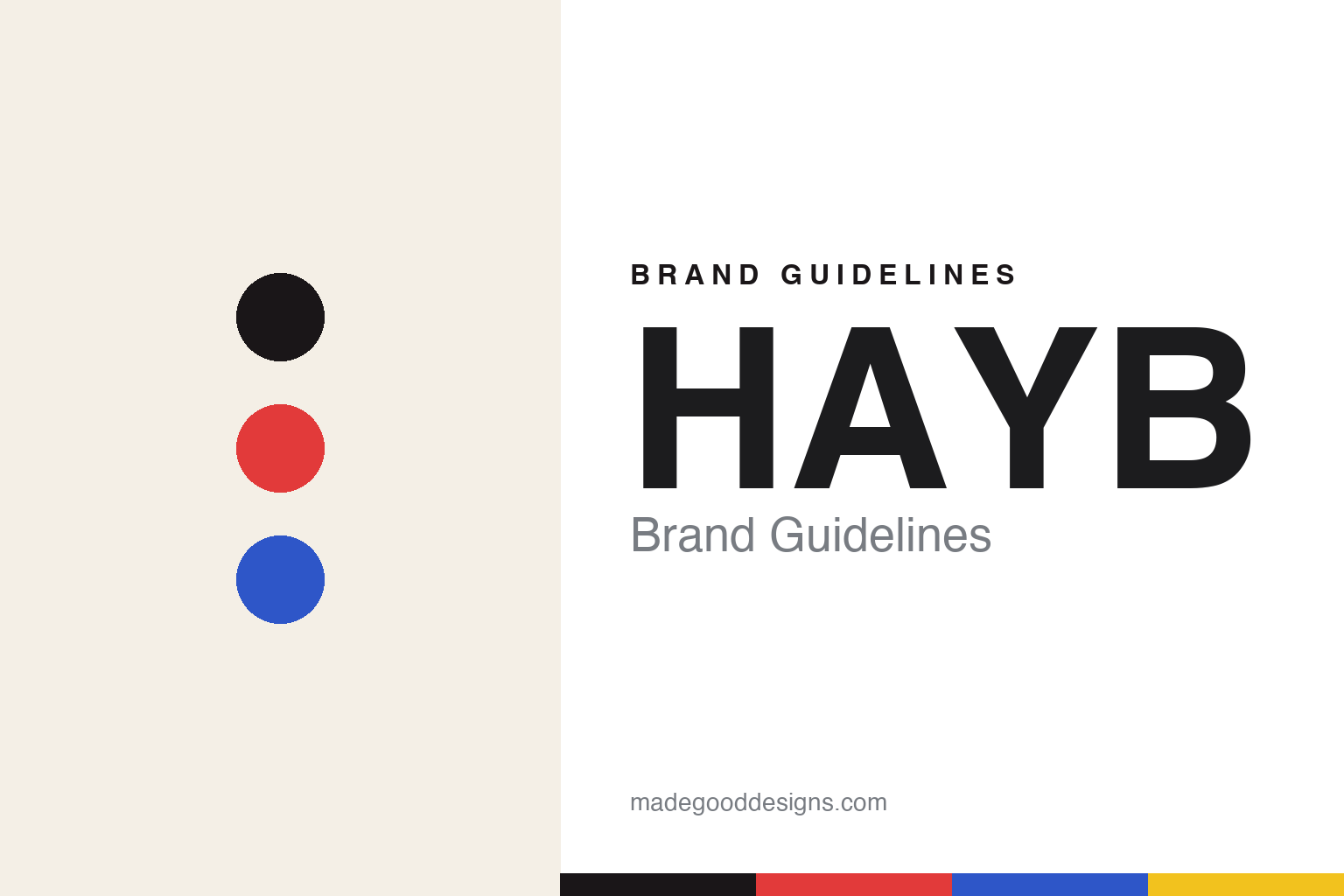
HAYB Brand Guidelines
How are you brewing?
Aa
Two constants: a bold red-and-blue palette and a type-forward sans register. Abstract homage — not the HAYB packaging.
How are you brewing?
HAYB made bold colour and typography its whole voice.
HAYB is a lesson in colour as confidence. A family business founded in 2016 in Warsaw by father and son Robert and Wiktor Borowski — originally as “Coffee Republic,” before a trademark dispute prompted the rebrand — it is an independent roaster and café known as “Warsaw’s colourful rebels.” Its name is an acronym: “How Are You Brewing?”
Its identity is bold, colourful, playful and type-forward. The current look is the 2022 “Effortless Speciality” rebrand, with creative direction by the Warsaw agency CUKIER and a graphic and type layer led by Mateusz Machalski — a prominent Polish type designer and professor at the Academy of Fine Arts in Warsaw — with Aleksandra Otulska and Daga Podkrólewicz. It runs across packaging, labels, roastery and illustration, using loud, multi-coloured bags to break firmly with the muted, kraft-and-white specialty norm.
(Honest notes: the name is “How Are You Brewing?” — not “Have A Good Day,” a common myth. It was founded in 2016 by Robert and Wiktor Borowski, originally as “Coffee Republic.” The design is by the agency CUKIER with type designer Mateusz Machalski. And the exact colours aren’t published, so the bright tones here are a qualitative, unofficial interpretation.)
Colour
HAYB lives in a bold red-and-blue palette. Click a swatch to copy the hex.
HAYB’s identity is bold, colourful and playful — an ink, a red, a blue, a yellow, and a cream. The palette is loud and multi-coloured — the register of “colourful rebels” who reject the muted specialty norm. It signals energy and confidence rather than restraint. The honest caveat: with no published brand hex, these tones are an original, unofficial interpretation, not first-party values.
The lesson is a loud, multi-colour palette signals playful confidence. HAYB’s world is a shelf of bright, type-forward bags. For designers, it is a reminder that bold colour, backed by strong typography, reads as energetic and distinctive — right for a brand positioned against the norm. The takeaways: reject the category default (kraft and white); go loud and multi-colour; let a type designer anchor it so the boldness stays crafted; and — because bright hues fail as small text — keep type dark and let colour fill the fields; treat any single hex as unofficial.
Typography
The register is a type-forward sans — bold, crafted, confident.
HAYB’s identity carries a bold, crafted, confident spirit — loud colour and strong letters. A type-forward sans captures the mood: it is expressive and assured, the register of a type-designer-led rebrand. Set in a red-and-blue palette, the type-forward sans feels bold and crafted — exactly the personality HAYB carries. It is confident rather than quiet, mirroring packaging where typography does the talking. (HAYB’s real packaging and its designers’ type are works we describe but do not reproduce, and the exact letterforms are not ours to use.) Because they are not ours to use, the honest description is “a type-forward sans spirit,” shown here in a stand-in. The type behaves like the brand: bold, crafted and confident.
Aa
A type-forward sans spirit — bold and crafted. (Specimen set in Syne, a type-forward sans STAND-IN; NOT the HAYB packaging.)
Colour as identity
HAYB stands for loud colour and crafted type.
HAYB is a lesson in making colour the identity. A red-and-blue palette, a type-forward sans and loud, playful bags make bold confidence the whole brand — colourful, crafted, unmistakable. The colour is the differentiator. The differentiator is a loud, type-forward, rebel identity.
For designers and brand-builders, HAYB offers a clear takeaway: be loud, but keep it crafted. The lessons: reject the muted norm (go multi-colour); anchor the boldness with a real type designer (Mateusz Machalski, via CUKIER); and let the packaging carry the voice. It is also a reminder to stay accurate: the name is “How Are You Brewing?”, the founders are Robert and Wiktor Borowski (ex–“Coffee Republic”), and the palette here is an unofficial interpretation. HAYB made colour the brand — proof that crafted loudness can be the difference.
Explore & save
Keep HAYB’s identity on hand — save it to a board in the Made Good inspiration library.
HAYB identity set
Pin the red-and-blue palette and the type-forward-sans register to your own board.


