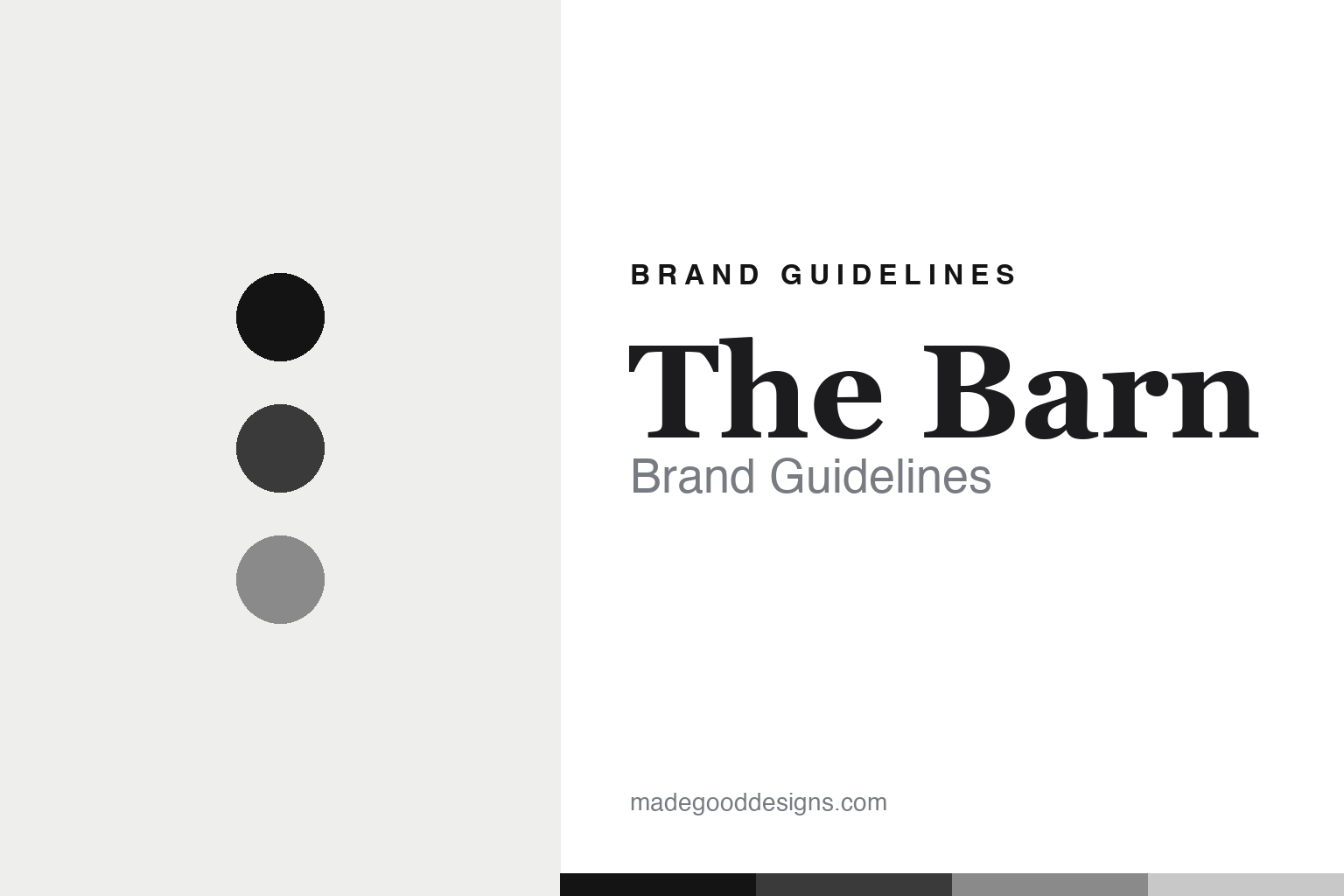
The Barn Brand Guidelines
Serif meets hand-drawn.
Aa
Two constants: a monochrome palette and a linear serif register. Abstract homage — not the Barn packaging.
Serif meets hand-drawn
The Barn stages an elite serif against a handmade mark.
The Barn is a lesson in austerity as a statement. Founded in 2010 by Ralf Rüller in Berlin’s Scheunenviertel (the “Barn Quarter,” which gives the name), and roasting its own coffee from 2012, it is a defining German third-wave pioneer — the first Berlin roaster to embrace light, Nordic-style roasting, with a famously purist house style.
Its brand identity is stark, monochrome minimalism — black-and-white, typography-led, ornament stripped away to mirror the product ethos. The most distinctive move is the logo’s deliberate tension: a refined linear serif wordmark that says elite, editorial, high-end, set against a separate hand-drawn mark that “feels handcrafted, as if someone drew it and scanned it.” Elite roaster meets everything-by-hand.
(Honest notes: it was founded as a café in 2010 and began roasting in 2012. No designer or studio is publicly credited — the identity reads as in-house. The hand-drawn mark is exactly that — hand-drawn — but we don’t assert it depicts a barn. And there’s no official brand hex, so the tones here are an unofficial interpretation.)
Colour
The Barn lives in a monochrome palette. Click a swatch to copy the hex.
The Barn’s identity is austere, high-contrast and monochrome — a black, a charcoal, a grey, a silver, and a white. The palette is black-and-white with greys — the register of ornament-free, typographic minimalism. It signals purity and restraint rather than colour. The honest caveat: with no published brand hex, these tones are an original, unofficial interpretation, not first-party values.
The lesson is monochrome signals purist restraint. The Barn’s world is a black-and-white bag that lets the coffee stand alone. For designers, it is a reminder that a strict greyscale reads as austere and premium — right for a purist roaster. The takeaways: strip the colour; let type and white space carry it; add one handmade mark for warmth; and treat any single tone as unofficial — using black for small text so the austerity holds.
Typography
The register is a linear serif — refined, editorial, high-end.
The Barn’s identity carries a refined, editorial, purist spirit — an elite serif and a handmade mark. A linear serif captures the mood: it is elegant and restrained, the register of a high-end, editorial brand. Set in a monochrome palette, the linear serif feels refined and austere — exactly the personality The Barn carries. It is elite rather than ornate, mirroring an ornament-free label. (The Barn’s real logo and packaging are works we describe but do not reproduce, and the exact typefaces are not ours to use.) Because they are not ours to use, the honest description is “a linear serif spirit,” shown here in a stand-in. The type behaves like the brand: refined, editorial and austere.
Aa
A linear serif spirit — refined and editorial. (Specimen set in Prata, a linear serif STAND-IN; NOT the Barn logo.)
Austerity as identity
The Barn stands for restraint on the page as an argument for purity.
The Barn is a lesson in making austerity the identity. A monochrome palette, a linear serif and an ornament-free label make restraint itself the whole brand — purist, editorial, unmistakable. The austerity is the differentiator. The differentiator is a monochrome, typographic, purist identity.
For designers and brand-builders, The Barn offers a clear takeaway: less is the message. The lessons: strip the ornament so the product speaks; stage a contrast (a refined serif against a handmade mark) so minimalism isn’t generic; and let the name come from the place (the Scheunenviertel). It is also a reminder to stay accurate: it began as a café in 2010 (roasting 2012), no designer is credited, and the palette here is an unofficial interpretation. The Barn made austerity the brand — proof that restraint can be the difference.
Explore & save
Keep The Barn’s identity on hand — save it to a board in the Made Good inspiration library.
The Barn identity set
Pin the monochrome palette and the linear-serif register to your own board.


