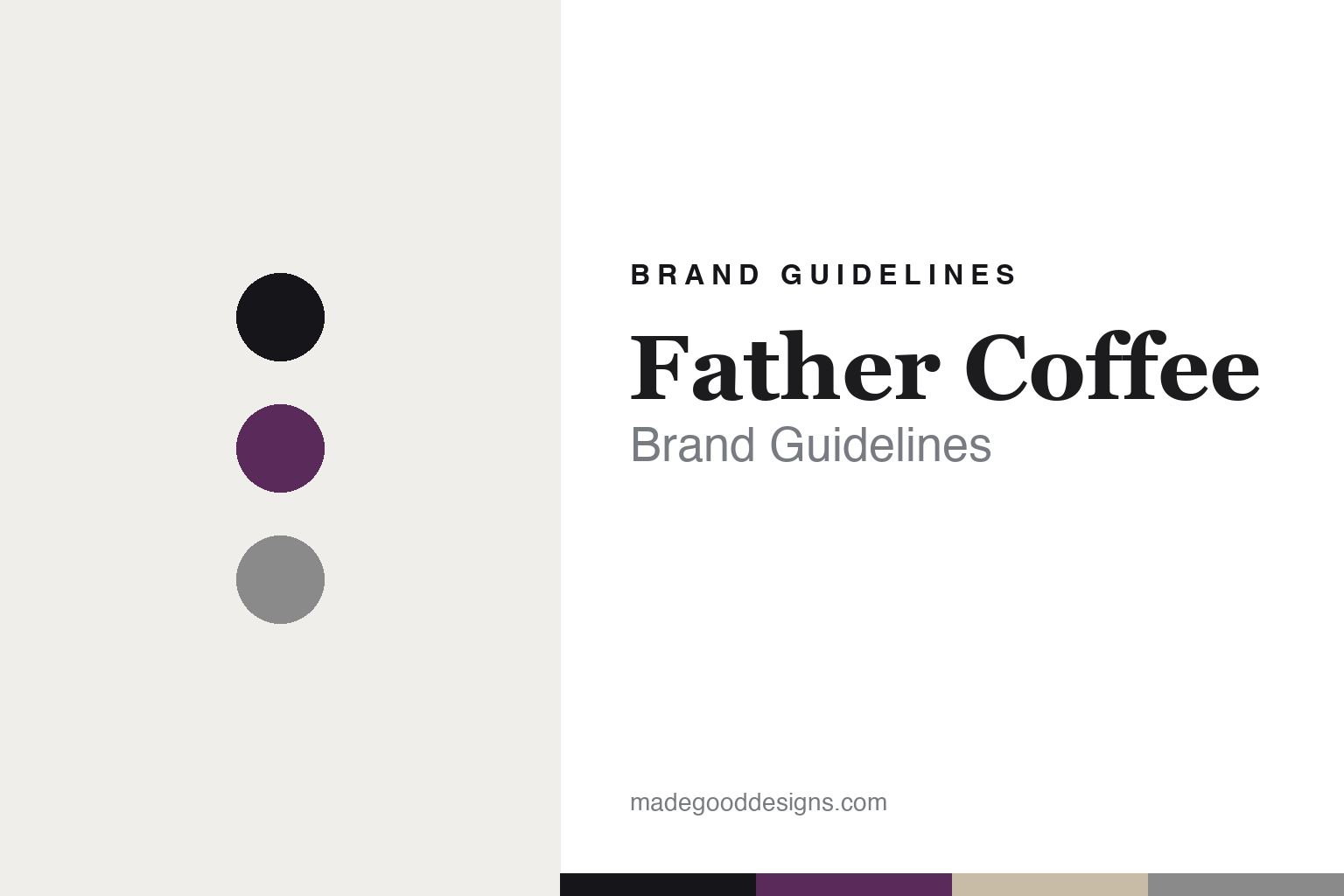
Father Coffee Brand Guidelines
A founder-designed serif.
Aa
Two constants: a monochrome-plus-plum palette and a contrast serif register. Abstract homage — not the Father Coffee packaging.
A founder-designed serif
Father’s polished identity was designed by a founder.
Father Coffee is a lesson in design credibility from inside. Founded in 2013 in Braamfontein, Johannesburg (its roastery moved to Kramerville in 2021), it is an independent, founder-owned roaster — and unusually, its polished identity was designed in-house by co-founder Nicholas Christowitz, a professional graphic designer.
Its brand identity is considered, near-architectural minimalism. The “Father” wordmark is a high-contrast serif logotype — heavy, solid letterforms paired with hairline thin serifs — set with generous white space. There’s no pictorial crest; the identity is wordmark-led. The palette is a near-monochrome white, black and greyscale shell, and the only real colour comes from the colourful origin labels that code each coffee. A clean sans (Dinamo’s “Repro”) carries the functional text.
(Honest notes: the identity is founder-designed in-house by Nicholas Christowitz — not an outside agency (his separate practice, Http.Studio, isn’t Father’s agency). The co-founder count is reported inconsistently, so we credit Christowitz and hedge the rest. A “moon-phase” packaging claim is likely another brand. And there’s no official brand hex, so the tones here are an unofficial interpretation.)
Colour
Father lives in a monochrome-plus-plum palette. Click a swatch to copy the hex.
Father’s identity is austere, architectural and premium — an ink, a plum, a grey, a sand, and a white. The palette is a near-monochrome base with a single origin-label colour (here, a plum) — the register of gallery-like restraint punctuated by editorial colour-coding. It signals authority and refinement rather than noise. The honest caveat: with no published brand hex, these tones are an original, unofficial interpretation, not first-party values.
The lesson is monochrome plus one coded colour signals architectural restraint. Father’s world is a white bag with a single colourful origin label. For designers, it is a reminder that a greyscale shell with one label colour reads as considered and premium — right for a founder-designed identity. The takeaways: keep the shell monochrome; let a colour code the origin; lead with a contrast serif; and treat any single hex as unofficial — using ink for small text so the restraint holds.
Typography
The register is a contrast serif — heavy and hairline, architectural.
Father’s identity carries a considered, architectural, authoritative spirit — a designer’s hand and a name that means authority. A high-contrast serif captures the mood: it pairs heavy strokes with hairline serifs, the register of a confident, editorial wordmark. Set in a monochrome-plus-plum palette, the contrast serif feels architectural and authoritative — exactly the personality Father carries. It is refined rather than loud, mirroring a disciplined, white-space label. (Father’s real wordmark and packaging are works we describe but do not reproduce, and the exact typeface is not ours to use.) Because they are not ours to use, the honest description is “a contrast serif spirit,” shown here in a stand-in. The type behaves like the brand: heavy, hairline and architectural.
Aa
A contrast serif spirit — heavy and hairline. (Specimen set in Bodoni Moda, a contrast serif STAND-IN; NOT the Father Coffee wordmark.)
In-house design as identity
Father stands for a roaster whose design authority is its own.
Father Coffee is a lesson in owning your design. A monochrome-plus-plum palette, a contrast serif and a founder-designed system make design credibility the whole brand — considered, architectural, unmistakable. The in-house authorship is the differentiator. The differentiator is a founder-designed, contrast-serif, monochrome identity.
For designers and brand-builders, Father offers a clear takeaway: the design can come from within. The lessons: let a designer-founder set the identity (Nicholas Christowitz); build a monochrome shell and let colour code the origin; and lead with a distinctive contrast serif. It is also a reminder to stay accurate: it was founded in 2013, the identity is in-house (not an outside agency), and the palette here is an unofficial interpretation. Father made in-house design the brand — proof that design authority can be the difference.
Explore & save
Keep Father Coffee’s identity on hand — save it to a board in the Made Good inspiration library.
Father Coffee identity set
Pin the monochrome-plus-plum palette and the contrast-serif register to your own board.


