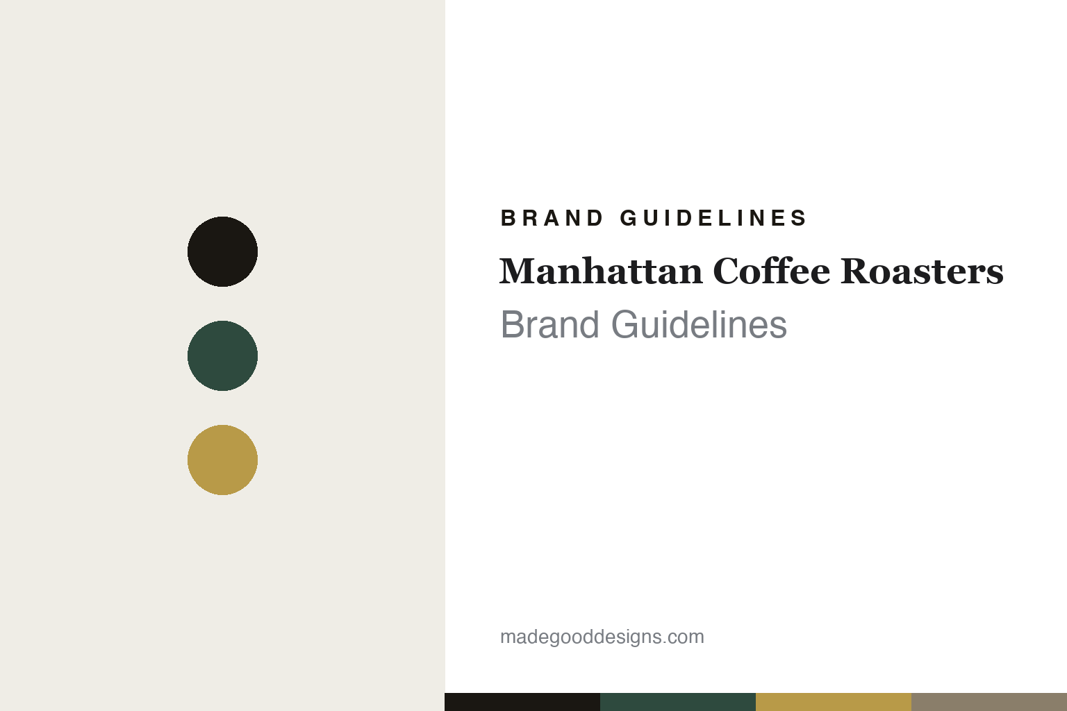
Manhattan Coffee Roasters Brand Guidelines
Gilded Art Deco.
Aa
Two constants: a deco-green-and-gold palette and a Deco caps register. Abstract homage — not the Manhattan packaging.
Gilded Art Deco
Manhattan styles specialty coffee as a fancy hotel.
Manhattan Coffee Roasters is a lesson in coffee as luxury. Founded in March 2017 in Rotterdam by Esther Maasdam and Ben Morrow (Coffee Masters and Latte Art champions), it is an independent roaster known for competition-grade micro-lots and experimental processing. Its name references the historic Rotterdam-to-Manhattan Holland America Line — a harbour heritage, not a generic New York nod.
Its brand identity is opulent, gilded Art Deco — explicitly framed as “a fancy hotel,” the opposite of stripped-back Scandinavian minimalism. Designed by the studio Pavement (with letterpress print by Studio On Fire), it is a bespoke, delicately textured, gilded pouch system in a palette of brown, gray, green and white accented with gold. Against that decorative Deco frame sits an information-dense, transparency-forward label — competition-lab precision meets old-world luxury.
(Honest notes: it was founded in 2017 (not 2015, the year Ben won New York Coffee Masters), and the founders are Coffee Masters / Latte Art champions, not World Barista Champions. The identity is gilded Art Deco — not a minimalist black-and-white skyline — designed by the US studio Pavement. And there’s no official brand hex, so the tones here are an unofficial interpretation.)
Colour
Manhattan lives in a green-and-gold palette. Click a swatch to copy the hex.
Manhattan’s identity is opulent, gilded and Deco — an ink, a deco green, a gold, a taupe, and a white. The palette pairs a deep Art Deco green with gold gilding — the register of a grand hotel lobby. It signals luxury and old-world sophistication rather than clinical minimalism. The honest caveat: with no published brand hex, these tones are an original, unofficial interpretation, not first-party values.
The lesson is a deep green with gold signals gilded luxury. Manhattan’s world is a fancy-hotel bag with a shimmering finish. For designers, it is a reminder that a Deco green with gold reads as opulent and refined — right for a roaster styling coffee as a luxury good. The takeaways: borrow a rich period world (Art Deco); use gold as the signature; keep the labels information-dense underneath; and treat any single hex as unofficial — using ink for small text so the gilding leads.
Typography
The register is Deco caps — opulent, engraved, luxurious.
Manhattan’s identity carries an opulent, engraved, luxurious spirit — a fancy hotel and gold leaf. A Deco-caps face captures the mood: it is grand and engraved, the register of a 1920s hotel lobby. Set in a green-and-gold palette, the Deco caps feel opulent and luxurious — exactly the personality Manhattan carries. It is grand rather than plain, mirroring a gilded pouch. (Manhattan’s real packaging is the work of the studio Pavement; we describe but do not reproduce it, and the exact typefaces are not ours to use.) Because it is not ours to use, the honest description is “a Deco caps spirit,” shown here in a stand-in. The type behaves like the brand: opulent, engraved and luxurious.
Aa
A Deco caps spirit — opulent and engraved. (Specimen set in Cinzel, a Deco caps STAND-IN; NOT the Manhattan packaging.)
Opulence as identity
Manhattan stands for coffee styled as a gilded luxury good.
Manhattan Coffee Roasters is a lesson in making opulence the identity. A green-and-gold palette, Deco caps and a gilded pouch make luxury the whole brand — grand, refined, unmistakable. The opulence is the differentiator. The differentiator is a gilded, Art-Deco, luxury identity.
For designers and brand-builders, Manhattan offers a clear takeaway: borrow a luxury world on purpose. The lessons: reject the category default (Scandinavian minimalism) for a rich period style (Art Deco); commission a studio to build a bespoke gilded package (Pavement); and keep transparency data dense beneath the decoration. It is also a reminder to stay accurate: it was founded in 2017, the design is by the US studio Pavement, and the palette here is an unofficial interpretation. Manhattan made opulence the brand — proof that a borrowed world can be the difference.
Explore & save
Keep Manhattan Coffee Roasters’s identity on hand — save it to a board in the Made Good inspiration library.
Manhattan Coffee Roasters identity set
Pin the green-and-gold palette and the Deco-caps register to your own board.


