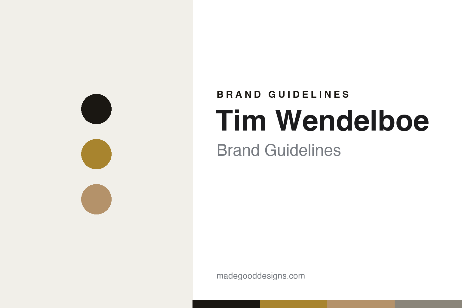
Tim Wendelboe Brand Guidelines
Information-first minimalism.
Aa
Two constants: a gold-and-kraft palette and a clean grotesque register. Abstract homage — not the Tim Wendelboe packaging.
Information-first minimalism
Tim Wendelboe made traceability the visual message.
Tim Wendelboe is a lesson in data as design. The 2004 World Barista Champion opened his Oslo roastery and espresso bar in 2007 in Grünerløkka, and became a defining figure of third-wave, Nordic light-roast coffee — independent and owner-run.
Its brand identity is disciplined, information-first minimalism, designed by the Oslo studio Flammier (Alexander Flammier Muskaug). The logo is a spare “TW” monogram (with a product mark placing it in an ellipse with a coffee-bean reference); the labels split by tier — brown/kraft for regular coffee, white with a golden logo for specialty. The genuinely distinctive move is content: the label foregrounds producer, farm, variety, process, harvest and roast date — traceability as the visual message, not ornament. Many Nordic roasters echoed the template.
(Honest notes: the business was founded in 2007 — 2004 is the barista title. It’s independent (early startup funding from Solberg & Hansen wasn’t ownership). It isn’t a bare wordmark — there is a TW monogram and an ellipse mark. The designer is Flammier, not the ceramics collaborators. And there’s no official brand hex, so the tones here are an unofficial interpretation.)
Colour
Tim Wendelboe lives in a gold-and-kraft palette. Click a swatch to copy the hex.
Tim Wendelboe’s identity is restrained, neutral and premium — an ink, a gold, a kraft, a stone, and a white. The palette pairs a gold accent with kraft and white — the register of the specialty (white-and-gold) and regular (kraft) label split. It signals craft and provenance rather than colour. The honest caveat: with no published brand hex, these tones are an original, unofficial interpretation, not first-party values.
The lesson is gold and kraft signal a restrained, premium identity. Tim Wendelboe’s world is a neutral bag dense with provenance. For designers, it is a reminder that a gold on white or kraft reads as quiet and high-end — right for an information-first roaster. The takeaways: keep the palette neutral; use gold as the only luxury cue; split tiers by label colour; and treat any single hex as unofficial — using ink for small text so the data leads.
Typography
The register is a clean grotesque — neutral, disciplined, editorial.
Tim Wendelboe’s identity carries a neutral, disciplined, editorial spirit — a monogram and dense data. A clean grotesque captures the mood: it is quiet and technical, the register of a label that reads like a document. Set in a gold-and-kraft palette, the clean grotesque feels neutral and disciplined — exactly the personality Tim Wendelboe carries. It is editorial rather than decorative, mirroring an information-first label. (Tim Wendelboe’s real packaging is the work of Flammier; we describe but do not reproduce it, and the exact typefaces are not ours to use.) Because it is not ours to use, the honest description is “a clean grotesque spirit,” shown here in a stand-in. The type behaves like the brand: neutral, disciplined and editorial.
Aa
A clean grotesque spirit — neutral and disciplined. (Specimen set in Archivo, a clean grotesque STAND-IN; NOT the Tim Wendelboe packaging.)
Data as identity
Tim Wendelboe stands for provenance over ornament.
Tim Wendelboe is a lesson in making data the identity. A gold-and-kraft palette, a clean grotesque and a TW monogram make provenance itself the whole brand — neutral, disciplined, benchmark-setting. The traceability is the differentiator. The differentiator is an information-first, Nordic-minimal identity.
For designers and brand-builders, Tim Wendelboe offers a clear takeaway: information can be the design. The lessons: foreground the facts (producer, farm, process, roast date); use one small mark (the TW monogram) and one luxury cue (gold on white); and split tiers by colour rather than clutter. It is also a reminder to stay accurate: the business began in 2007, the designer is Flammier, and the palette here is an unofficial interpretation. Tim Wendelboe made data the brand — proof that provenance can be the difference.
Explore & save
Keep Tim Wendelboe’s identity on hand — save it to a board in the Made Good inspiration library.
Tim Wendelboe identity set
Pin the gold-and-kraft palette and the clean-grotesque register to your own board.


