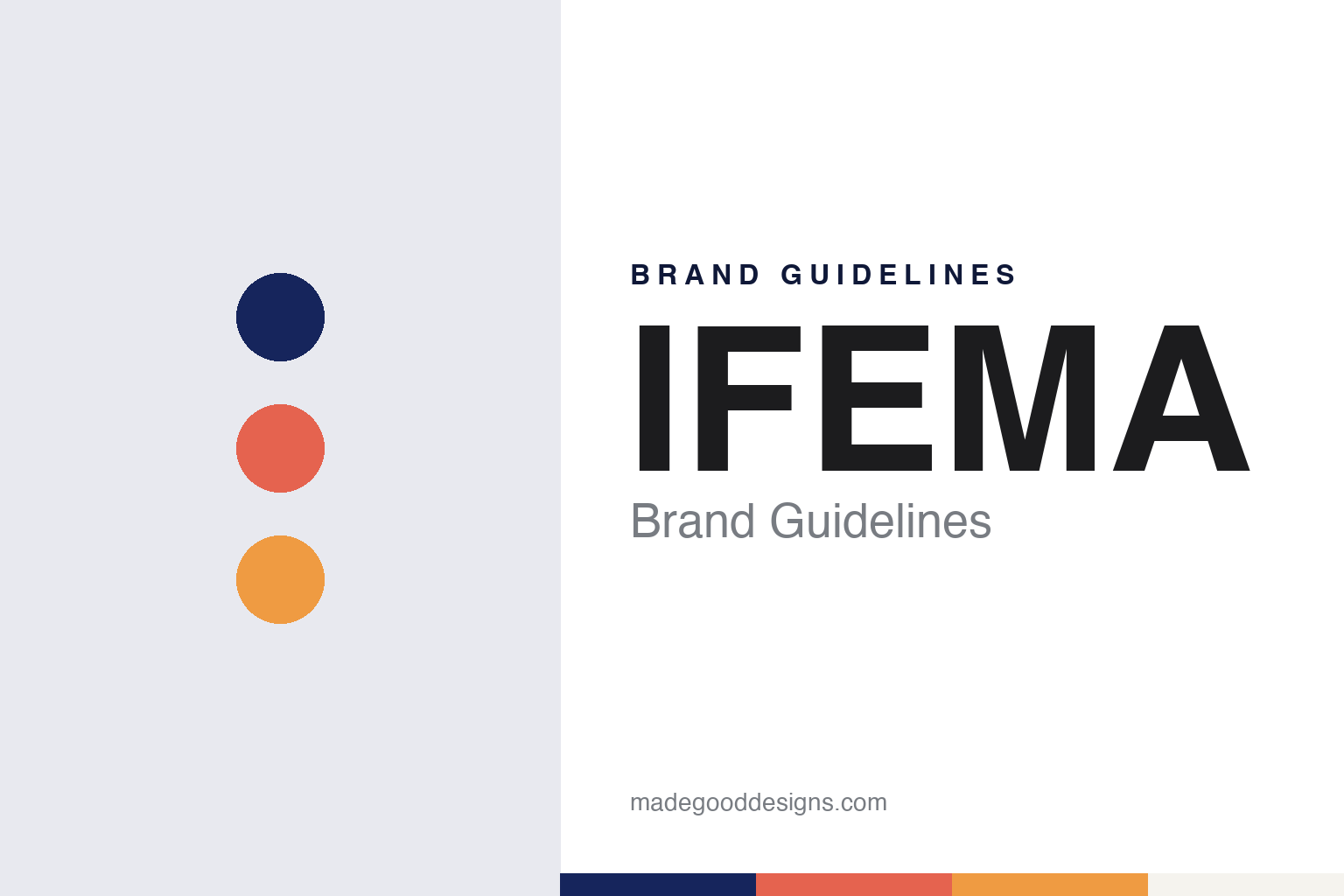
IFEMA Brand Guidelines
A 1980 Madrid fair consortium and an opened “i”.
Aa
Two constants: a deep blue, coral and orange palette and a rounded grotesque register. Abstract homage — not an IFEMA MADRID mark; no logo, symbol or fair name is reproduced.
Institución Ferial de Madrid
A consortium built to give Madrid a fair.
IFEMA, short for Institución Ferial de Madrid, was founded in 1980, the organisation and Spanish Wikipedia say. Spanish Wikipedia sets out the background: a 1943 law under the Franco government allowed only Valencia and Barcelona to hold general international fairs with a permanent organisation and fixed dates, and Madrid had no such concession. In 1978 the Madrid Chamber of Commerce and the city council began talks that led to IFEMA’s creation, with the chamber, the city council, the provincial council and the savings bank Caja Madrid as its partners.
IFEMA is not a company in the usual sense but a consortium. Its members today are the Comunidad de Madrid, the city council of Madrid, the Madrid Chamber of Commerce and Industry and the Fundación Montemadrid, the organisation says; Spanish Wikipedia gives their shares as 31 per cent each for the first three and 7 per cent for the foundation, and puts the staff at about 400. The members’ senior representatives sit on its governing bodies, IFEMA says.
Its main grounds lie in the Campo de las Naciones, in the Barajas district north-east of the city centre, near the airport and between the M-11 and M-40 motorways. esMadrid, the city’s official tourism site, describes 240,000 square metres of exhibition space in 13 halls, two convention centres and 14,000 parking spaces; Spanish Wikipedia gives 200,000 square metres in 12 halls. Since January 2019 IFEMA has also run the nearby IFEMA Palacio Municipal, and it is extending onto a plot at Valdebebas, across the M-11, where two new halls, numbered 21 and 22, are to join the main site through a tunnel, esMadrid says.
Colour
Fairs, congresses and concerts.
IFEMA organises its own fairs and hosts others. Spanish Wikipedia ranks its fairs by their 2014 income as FITUR, Fruit Attraction, ARCOmadrid and the September edition of Intergift. Among other events it has organised, the same source names Mercedes-Benz Fashion Week Madrid, formerly Pasarela Cibeles, along with Feriarte and Liber. esMadrid says the institution stages more than 800 fairs, congresses and leisure events a year and receives around four million visitors.
Reason Why, the Spanish marketing and advertising publication, reported in April 2021 that 2019 had been IFEMA’s record year, with almost 900 events, 33,300 participating companies and 4.3 million visitors. The same report quoted IFEMA’s president, José Vicente de los Mozos, on plans for 16 congresses and fairs held entirely online and around 50 more in hybrid form, run on IFEMA’s own digital platform.
The organisation describes its range as wider than trade. In a Reason Why interview published on 23 April 2021, IFEMA’s director of marketing and digital strategy, Javier Blanquer, said that perhaps 70 per cent of its activities are aimed at professionals, with shows and concerts making up much of the rest. Ismael Merlo of the branding firm BrandFor said in the same interview that a visitor might come to IFEMA to close a deal or to see an exhibition about the television series Game of Thrones, and that the brand had been built to cover both.
Typography
How fair organisers present themselves.
Exhibition and trade-fair organisers sell two things at once: the shows themselves and the places that hold them. Their corporate websites reflect that split. GL events, for example, divides its group page into Live, Venues and Exhibitions, while Easyfairs gives its owned halls in Belgium, the Netherlands and Sweden their own section and logo files alongside the group mark.
Most of the visible branding belongs to the shows rather than the parent company. A group may run more than a hundred show brands, each with its own name, logo and audience, so the corporate identity often works as an endorsement in the background. Many show names simply state a sector, a material or a place, as Global Industrie, UK Metals Expo and Packaging Première do, while others, such as Sirha or Première Vision, work as names in their own right.
Photography does much of the work. Organisers publish wide shots of busy aisles, stands and halls, and some credit the photographer by name beside the show and city, as GL events does on its exhibitions page. Venue pages lean on floor areas, hall counts and plain descriptions of what the space can be shaped into, from a small trade show to a large conference.
Behind the shows sit practical tools for exhibitors and visitors, described plainly: online portals, exhibitor packages, floor plans and visitor registration. Corporate pages then cover the owners, the board and the venues held under ownership or concession, often with a dated history timeline. This guide sets out what can be checked about each organiser — who founded it, who owns it and which shows and venues it runs — and marks what rests on the company’s own word.
Aa
A slightly rounded grotesque, after the signage-based type IFEMA MADRID uses. (Specimen set in Barlow, a sans STAND-IN; NOT the IFEMA MADRID logo.)
IFEMA MADRID
The 2021 identity: an “i” opened to the world.
On 13 April 2021 IFEMA presented its first major change of corporate identity in 30 years, Reason Why reported, adding the word Madrid to its name: the institution now signs itself IFEMA MADRID. BrandFor handled the strategy, logo and visual identity, and Publicis created the launch campaign, “Llámalo IFEMA MADRID.” The brand line is “Siente la inspiración” (feel the inspiration), resting on four values: impact, connection, vitality and ingenuity; BrandFor summed up the brand essence in English as “Live-in inspiration.” De los Mozos said the aim was for the new image to act as an ambassador for Madrid abroad. The change was to be introduced step by step over the following months, with the road signs to the grounds the largest single task, while the digital channels switched at once, Reason Why reported.
The previous logo, which IFEMA’s director general Eduardo López-Puertas said had been designed by Carlos Rolando three decades earlier, centred on a letter “i.” BrandFor said it started from that central “i” and “opened it to the world,” so that both identities share it in their symbol; its creators describe the new wordmark as offering a palindromic reading. The symbol alone stands in where the full logo does not fit, such as a favicon or a lanyard.
The identity guide described by Reason Why names a deep blue as the main colour, used in the logo, with a brighter blue, a coral that nods to the flag of the Comunidad de Madrid, and an orange. Coral and orange are activation colours, never used over large areas, and the deep blue runs into coral in gradients; lavender, sky blue, mandarin and amber are secondary tones. Two typefaces were chosen: FS Meridian, a humanist sans with straight, rigid terminals, and Barlow, a slightly rounded grotesque based on signage lettering. The guide pairs them for contrast, with FS Meridian for expression and Barlow for everyday legibility.
For a design guide, IFEMA shows how a fair institution can tie its name and colours to its city. Compare Messe Düsseldorf, another publicly owned fair organiser, and Fiera Milano. For this guide we use a deep blue, a coral and an orange with a sans, an unofficial interpretation; no product or logo is reproduced.
Explore & save
Keep IFEMA’s identity on hand — save it to a board in the Made Good inspiration library.
IFEMA identity set
Pin the IFEMA deep blue, coral and orange palette and the rounded grotesque register to your own board.