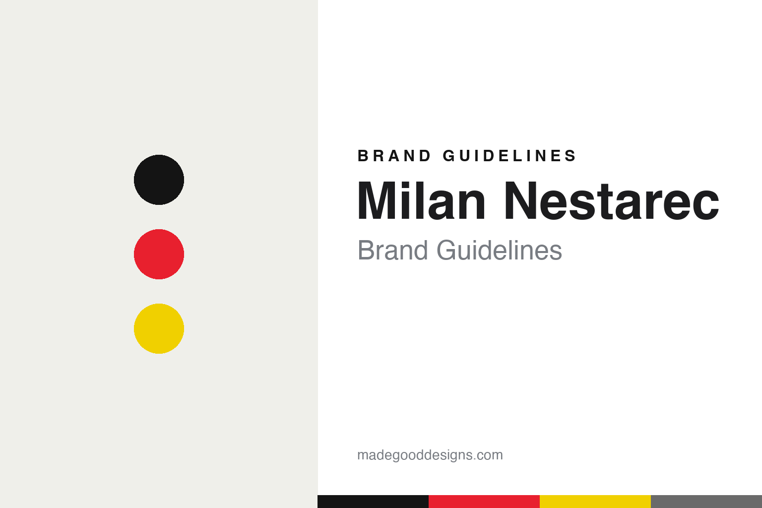
Milan Nestarec Brand Guidelines
Irreverent by design.
Aa
Two constants: a punk-red palette and a loud display register. Abstract homage — not the Nestarec labels or lettering.
Irreverent by design
Milan Nestarec makes bold, irreverent Moravian natural wine.
Milan Nestarec is a lesson in irreverence as an identity. Milan Nestarec (born 1988) runs a multi-generational family estate in Moravia, Czech Republic (around Velké Bílovice), which he took in a radical low-intervention direction in the early 2010s; the land was returned to the family after 1989.
Its brand identity is bold, punchy and irreverent — high-contrast, type-led labels with a punk, DIY, deadpan energy, and provocative, playful cuvée names (Youngster, Troublemaker, Danger 380 Volts, Forks & Knives, Kiddo). Even a bilingual pun turns up — a wine whose name plays on the Czech word for “a hoax.” It is a deliberate rejection of stuffy, château wine convention.
(Honest notes: Milan actually rejects the “natural” and “artisanal” labels, calling his methods simply “normal.” The labels are made with outside graphic collaborators (no single named studio is credited). It’s an independent family estate. And there’s no official brand hex, so the tones here are an unofficial interpretation.)
Colour
Milan Nestarec lives in a punk-red palette. Click a swatch to copy the hex.
Nestarec’s identity is loud, high-contrast and irreverent — an ink, a punk red, an electric yellow, a grey, and a snow. The palette pairs a punk red with an electric yellow on black — the register of a bold poster and a deadpan joke. It signals energy, humour and rebellion rather than heritage or restraint. The honest caveat: with no published brand hex, these tones are an original, unofficial interpretation, not first-party values.
The lesson is a punk red plus electric yellow signals an irreverent identity. Nestarec’s world is a loud label that refuses to take wine too seriously. For designers, it is a reminder that a punk red with an electric yellow reads as bold and rebellious — right for an irreverent label. The takeaways: go high-contrast; add an electric accent; and treat any single hex as unofficial — using ink for small text so the palette stays loud.
Typography
The register is a loud display — bold and deadpan.
Nestarec’s identity carries a bold, irreverent, deadpan spirit — punk energy and provocative names. A loud display face captures the mood: it is heavy and high-impact, the register of a poster that grabs you. Set in a punk-red palette, the loud display feels bold and deadpan — exactly the personality Nestarec carries. It is rebellious rather than refined, mirroring an anti-château label. (Nestarec’s real labels are works we describe but do not reproduce, and the exact lettering is not ours to use.) Because the labels are not ours to use, the honest description is “a loud display spirit,” shown here in a stand-in. The type behaves like the brand: bold, irreverent and deadpan.
Aa
A loud display spirit — bold and deadpan. (Specimen set in Anton, a loud display STAND-IN; NOT the Nestarec labels or lettering, which are their own work.)
Irreverence as identity
Milan Nestarec stands for anti-château, irreverent design.
Milan Nestarec is a lesson in making irreverence the identity. A punk-red palette, loud type and provocative names make anti-convention the whole brand — bold, funny, rebellious. The irreverence is the differentiator. The differentiator is a loud, provocative, anti-château identity.
For designers and brand-builders, Nestarec offers a clear takeaway: attitude can be a brand. The lessons: reject the category’s solemnity (no crest, no reverence); make names do the talking (Youngster, Danger 380 Volts, a bilingual pun); and commit to a loud, type-led look. It is also a reminder to stay accurate: he rejects the “natural/artisanal” vocabulary (he calls it “normal”), the labels are made with outside collaborators (no single studio credited), and the palette here is an unofficial interpretation. Nestarec made irreverence the brand — proof that attitude can be the difference.
Explore & save
Keep Milan Nestarec’s identity on hand — save it to a board in the Made Good inspiration library.
Milan Nestarec identity set
Pin the punk-red palette and the loud-display register to your own board.


