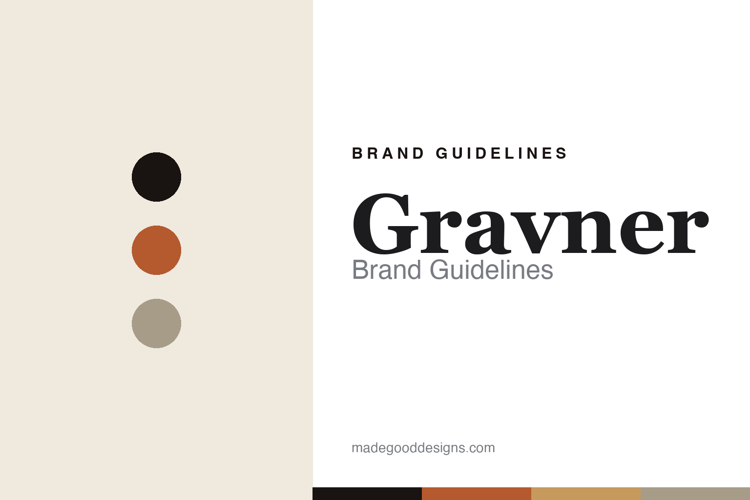
Gravner Brand Guidelines
Anti-design as design.
Aa
Two constants: a clay-and-ivory palette and a classical serif register. Abstract homage — not the Gravner label or bottle.
Anti-design as design
Gravner’s design signature is severe restraint — a label that refuses decoration.
Gravner is a lesson in restraint as identity. The Gravner family bought their land in Oslavia, a tiny hamlet in the comune of Gorizia, in the Collio hills of Friuli, Italy (right on the Slovenian border) in 1901, and began commercial bottling in 1973. Josko Gravner took over in the early 1980s making conventional, international-style wines — until a 1987 trip to Napa disillusioned him and a devastating 1996 hailstorm became the catalyst for a radical return to ancient methods.
Its brand identity is austere, near-monastic and almost anti-design — a pale, unbleached cream ground, quiet classical serif lettering set small and centred, and minimal copy. Where most natural-wine branding today is playful and illustrative, Gravner is the opposite pole: severe, silent, reverent. The austerity is the statement. Its wines — built on the native Ribolla Gialla, fermented in beeswax-lined Georgian clay amphorae buried under the cellar — signal age and gravity, and the label defers to them.
(Honest notes: Gravner didn’t “invent orange wine” — skin contact is an ancestral, Georgian technique, and the term “orange wine” was coined in 2004 by importer David Harvey; Gravner is a modern pioneer. The amphora switch is around 2000–2001, not 1997. Its labels have no famous designer. And there’s no official brand hex, so the tones here are an unofficial interpretation.)
Colour
Gravner lives in a clay-and-ivory palette. Click a swatch to copy the hex.
Gravner’s identity is earthen, quiet and ancient — an ink, a terracotta, an ochre, a stone, and an ivory. The palette leans on the terracotta of buried clay amphorae with an unbleached ivory — the register of Georgian qvevri, cellar earth and long, oxidative aging. It signals reverence and age rather than gloss. The honest caveat: with no published brand hex, these tones are an original, unofficial interpretation, not first-party values.
The lesson is terracotta and ivory signal an ancient, earthen identity. Gravner’s world is amber wine resting for years in clay under the cellar floor. For designers, it is a reminder that terracotta with an unbleached ivory reads as reverent and old — right for an amphora pioneer. The takeaways: anchor with ink; use a clay terracotta; add ochre and stone; and treat any single hex as unofficial — using ink for small text so the palette stays austere.
Typography
The register is a classical serif — quiet, considered, near-monastic.
Gravner’s identity carries a classical, reverent, old-world spirit — restraint and gravity. A classical serif captures the mood: it is quiet and considered, closer to an old document or an apothecary label than a modern wine brand. Set in a clay-and-ivory palette, the classical serif feels austere and near-monastic — exactly the personality Gravner carries. It is restrained rather than showy, mirroring a label that refuses decoration. (Gravner’s real label is a trademark we describe but do not reproduce, and the exact typeface is not ours to use.) Because the label is not ours to use, the honest description is “a classical serif spirit,” shown here in a stand-in. The type behaves like the brand: quiet, considered and reverent.
Aa
A classical serif spirit — quiet and near-monastic. (Specimen set in EB Garamond, a classical serif STAND-IN; NOT the Gravner label, which is a trademark.)
Restraint as identity
Gravner stands for a label that signals gravity by refusing decoration.
Gravner is a lesson in making restraint the identity. A clay-and-ivory palette, a quiet classical serif and an almost anti-design label make severity itself the whole brand — reverent, silent, unmistakable. The restraint is the differentiator. The differentiator is an austere, ancient, amphora identity.
For designers and brand-builders, Gravner offers a clear takeaway: refusing decoration can be the design. The lessons: let the label recede (unbleached paper, small classical type); put the meaning in the object and the method (clay qvevri, years of aging, the heavy dark bottle); and let a native grape carry the story (Ribolla Gialla in Oslavia since the 1200s). It is also a reminder to stay accurate: Gravner is a modern revivalist (not the inventor of orange wine), the clay switch is around 2000–2001, and the palette here is an unofficial interpretation. Gravner made restraint the brand — proof that silence can be the difference.
Explore & save
Keep Gravner’s identity on hand — save it to a board in the Made Good inspiration library.
Gravner identity set
Pin the clay-and-ivory palette and the classical-serif register to your own board.


