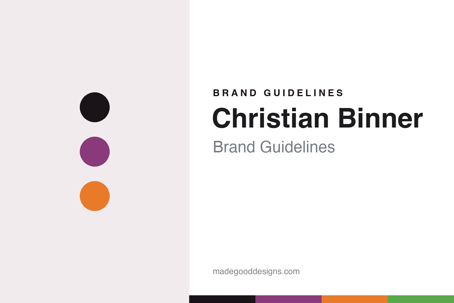
Christian Binner Brand Guidelines
The irreverent labels.
Aa
Two constants: a purple-and-orange palette and a bold display register. Abstract homage — not the Binner or Pirouettes labels.
The irreverent labels
Binner’s design fame lives in a collective and a few witty puns.
Christian Binner is a lesson in irreverence as a break from convention. Christian Binner took over his family’s Ammerschwihr, Alsace estate in 1999 (the family had farmed the village since 1770), turning it organic and then biodynamic, and making no-sulfur, skin-contact Alsace wines.
Its brand identity is playful and irreverent — but honestly, the famous colourful labels are mostly his collective, Les Vins Pirouettes (launched 2008), whose bright, caricature-style bottles are each named after the individual grower (“Riesling de Julien,” “Tutti Frutti de Stéphane”). The estate’s own wit shows in small gestures: the orange “Si Rose” carries an illustration of a liver (a pun on cirrhosis), and Binner’s take on the shared “Brutal!!!” label swaps the usual grim reaper for an Alsatian stork.
(Honest notes: the core Domaine Binner estate labels are comparatively restrained and thinly documented, and no illustrator or designer is credited for either brand, so we don’t name one. The family farmed since 1770, but organic and no-sulfur are recent commitments. And there’s no official brand hex, so the tones here are an unofficial interpretation.)
Colour
Christian Binner lives in a purple-and-orange palette. Click a swatch to copy the hex.
Binner’s identity is bright, playful and irreverent — an ink, a purple, an orange, a leaf, and a paper. The palette pairs a vivid purple with a warm orange — the register of caricature, comic energy and a break from staid Alsace tradition. It signals fun and rebellion rather than heraldry. The honest caveat: with no published brand hex, these tones are an original, unofficial interpretation, not first-party values.
The lesson is a purple with an orange signals a playful, irreverent brand. Binner’s world is a shelf of bright, caricatured natural-wine bottles. For designers, it is a reminder that a vivid purple with an orange reads as fun and rebellious — right for labels that mock formality. The takeaways: lead with a saturated hue; add a warm contrast; keep it irreverent; and treat any single hex as unofficial — using ink for small text so the palette stays bold.
Typography
The register is a bold display — playful, loud, irreverent.
Binner’s identity carries a playful, loud, irreverent spirit — caricatures and puns. A bold display face captures the mood: it is confident and fun, the register of a label that breaks the rules. Set in a purple-and-orange palette, the bold display feels playful and irreverent — exactly the personality Binner’s natural-wine world carries. It is loud rather than formal, mirroring a caricatured Pirouettes bottle. (Binner’s and Pirouettes’ real labels are works we describe but do not reproduce, and no typeface is documented for us to use.) Because they are not ours to use, the honest description is “a bold display spirit,” shown here in a stand-in. The type behaves like the brand: playful, loud and irreverent.
Aa
A bold display spirit — playful and irreverent. (Specimen set in Shrikhand, a bold display STAND-IN; NOT the Binner or Pirouettes labels.)
Irreverence as identity
Christian Binner stands for a playful break from Alsace formality.
Christian Binner is a lesson in making irreverence the identity. A purple-and-orange palette, a bold display and caricature labels make playfulness the whole brand — bright, funny, rebellious. The irreverence is the differentiator. The differentiator is a playful, natural-wine, anti-formal identity.
For designers and brand-builders, Binner offers a clear takeaway: humour can be a break from convention. The lessons: name a bottle after the grower (Pirouettes’ “de Julien,” “de Stéphane”); let a pun carry a wine (the Si Rose liver, the Brutal stork); and use bright, caricatured art to reject appellation formality. It is also a reminder to stay accurate: the fame is mostly the Pirouettes collective (not the core estate), no designer is credited, and the palette here is an unofficial interpretation. Binner made irreverence the brand — proof that humour can be the difference.
Explore & save
Keep Christian Binner’s identity on hand — save it to a board in the Made Good inspiration library.
Christian Binner identity set
Pin the purple-and-orange palette and the bold-display register to your own board.


